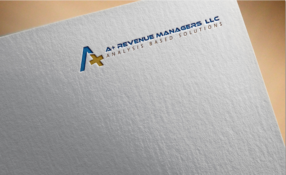
Logo design for revenue enhancement specialists

¿Quieres ganar un trabajo como este?
Este cliente recibió 80 diseños de logo de 14 diseñadores. Eligieron este diseño de logo de Daniyal como el diseño ganador.
Únete gratis Encuentra trabajos de diseño- Garantía
- Proyecto agrupado 1
Resumen de Diseño de Logo
Want a clean, powerful design that depicts our commitment to helping our clients receive the monies due them for their services. We work mainly with doctors' who experience insurance companies denying them the funds they have already earned. Our company name is "A+ Revenue Managers, LLC" and we feel there is a lot that can be done with our name to tie it into our message.
Objetivo del mercado(s)
The medical field
Tipo de industria / entidad
Medical
Información de contacto para la tarjeta del negocio
Need a basic design from which we can order cards for several representatives by changing the names and contact information with the printer
Texto del logo
We are open....maybe the company name; maybe our tag line: "Analysis Based Solutions"?????
Estilos de logo de interés
Logo abstracto
Conceptual / simbólico (texto opcional)
Estilos de fuente para usar
Mira y siente
Cada control deslizante ilustra las características de la marca del cliente y el estilo que debe comunicar el diseño de tu logotipo.
Elegante
Atrevido
Juguetón
Serio
Tradicional
Moderno
Atractivo
Profesional
Femenino
Masculino
Vistoso
Conservador
Económico
De Alta Gama
Requisitos
Debes tener
- A logo that is free standing but can also have the company name incorporated seamlessly depending upon the usage required.
Agradable de tener
- We feel the "A" and the "+" symbol are prime for a logo. We played around with it and there is a photo of a design we came up with that is attached. We are not adverse to the logo being in metallic gold but are unsure of the Ideal color for the company name; it might not be very legible if in gold.....we leave that to the designers. Blue is prevalent in the medical industry so I don't know if that is a reason to do something else or stay with the blue. I like fonts without serifs and also like some of the "handwriting" fonts and blueprint styles. Again, I will leave this to the designers. We may end up mixing elements from different designs, if possible.
No debería tener
- Nothing comes to mind. We don't want to tie them down too much because we want their creativity to flow. I trust they will know what is tasteful and what is not.
Archivos
Pagos
Total
US$160
Fecha límite del proyecto
05 jul. 2016 20:44:14 UTCUpgrades del proyecto
Proyecto(s) incluido(s)
- ofreciendo US$39 por el diseño de tarjeta de presentación al ganador