IT Consulting company needs your logo idea
¿Quieres ganar un trabajo como este?
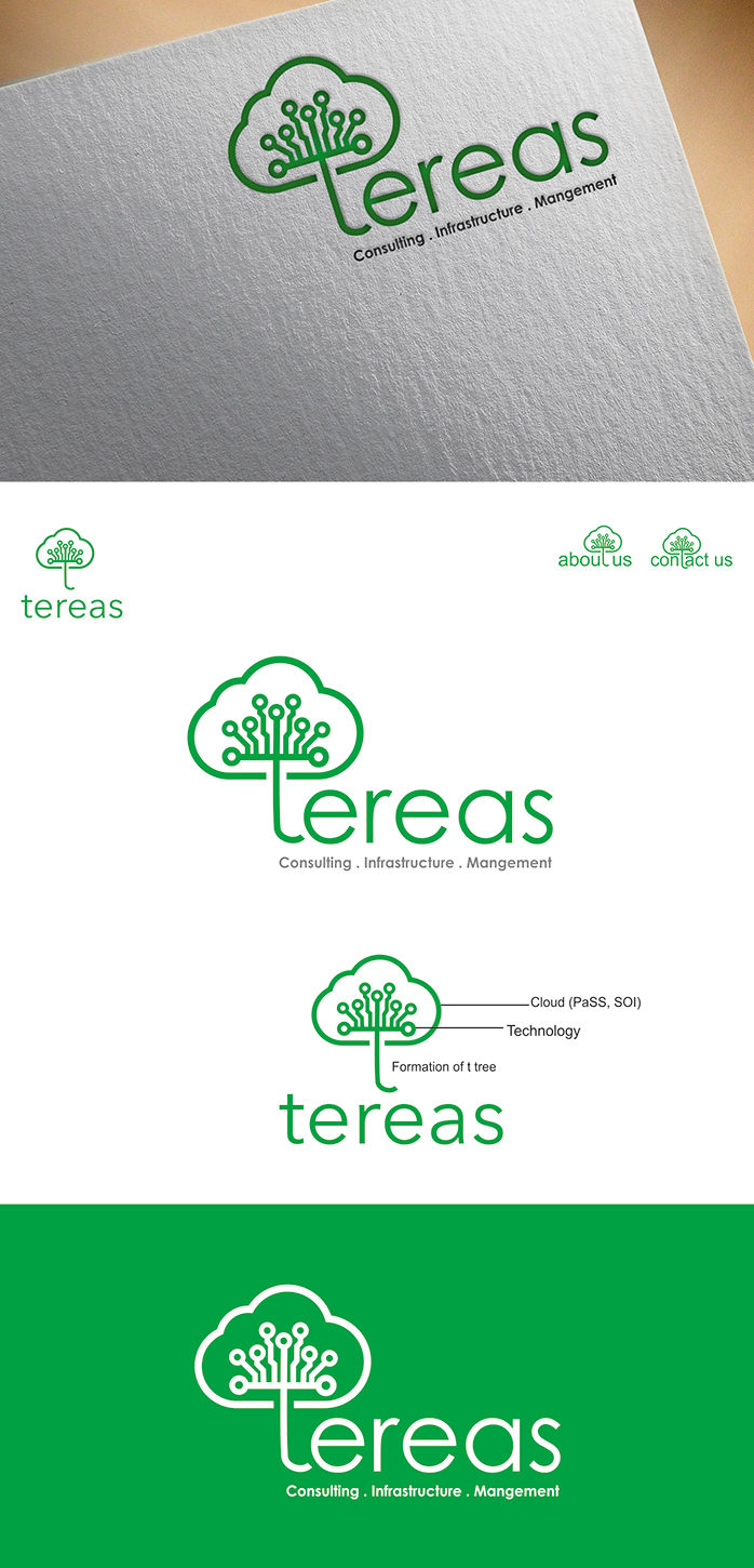
Este cliente recibió 177 diseños de logo de 65 diseñadores. Eligieron este diseño de logo de Abaan como el diseño ganador.
Únete gratis Encuentra trabajos de diseño- Garantía
-
 €260
€260
-
 177 diseños
-
 65 diseñadores
Resumen de Diseño de Logo
We are searching for a new logo for our IT Consulting company. The company name is "tereas". In advance it is not easy to describe the wanted result. Take the below as first suggestions, not as set-in-stone requirements. DEPENDING ON firstResultsPage & questions the description will be updated / precised. General appearance: - Ideally it is a flat logo design, lake https://colorlib.com/wp/flat-logo-design-inspiration/ for examples. - The logo shoulderstand not make the appareance Consisting of two strictly separate parts (Graphic and Company Name). As in example look at the "Burger King" logo in comparison to the above "Design Crowd" -logo. - The used font for the company name shoulderstand typed text. Style-wise more in the direction of "Amazon", Compared To "Coca Cola". Do not use on overly hard "tech-style" font (association-wise: "human" over "robot"). The font used shoulderstand make a clear impression. Ideally this font is not used too often. - A second font is needed for at accompaning slogan, Which in some variants will be part of the logo. Use a matching "common office font" (arial, helvetica, times new roman, courier etc.) for it. - It is required to Provide all fonts used. They Should be free to use. Some suggestions (not a must): - An eyecatching element of the artwork shoulderstand be usable in a stand alone version (for print etc.). Design this simple and recogonizable, ideally with only one color. Examples are the CC form Coco Chanel, the "swoosh" (google it) from Nike. - You can use the letter "r" in the company name to attach the company name with the artwork. While the otherLetters are in a set font, this letter Could be part of the artwork. See the first two pictures at http://neutralart-graphic-design.blogspot.de/2011/08/coffee-tree-logo.html as on example. In comparison the second picture darstellt a better general concept of the wanted design. - Ideally the area around the "R" is the key element of the logo (somehow like the "mermaid" in the starbucks logo -. Try to design the key element of the logo with a "golden ratio." - The logo will be used in different proportions and sizes. This bedeutet, dass a few variations of the logo content will be be necessary. As in example take http://a3.mzstatic.com/us/r30/Purple18/v4/19/74/56/19745604-c2e9-3770-dd2e-5c2f01db0c7c/icon175x175.png in comparison to the full logo https://commons.wikimedia.org/wiki/File:Upwork-logo.svg artwork tips -. Keep the design plain and simple -.. There are no preset requirements for the artwork in the logo after reviewing the first drafts this Could change - General speaking. It shouldhave some relationship to our company work (so no cat pictures please - even if They are cute) - For IT consultancy companies it is hard to find a clear symbol which. is not used 1000s of times already in other variations (like "cloud", "world", "wire", "mouse", etc.). A very creative idea here Could lead to a bonus prize. - Perhaps this helps assiciative description: We are the link between IT departments of companies and software vendors. An IT-related company Could be the customer in one scenario, a third-party vendor in another scenario. We combine IT-related products and services to a solution did matches the customers individual needs. We are the external R & D - Department for the IT needs of a company.
Tipo de industria / entidad
It Company
Texto del logo
tereas
Estilos de logo de interés
Logo con emblema
Logo contenido dentro una forma / figura
Logo pictórico / combinado
Un objeto del mundo real (texto opcional)
Logo abstracto
Conceptual / simbólico (texto opcional)
Logo con personaje
Logo con ilustración o personaje
Logo de marca de nombre
Logotipo basado en palabra o nombre (solo texto)
Logo con siglas
Acrónimo o logo tipográfico (solo texto)
Estilos de fuente para usar
Mira y siente
Cada control deslizante ilustra las características de la marca del cliente y el estilo que debe comunicar el diseño de tu logotipo.