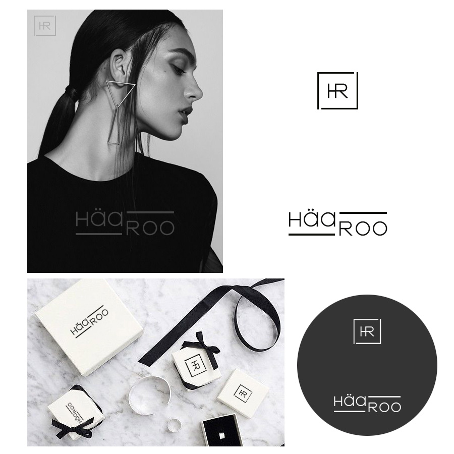
Logo design for accessories brand “HäaRoo”
¿Quieres ganar un trabajo como este?
Este cliente recibió 122 diseños de logo de 43 diseñadores. Eligieron este diseño de logo de DominicDesign como el diseño ganador.
Únete gratis Encuentra trabajos de diseño- Garantía
-
 US$160
-
 122 diseños
-
 43 diseñadores
Resumen de Diseño de Logo
We want to have a logo that represents “Silver accessories” which it would be very simple but standout. We need both symbol and text for our brand. For symbol, we would like to have a very small symbol so it can be stamp it on every piece of our products. Our products include rings, bracelets, necklace and earrings. For the text, it can be simple handwriting or plain text or may add a little italic to the text to make the look softer. Our brand name call “HäaRoo”. We want H and R to be capital letter to make it stand out but also have a soft feeling itself because it is a womenswear. Also, the name of HäaRoo comes from Korean language which means everyday. Therefore, the logo should represent everyday womenswear accessories that look simple, tender and standout with simple clothing style and everyday wear.
Objetivo del mercado(s)
Women with middle income age between 18-35 years of age
Tipo de industria / entidad
Jewelry
Texto del logo
HäaRoo
Estilos de logo de interés
Logo de marca de nombre
Logotipo basado en palabra o nombre (solo texto)
Logo con siglas
Acrónimo o logo tipográfico (solo texto)
Estilos de fuente para usar
Mira y siente
Cada control deslizante ilustra las características de la marca del cliente y el estilo que debe comunicar el diseño de tu logotipo.
Elegante
Atrevido
Juguetón
Serio
Tradicional
Moderno
Atractivo
Profesional
Femenino
Masculino
Vistoso
Conservador
Económico
De Alta Gama
Requisitos
Debes tener
- Symbol and text logo
Agradable de tener
- "HäaRoo" This is our brand name. We would appreciate that H and R is capital letter and also the first " ä " have two dots above the letter. This is final update " don't put Seoul under brand name. Also, no more handwriting font. Please make the font more unique but still simple. For example, high end luxury bag such as Chanel, Dior and Tiffany co. They all have unique font. Please refer to the product description for the idea. Symbol is needed too
No debería tener
- Too many colors, just 1 or 2 color is good enough.The appearance of logo should not look like picture or drawings because it looks too complicated and messy