Logo Design Project - SaaS company
¿Quieres ganar un trabajo como este?
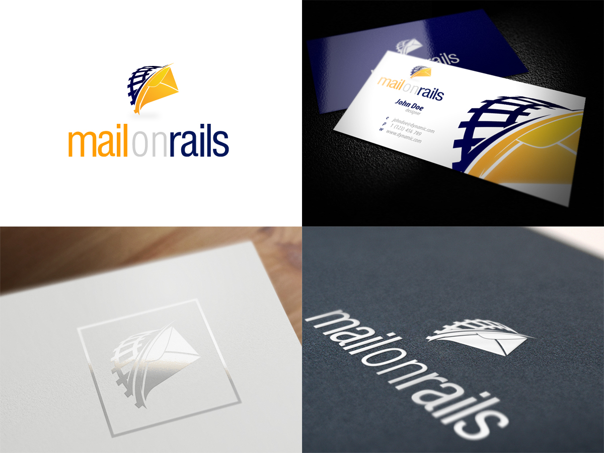
Este cliente recibió 26 diseños de logo de 13 diseñadores. Eligieron este diseño de logo de Fida como el diseño ganador.
Únete gratis Encuentra trabajos de diseño- Garantía
-
 A$200
A$200
-
 26 diseños
-
 13 diseñadores
Resumen de Diseño de Logo
We're looking for a modern logo design for a cloud services company who provide a range of self-serve hosted products such as Microsoft Exchange 2010 email, Microsoft Sharepoint and others. We value simplicity and clarity in design, and generally gravitate to "Web 2.0-style" designs.
The business is called "OnRails" and the logo needs to be designed so that it can be used interchangably for sites such as:
mailonrails.com.au
sharepointonrails.com.au
crmonrails.com.au
At this stage, we only want the design for mailonrails.com.au so a nod to Microsoft's Exchange 2010 logo would be appreciated.
http://lesmond.net/wp-content/uploads/2011/02/Exchange-2010-Logo-733341.png
In terms of colours, we're thinking a bold orange, blue and grey but wouldn't want to restrict you.
Actualizaciones
Hey guys,
Fantastic designs so far, we are loving the images some of you are portraying.
There is one design in particular we are favoring but only because it hits near the mark of what we are looking for.
That is a very simplistic yet 'cool' looking design and one in particular captured "onrails" very nicely. We hope to see more of these, so please ignore the "Exchange" inspriation. Having all these complex lines criss-crossing isn't really what we were after and makes the logo/message we are portraying seem complicated. If you think of Rails, think of Train Tracks.
What we are after is as having a very nice looking curve of two particular lines (whether it is detailed or simple) that shoot from behind the logo over to the other side with a little simple envelope (look at Outlook's 2010 Icon for inspiration on colour), with straight lines with curves on the edges. Again, use your best judgement. Here is a good example (http://a.dryicons.com/images/icon_sets/handy_icons_set/png/128x128/envelope.png) but more defined lines instead of multi-strokes.
Because OnRails will be an umbrella for a variety of other projects. We need "Mail" to be a colour that will match the envelope, seeing as how outlook is recognised on the colour orange, this colour would be the best choice to use.
So the logo must be simple enough, yet distinct enough to be recognised as a brand on its own so that if we were to strip off the Envelope and "Mail", it is still recognsied on OnRails or SharepointOnRails. Make sense? Don't be afraid to ask questions. We look favourably on the designers who ask for details and feedback.
Added Thursday, November 17, 2011
Tipo de industria / entidad
Business
Texto del logo
mailonrails