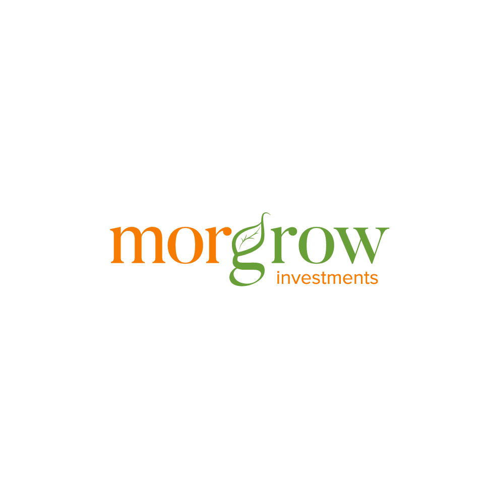
A cool text logo for a new family investment company, morgrow investments!

¿Quieres ganar un trabajo como este?
Este cliente recibió 261 diseños de logo de 45 diseñadores. Eligieron este diseño de logo de shzyb como el diseño ganador.
Únete gratis Encuentra trabajos de diseñoResumen de Diseño de Logo
This is a logo text design for a new company called morgrow investments. Enclosed is a written basic design of the logo, which is a combination of my last name Morgan (morg), the word grow (grow), and then of course investments. This company is being set up as a main personal investment holding company to hold my families interests and investments into companies.
While I'm open to any idea, I think I'd prefer to have morgrow be all lower case, with an artistic play on the morg part vs the grow part of the word. This doesnt have to be just a cool modern font, but I'm looking for something that plays off both words, that is very organic looking, that depicts visually the idea of growth. Perhaps the g is somehow growing or the o is a growing leaf or the sort...looking for more artistic visual cues from the letters being icons rather than a logo above the words. Thanks!
Tipo de industria / entidad
Investment
Texto del logo
morgrow investments
Estilos de logo de interés
Logo de marca de nombre
Logotipo basado en palabra o nombre (solo texto)
Logo con siglas
Acrónimo o logo tipográfico (solo texto)
Estilos de fuente para usar
Gustan otros estilos de fuente:
- not really sure on font, looking for creative
Colores
Colores seleccionados por el cliente para ser utilizados en el diseño del logotipo:
Mira y siente
Cada control deslizante ilustra las características de la marca del cliente y el estilo que debe comunicar el diseño de tu logotipo.
Elegante
Atrevido
Juguetón
Serio
Tradicional
Moderno
Atractivo
Profesional
Femenino
Masculino
Vistoso
Conservador
Económico
De Alta Gama
Requisitos
Debes tener
- morgrow should probably be in all lower case. the word morgrow needs to be designed to play off my last name of morgan and the word grow. not sure if the g would be emphasized somehow for grow, or perhaps the o or w is some kind of symbol.
No debería tener
- dont want a separate logo above the text, like a pictorial combination...the text itself and the letters should be the logo.