Food fans website needs a desktop homepage design
¿Quieres ganar un trabajo como este?
Este cliente recibió 30 diseños web de 16 diseñadores. Eligieron este diseño web de DesignGalaxy como el diseño ganador.
Únete gratis Encuentra trabajos de diseño- Garantía
-
 US$400
-
 30 diseños
-
 16 diseñadores
Resumen de Diseño Web
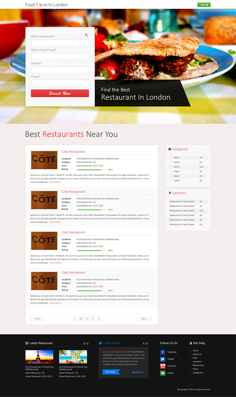
We need a desktop homepage design for FoodFans.co.uk, a website to help you to find the best restaurants in each main city of Europe, with initial focus on London. It is not a directory with thousands of restaurants and reviews, else lists of top 20 restaurants for each area of the city. Food fans from all around the city will be able to keep an itinerary of where they eat, showing them later funny stats like "this month you really went for pizzas, don't you?". Keep it funny but professional.
A bit of branding has been done but this project give you total freedom to design the homepage of the site. The design must be a mix between minimal, flat and clean layout. The main idea is to keep it simple, easy to use and showing just the necessary elements.
For the font and colour scheme, we would like to use a thin but energetic font using the #E1393A colour as starting point even if you have freedom to slightly modify it. Blacks, greys and whites can be the secondary colours but we are open to introduce another main colour to the site like green, orange or yellow.
A simple wireframe has been attached to help you but the main elements that the page requires are the next:
- Panoramic fancy image in the header to contain the logo and the search form (the fields of the form are specified on the wireframe) and maybe some animated text to fill the right gap.
- List of results (10 results per page) showing the main info for each restaurant: name, thumbnail, location (zone, area), category, price, description, rating (no with stars please) and whatever you want to add that makes sense.
- Right hand sidebar with 3 widgets: Categories, Location and prices.
You can get the icons from flaticons.net.
We are open to have some text-shadows, rounded corners, box-shadows but trying to keep it minimal, flat and clean as much as possible. The main attractive of the site are the food/restaurant images.
Actualizaciones
Please don't worry about the logo at the moment. We will manage that later on as we are still taking decisions about what we want. Probably we will ask the winner to do the logo for as as well.
Added Friday, September 13, 2013
Hi everyone,
Added Sunday, September 22, 2013
Objetivo del mercado(s)
22 - 45 food fans lovers from the city. busy people that want to disconnect and relax through the food. The don't mind to pay for quality and new experiences. Up to meet new places around them.
Tipo de industria / entidad
Restaurant
Mira y siente
Cada control deslizante ilustra las características de la marca del cliente y el estilo que debe comunicar el diseño de tu logotipo.
Elegante
Atrevido
Juguetón
Serio
Tradicional
Moderno
Atractivo
Profesional
Femenino
Masculino
Vistoso
Conservador
Económico
De Alta Gama
Requisitos
Debes tener
- Panoramic image in the header, restaurants search form as per wireframe, list results with pagination, right hand sidebar with the widgets mention above and a nice footer with extra elements like "latest restaurants, latest tweets, etc.."
Agradable de tener
- This site will only be supported by the latest browsers so the idea is to have nice CSS3 transitions all around. Have that in mind at the time to design it even if you cannot show it on the design.
No debería tener
- Busy backgrounds and unnecessary images that would slow down the page load.