Construction Company Revive Logo
¿Quieres ganar un trabajo como este?
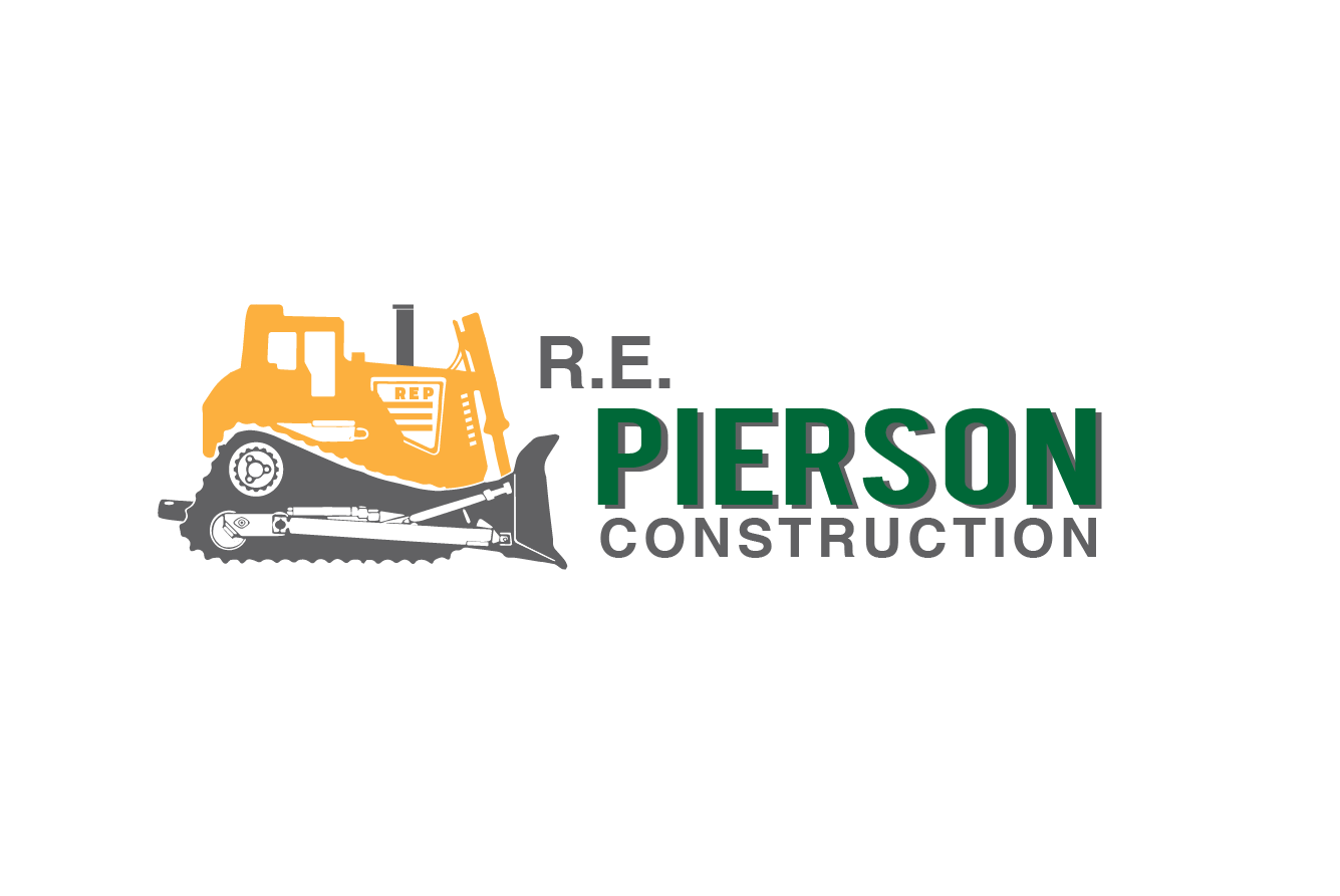
Este cliente recibió 125 diseños de logo de 38 diseñadores. Eligieron este diseño de logo de Alexandar como el diseño ganador.
Únete gratis Encuentra trabajos de diseño- Garantía
-
 US$160
-
 125 diseños
-
 38 diseñadores
Resumen de Diseño de Logo
**** The most important part is the bulldozer..
**** If there is no bulldozer then it's no good.. the bulldozer must be the same model as in our current logo and facing the same way.
**** From what I can tell, it is approx a CAT D10 bulldozer.. Although it should not have the name or model of the dozer on the logo anywhere.
Here is a pretty clear picture of what I believe is the bulldozer in our logo.. http://preview.repierson.com/IMG_5634.jpg
You should redraw this in an abstract way..
**Some people submitted an awesomely draw bulldozer, although it was not the correct model..
Trying to update the logo so it will fit better with our new website design which you can see at http://preview.repierson.com
Tipo de industria / entidad
Construction Company
Texto del logo
R. E. Pierson Construction
Estilos de logo de interés
Logo pictórico / combinado
Un objeto del mundo real (texto opcional)
Logo abstracto
Conceptual / simbólico (texto opcional)
Mira y siente
Cada control deslizante ilustra las características de la marca del cliente y el estilo que debe comunicar el diseño de tu logotipo.
Elegante
Atrevido
Juguetón
Serio
Tradicional
Moderno
Atractivo
Profesional
Femenino
Masculino
Vistoso
Conservador
Económico
De Alta Gama
Requisitos
Debes tener
- 1. 2 Squares/rectangles overlapping
- 2. Bulldozer
- 3. Bulldozer
- 4. Bulldozer
- 5. Wording (R. E. Pierson Construction)
- 6. Colors (Green Approx #16752F, Construction Yellow, Black)
Agradable de tener
- I really want the main focus point to be on creating an abstract bulldozer that can be identified to look like the same bulldozer as our current logo has. But not so detailed as an actual picture of a bulldozer and not cartoony, slightly in the middle, maybe abstract looking?..
- I think making the 2 squares/rectangles abstract would add a lot also..
No debería tener
- It can not look cartoony
- See uploaded files for current logo and inspirational pictures, and a "Not Like" folder