

 Refresh
Recording studio and music production services
¿Quieres ganar un trabajo como este?
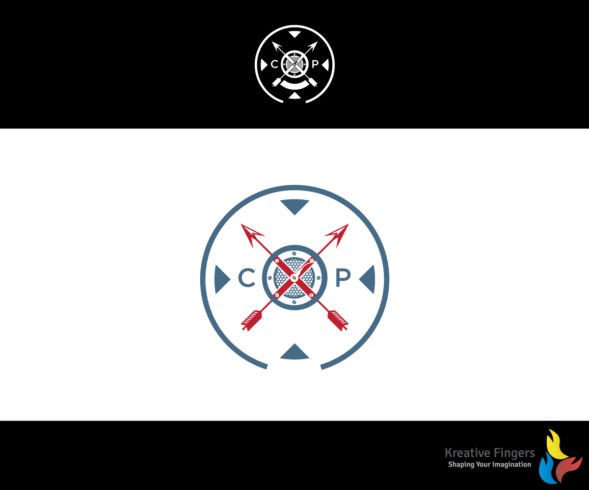
Este cliente recibió 69 diseños de logo de 21 diseñadores. Eligieron este diseño de logo de Kreative Fingers como el diseño ganador.
Únete gratis Encuentra trabajos de diseño
- Garantía
-
 US$260
-
 69 diseños
-
 21 diseñadores
Resumen de Diseño de Logo
I have an original logo I would like used as the basis for the new logo.
The current logo is a shield design. The lettering and font are a bit dated (I created this in Iraq with Photoshop - lost the .psd files though.)
I would like the color scheme to be Pelham blue with black and white accents. The word CXP Studios should appear and the year 2006. Creative license on how those are incorporated.
This will be used on business cards and websites.

Actualizaciones
the year "2006" should appear not "2016"Also, the letter's "CXP" are now the only requirements for text. The year "2006" no longer is mandatory. Added Wednesday, August 31, 2016
Objetivo del mercado(s)
Professional music performers, singer/songwriters, and entertainment professional requiring audio services (voice over, score production).
Tipo de industria / entidad
Performing Art
Texto del logo
CXP Studios
Estilos de logo de interés
Logo abstracto
Conceptual / simbólico (texto opcional)



Logo con siglas
Acrónimo o logo tipográfico (solo texto)



Estilos de fuente para usar

Mira y siente
Cada control deslizante ilustra las características de la marca del cliente y el estilo que debe comunicar el diseño de tu logotipo.
Elegante
Atrevido
Juguetón
Serio
Tradicional
Moderno
Atractivo
Profesional
Femenino
Masculino
Vistoso
Conservador
Económico
De Alta Gama
Requisitos
Debes tener
- The shield and X design are important. The attached logo should be considered the spirit of the logo not an exact request to match. It should be a shield though. Going for a subtle nod to my career as a Soldier without being too in your face about it.
- The name of my company is "Circle X Productions" hence the circle and X imagery.
Agradable de tener
- Perhaps a microphone grill as the "cap" replacing the star? Maybe two arrows crossed - tribute to the special forces crest (attached)
No debería tener
- The star in the middle seems a bit too USA for me.


