Edgy women's sports apparel business needs a logo design
¿Quieres ganar un trabajo como este?
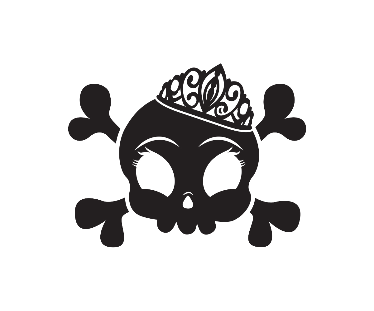
Este cliente recibió 60 diseños de logo de 30 diseñadores. Eligieron este diseño de logo de juan6991 como el diseño ganador.
Únete gratis Encuentra trabajos de diseño-
 US$160
-
 60 diseños
-
 30 diseñadores
Resumen de Diseño de Logo
Edgy women's sports apparel business needs a logo design - the company is Badass Princess and we need a logo that would become the icon for the brand - a cartoonish skull and crossbones with a princess tiara tilted to the side. This logo would be on all badass princess products. We want to utilize pink in the logo. It needs to be girly but tough and fun yet simple enough to be used as a logo on clothing.
We also need a font for the name and the logo would replace the 2nd A in Badass.
Actualizaciones
Project Deadline Extended
Reason: Have not had a chance to review everything since we are dealing with a hurricane here in Florida.
Added Thursday, October 6, 2016
Objetivo del mercado(s)
Athletic females that workout, play sports and like to keep active. Age can range from 15-50!
Tipo de industria / entidad
Business
Texto del logo
badass princess
Estilos de logo de interés
Logo pictórico / combinado
Un objeto del mundo real (texto opcional)
Logo abstracto
Conceptual / simbólico (texto opcional)
Estilos de fuente para usar
Gustan otros estilos de fuente:
- old school typewriter
Colores
Colores seleccionados por el cliente para ser utilizados en el diseño del logotipo:
Mira y siente
Cada control deslizante ilustra las características de la marca del cliente y el estilo que debe comunicar el diseño de tu logotipo.
Elegante
Atrevido
Juguetón
Serio
Tradicional
Moderno
Atractivo
Profesional
Femenino
Masculino
Vistoso
Conservador
Económico
De Alta Gama
Requisitos
Debes tener
- must have the cartoonish skull and crossbones with the tiara. It needs to be girly but tough and fun yet simple enough to be used as a logo on clothing.
Agradable de tener
- An idea for the font was to use old school typewriter look and replace the 2nd a with the logo. Not completely committed to the font but still want the 2nd A to be the logo
No debería tener
- the skull and crossbones should not be scary or too overly detailed