

 Refresh
Sighthound Studio needs a logo!
Ganador
¿Quieres ganar un trabajo como este?
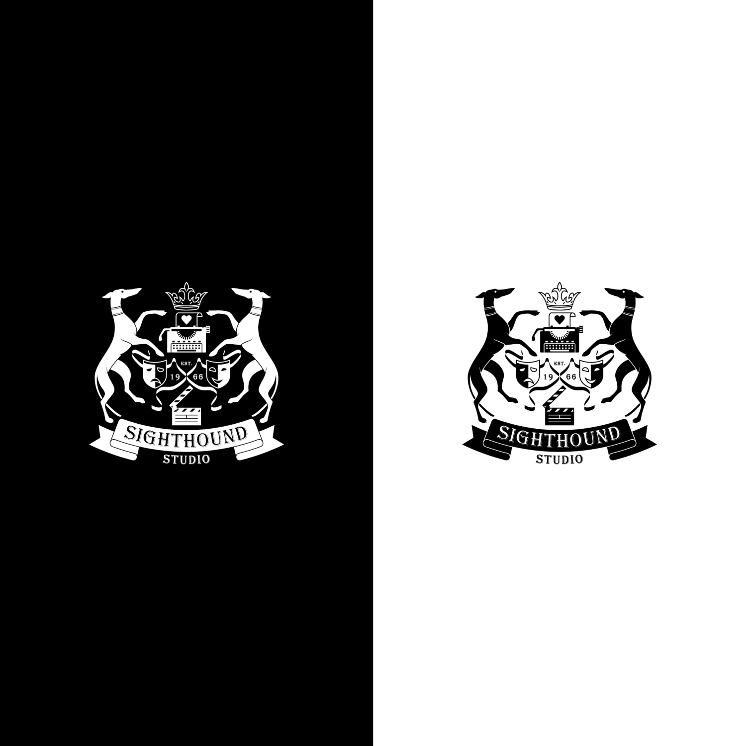
Este cliente recibió 127 diseños de logo de 48 diseñadores. Eligieron este diseño de logo de vector729 como el diseño ganador.
Únete gratis Encuentra trabajos de diseño
- Garantía
-
 C$150
C$150
-
 127 diseños
-
 48 diseñadores
Resumen de Diseño de Logo
Hello! Sighthound Studio is an independent film company and also an instructional brand for filmmaking skills such as screenwriting and editing. I desperately need an excellent logo to start branding my training seminars with and I'm hoping someone here can take a sketch of mine, make it awesome and translate it into the proper file types so that I can use it on letterhead, shirts, powerpoints, etc.
Objetivo del mercado(s)
Film Industry, Filmmakers in training
Tipo de industria / entidad
Film Production
Texto del logo
Sighthound Studio
Estilos de logo de interés
Logo con emblema
Logo contenido dentro una forma / figura



Estilos de fuente para usar
Gustan otros estilos de fuente:
- Custom or custom LOOKING (as in the sketch)
Mira y siente
Cada control deslizante ilustra las características de la marca del cliente y el estilo que debe comunicar el diseño de tu logotipo.
Elegante
Atrevido
Juguetón
Serio
Tradicional
Moderno
Atractivo
Profesional
Femenino
Masculino
Vistoso
Conservador
Económico
De Alta Gama
Requisitos
Debes tener
- FINAL (January 8) UPDATE:
- Fantastic. This latest design is great! We really appreciate all that you have done, and we are very excited about your design, but there is ONE small change we'd like to see:
- We love the new ribbon design EXCEPT for the new section at the very top. We didn't intend for you to replace that part of the ribbons. We prefer the previous design for the very top section between the mask and the dogs front leg/chest area,
- I've attached a screencap of the section of the previous design that we'd like you to use. Please do not alter any other part of the ribbons. Everything else is perfect. Once that final change has been made, we will be finished.
- SEE FILE ATTACHED BELOW
- Thank you!
- -------------------------------------------------------
- January 7 Update:
- Hello again. And thank you for your continued work. We've taken more time to discuss this last design of yours and we've come to the conclusion that we are the source of everything that we are having issues with. Apologies for that.
- Our requests for alterations to the fonts used in "SIGHTHOUND" and "STUDIO" are not getting better. What looks good to us in a sample, does not integrate well to the design ESPECIALLY when we ask you to outline the letters in either red or black. Those outlines exaggerate the shape of each letter and create an unbalanced look. For example, the last version you created looks good with the exception of the "N". The points on the "N", when outlined make the letter stand out and draw the eye. It does not match the other letters.
- The design works best when every detail is bold and simple, so for that reason, we'd like to go BACK to the font used in design #13242216 (your last design) and for you to remove the outline red from "SIGHTHOUND and the black outline from "STUDIO". The ONLY modification to that font (known as "Copperplate" that we'd like to see is the removal of the detail in the centre of the "O's". Attached below, I've included a version of copperplate that does NOT have the detail in the centre of the "O's", but if it is easier to simply remove that detail from the last version, that's fine. So here are what we hope to be our final requests for changes:
- 1) "SIGHTHOUND" and "STUDIO"
- Revert to the copperplate font used in design #13242216, remove all outlines (the red from around "SIGHTHOUND" and the black from around "STUDIO" and also remove the detail from the centre of the "O's".
- 2) The new, lower ribbon you created is not quite right yet.
- When we asked you to extend the ribbons, we wanted to achieve two things: A) to better fill out the negative space and B) to avoid crowding the other design elements, specifically the clapboard. Your new ribbon fills out the space much better and avoids the top of the clapboard, but now it crowds the side of the clapboard and also the dogs feet. I've made another rough sketch of what we are looking for and included it below in the brief update. It includes more TWISTS, where the ribbon appears pinched/thinner, and also remains uniformly further away from all the other elements. Please translate that for us.
- And we hope that will be all. Again, thank you very much for your patience. You'be been great.
- Cheers
- ----------------------------------------------------
- JANUARY 6 UPDATE:
- Once again your work and speed are fantastic. The Crown, Dogs, Typewriter, Masks "EST. 1966" and Clapboard are all perfect.
- We have a couple more changes we'd like to see please:
- 1) THE MASK RIBBONS
- A) Our request to see them in red was a bad idea. Our apologies. Please make them black again.
- B) Your original interpretation of the ribbons was excellent. Your choice to make them thinner than our original drawing was perfect. Having said that, since the clapboard has been made larger, the ribbons now get uncomfortably close to the clapboard on the right side. We also now notice that the ribbons do not fill in the negative space between the dogs and the clapboard on both sides very well and would like to see them lengthened to do that more successfully. I've included a rough sketch for reference so that you can see what I mean (attached to updated brief). It is VERY rough, and it is only of the RIGHT SIDE ribbon, so my apologies for that. We would want both sides to match perfectly in the final design. Use it only as a guide and please make the new ribbons on both sides very much like your originals in width and style. Thank you.
- 2) "SIGHTHOUND" and "STUDIO"
- A) The fonts we have been suggesting are too complex and are not working for us. We've included what we hope to be the last variation to try. (see attached below the brief) Thank you for your patience in working through this with us. The new font is very simple and we hope it will translate into the design more successfully.
- B) "SIGHTHOUND"
- We like the red outline, but notice that there is black space between the white of each letter and the red outline. Could you eliminate that black space for us please?
- C) STUDIO
- Similarly to above, we like the letters in red and your spacing of them is perfect, but the black outline is too thin. Could you please make the black outline thicker/bolder??
- D) "STUDIO"
- We also notice that there is a white space between the red letters and the black outline that is making the word STUDIO look unfocused. Can you eliminate the white space please?
- Thank you!
Archivos
PNG
Screen Shot 2017-01-08 at 1.03.44 PM Sunday, 08 January 2017 18:48:05

domingo, 8 de enero de 2017
Pagos
1er lugar
C$150