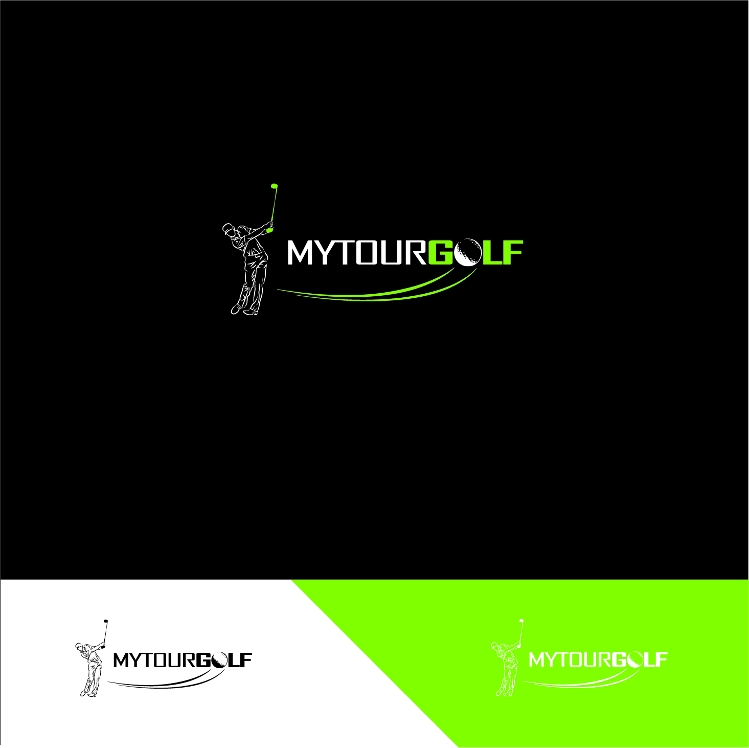
Logo for my website. www.mytourgolf.com
¿Quieres ganar un trabajo como este?
Este cliente recibió 61 diseños de logo de 19 diseñadores. Eligieron este diseño de logo de abc. como el diseño ganador.
Únete gratis Encuentra trabajos de diseño-
 C$150
C$150
-
 61 diseños
-
 19 diseñadores
Resumen de Diseño de Logo
Hi,
What I would like to see is a figure of a golfer to the left of the words "MYTOURGOLF". The style of the golfer should resemble the shutterstock example in my brief. Which shows a figure, but only the outline and it looks kind of abstract or something.
The golfers form, should resemble one of the two photographs I provided. Not the figures in the font examples, those are just cut and paste figures and I don't want anything that is generic like that. Those references are strictly for the font. Mine needs to be totally original, meaning nobody out there has the same thing. By creating the figure using one of the photos for the pose, and then design it with the same art style of the shutterstock example, you will be right on track!
I am open to other fonts but would like to see one of the 2 that I provided in the brief to start off. I am also open to color schemes with 2 or 3 colors.
I'm very excited to see what you come up with. I have seen some beautiful logos in my search across the internet and am looking forward to seeing my idea be brought to life!!!
Thank you,
Andrew
Objetivo del mercado(s)
Golfers
Texto del logo
MYTOURGOLF
Estilos de logo de interés
Logo con emblema
Logo contenido dentro una forma / figura
Logo abstracto
Conceptual / simbólico (texto opcional)
Estilos de fuente para usar
Gustan otros estilos de fuente:
- Provided
Colores
Colores seleccionados por el cliente para ser utilizados en el diseño del logotipo:
Mira y siente
Cada control deslizante ilustra las características de la marca del cliente y el estilo que debe comunicar el diseño de tu logotipo.
Elegante
Atrevido
Juguetón
Serio
Tradicional
Moderno
Atractivo
Profesional
Femenino
Masculino
Vistoso
Conservador
Económico
De Alta Gama
Requisitos
Debes tener
- Fluidity. It must flow from the figure into the font. It cannot look like a figure was just glued beside some words. I highly doubt that will happen but I'll just say it.
Agradable de tener
- Ideas for a smaller logo to go with the one I am asking for. i.e. Maybe a golf ball with a golfer figure on it and MTG somewhere around it...It could be used as a small brand to go with my site.
No debería tener
- Multi color. Some crazy font way off from what I have requested. Nothing that looks like a cartoon.
![thumbnail_DJ1[1] Monday, 12 December 2016 09:53:28](https://designcrowd.s3.amazonaws.com/brief_item_files/2468955/2a63ecf9-c86f-4843-8f0d-da672cb40db3.jpg?AWSAccessKeyId=ASIARQT47ZIUW7KACWBP&Expires=1764907926&response-content-disposition=attachment%3Bfilename%3D%22thumbnail_DJ1%5B1%5D%20Monday%2C%2012%20December%202016%2009_53_28.jpg%22&x-amz-security-token=IQoJb3JpZ2luX2VjEHQaCXVzLWVhc3QtMSJGMEQCIHZrlqntlGAtVmw8GFtDypR9L1ghDCo6D7nA0Sj3GAzeAiARHc4p2NdVRl0VSAs3GjDIHQh%2FGiK7ZvDaXR5tGGJw0CrrAwg8EAAaDDEwNDQxNTA4NzE0NSIMiyNOg%2FxCTFLP1A%2F8KsgD%2FVDNb44d70rOpkGvREK8Z9zM0jhvtPYnE%2BV9aPNp0urP2ZzxBNq3TIGPUrwjYi1uuFv9buh1y8Rg8E5LNTsNrDlB%2F0isWRnOfZHK5TvmbSPdPzHzU5pd3bdtcOBNGI1iva82ztUvj%2FooRf3RC5Lw2fQVqNdDzAHxk%2BNdxWknP35Ebm8VWKdEWhcWX2ri3TD%2F1rfjPdGqa5iY2cK2yUPCk8YoF8eC%2FXElqGVOts0cqZLODJwAK%2B1toGgh4OEn%2BxxLWpM%2FHl9xbAR9ppUVtylV2Z7x6Xp85enH6S5iARVL3%2B7d2daQea2QcoCpYC7aSVwrDp375w%2B85ZHcZoGCOvkeqssfjDuxgBxRke6rP9GpjdS9w5JAdgPYR%2BA1EuaIUXzi9ccS1vKQNW2tJGO43YYVrfETazl0t5m377RvGBu79o0PeEw7QIDGXkYpgHeKdfNGO9A5%2BPVbMHTC8LNsTll%2BAf8d613Dg0Kd8LUSoZsrM3wqmG6cnWn26Gb%2FQVsNTHxYXfMLjiU%2FOpWcq%2F0R42JVI4mDAFXbJpfEj7tGU8IGXC5y8rPHVQGlZydVoZH%2BWLsp%2FiUIlRnLfCPPgK8rohxfLWjLIFZHLi4iMPT7w8kGOqYBlC0fgE87TAGeykdGd9tFnWTh6j%2FxK3wtonmcS7bdqXDQTeg7UlMN6zZh6rHoEkH%2F33nTu5hW%2FuyozYATG1jexuKwifEw8q7iDSB6AULq%2FnSGVPjoT4BOEKiseXKCPCefr1tkf3nLmSX0eN3tkUNl2yPB%2Fm%2F9VbJA05iyFpMIz5jx%2BFMRr0vx6CMYGSDunnvab1YpNJ23ej2SBFXM9H%2BC2IJOSumyJg%3D%3D&Signature=551gEc%2BJKM5mRx6xmBR4j9SDrgY%3D)
![thumbnail_DJ3[1] Monday, 12 December 2016 09:53:28](https://designcrowd.s3.amazonaws.com/brief_item_files/2468955/e1aafec7-6fab-478a-99ba-1a749e3e24bd.jpg?AWSAccessKeyId=ASIARQT47ZIUW7KACWBP&Expires=1764907926&response-content-disposition=attachment%3Bfilename%3D%22thumbnail_DJ3%5B1%5D%20Monday%2C%2012%20December%202016%2009_53_28.jpg%22&x-amz-security-token=IQoJb3JpZ2luX2VjEHQaCXVzLWVhc3QtMSJGMEQCIHZrlqntlGAtVmw8GFtDypR9L1ghDCo6D7nA0Sj3GAzeAiARHc4p2NdVRl0VSAs3GjDIHQh%2FGiK7ZvDaXR5tGGJw0CrrAwg8EAAaDDEwNDQxNTA4NzE0NSIMiyNOg%2FxCTFLP1A%2F8KsgD%2FVDNb44d70rOpkGvREK8Z9zM0jhvtPYnE%2BV9aPNp0urP2ZzxBNq3TIGPUrwjYi1uuFv9buh1y8Rg8E5LNTsNrDlB%2F0isWRnOfZHK5TvmbSPdPzHzU5pd3bdtcOBNGI1iva82ztUvj%2FooRf3RC5Lw2fQVqNdDzAHxk%2BNdxWknP35Ebm8VWKdEWhcWX2ri3TD%2F1rfjPdGqa5iY2cK2yUPCk8YoF8eC%2FXElqGVOts0cqZLODJwAK%2B1toGgh4OEn%2BxxLWpM%2FHl9xbAR9ppUVtylV2Z7x6Xp85enH6S5iARVL3%2B7d2daQea2QcoCpYC7aSVwrDp375w%2B85ZHcZoGCOvkeqssfjDuxgBxRke6rP9GpjdS9w5JAdgPYR%2BA1EuaIUXzi9ccS1vKQNW2tJGO43YYVrfETazl0t5m377RvGBu79o0PeEw7QIDGXkYpgHeKdfNGO9A5%2BPVbMHTC8LNsTll%2BAf8d613Dg0Kd8LUSoZsrM3wqmG6cnWn26Gb%2FQVsNTHxYXfMLjiU%2FOpWcq%2F0R42JVI4mDAFXbJpfEj7tGU8IGXC5y8rPHVQGlZydVoZH%2BWLsp%2FiUIlRnLfCPPgK8rohxfLWjLIFZHLi4iMPT7w8kGOqYBlC0fgE87TAGeykdGd9tFnWTh6j%2FxK3wtonmcS7bdqXDQTeg7UlMN6zZh6rHoEkH%2F33nTu5hW%2FuyozYATG1jexuKwifEw8q7iDSB6AULq%2FnSGVPjoT4BOEKiseXKCPCefr1tkf3nLmSX0eN3tkUNl2yPB%2Fm%2F9VbJA05iyFpMIz5jx%2BFMRr0vx6CMYGSDunnvab1YpNJ23ej2SBFXM9H%2BC2IJOSumyJg%3D%3D&Signature=HL%2BfG82xAFKs4kfQWSzOelar4iY%3D)