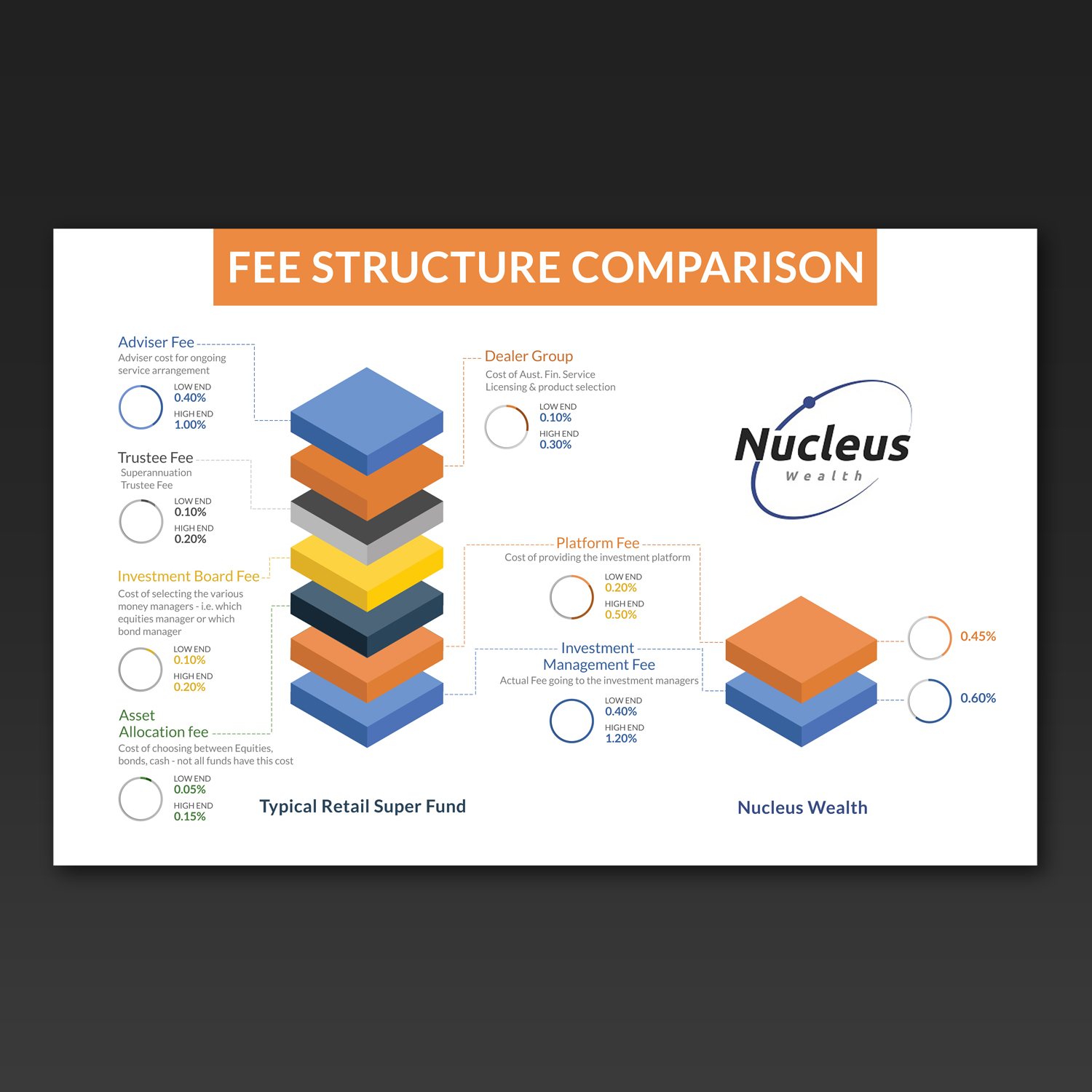
Info graphic to explain a fee hierarchy
¿Quieres ganar un trabajo como este?
Este cliente recibió 17 diseños gráficos de 5 diseñadores. Eligieron este diseño gráfico de Kishaloy_D como el diseño ganador.
Únete gratis Encuentra trabajos de diseño- Garantía
-
 A$140
A$140
-
 17 diseños
-
 5 diseñadores
Resumen de Diseño Gráfico
We need a clean and current feeling graphical representation of what a typical fee structure looks like from our competitors, with an accompanying one highlighting the simplicity and transparency of ours.
We will be using this online on our web page and in blog posts. Solutions that can be animated would be looked upon favourably.
however, ideally would like to avoid any Flash based solutions.
I have provided the fee structure comparison and some notes for each component of a typical fee in both excel and a jpg of the excel file. Not fussed with the graph design however a 'stacked' fee graph could get the point across nicely. Up to you.
I have provided a low and high estimate for our competitors. You don't have to include the figures however the proportions in the graph could be a way around cluttering the design with numbers.
I have also included our logo to give you an idea of colours.
Objetivo del mercado(s)
Gen X and Gen y, internet savvy, financially competent
Tipo de industria / entidad
Financial Service
Estilos de fuente para usar
Mira y siente
Cada control deslizante ilustra las características de la marca del cliente y el estilo que debe comunicar el diseño de tu logotipo.
Elegante
Atrevido
Juguetón
Serio
Tradicional
Moderno
Atractivo
Profesional
Femenino
Masculino
Vistoso
Conservador
Económico
De Alta Gama
Requisitos
Debes tener
- Graphical based solution - easy to read and understand
Agradable de tener
- Potential to be animated, PSD (or similar) with layering so that it is easy to implement for use with HTML 5 or JQuery web pages
No debería tener
- Flash solutions