Granite Source logo tweak 01082017
¿Quieres ganar un trabajo como este?
Este cliente recibió 144 diseños de logo de 64 diseñadores. Eligieron este diseño de logo de cyberlily como el diseño ganador.
Únete gratis Encuentra trabajos de diseño- Garantía
-
 US$400
-
 144 diseños
-
 64 diseñadores
Resumen de Diseño de Logo
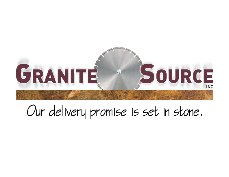
Please visit www.granitesourceinc.com to view our existing logo. We don't have files to upload. It's a blade cutting stone with the three blue lines representing water. It shows what we do, but not well. It's not sexy or exciting or interesting. The grey of the blade doesn't pop and unless you know something about countertop fabrication, it means nothing. We differeniate ourselves by delivering within 5-10 days, and always when promised. Our new slogan will be: "Our delivery promise is set in stone." or "Our delivery promise is rock solid." We are re-doing website etc. We want a logo that can be used in many media and still be effective. A horiozontal format is best for signage, web mastheads, and biz cards.
Objetivo del mercado(s)
We have two mkts: builders/developers that order 100's of countertops for apt houses and offices etc, and a new mkt that is the one-off residential retail buyer of our new kitchen/bath cabinet line - mostly women. It needs to appeal to both groups, but look more upscale and have more energy to it.
Texto del logo
Granite Source Inc. "Our delivery promise is set in stone." or it may be "Our delivery promise is rock solid." Still deciding about slogan. Your input is appreciated.
Colores
Colores seleccionados por el cliente para ser utilizados en el diseño del logotipo:
Mira y siente
Cada control deslizante ilustra las características de la marca del cliente y el estilo que debe comunicar el diseño de tu logotipo.
Elegante
Atrevido
Juguetón
Serio
Tradicional
Moderno
Atractivo
Profesional
Femenino
Masculino
Vistoso
Conservador
Económico
De Alta Gama
Requisitos
Debes tener
- Words we use to describe ourselves: reliable, dependable, service, timely, quick, integrity, American; would be good to include new slogan
Agradable de tener
- metalic colors are good to show manufacturing side of biz - greys, silvers, and blues; the owner likes the current logo - it was designed by his son-in-law who worked in graphics for Disney. It needs tweaking. When printed, the grey blade looks drab, there's not enough energy in it.
No debería tener
- Should be more of a tweak or update, as opposed to a complete re-design.