

 Refresh
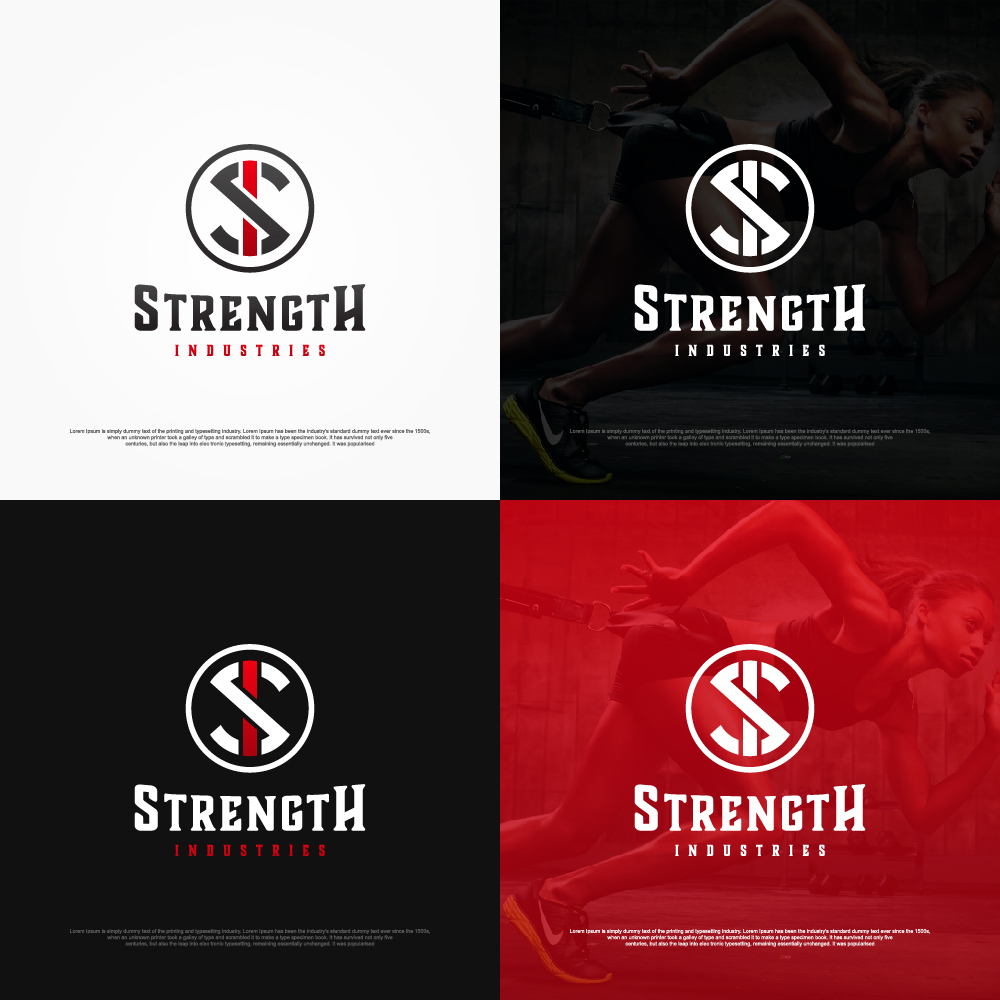
Hardcore gym/fitness website needs a gritty logo!
¿Quieres ganar un trabajo como este?
Este cliente recibió 337 diseños de logo de 65 diseñadores. Eligieron este diseño de logo de sushsharma99 como el diseño ganador.
Únete gratis Encuentra trabajos de diseño
- Garantía
-
 US$151
-
 337 diseños
-
 65 diseñadores
Resumen de Diseño de Logo
We're developing a "hardcore" fitness website that will be opening a physical gym in the near future as well. We'll try to separate ourselves from the traditional "24 Hour Fitness" and "Gold's Gym" businesses by using a grittier and less traditional approach to fitness and our content, with a more direct and in-your-face style.
Our content will include exercise programming, exercise demonstration, and some fitness clothing as well (that will feature this logo as well).
I'm looking for edgy, gritty, distressed, faded, etc.
I've gone into more depth on the specifics of what type of design I'd select below, but please ask any questions that you've got.

Actualizaciones
***Update***I've received a few badge logos that have caught my eye. Maybe attempt this style.The majority of what I've rated highly so far have had a fierce animal incorporated. Maybe attempt this style.Please check the attached files. They're labeled as good and bad examples - please use those to determine if your concept will be rated low right off the bat or not. So far I've gotten a lot that look identical to the bad examples that are posted. Added Tuesday, January 10, 2017
I've gotten a few new designs that are really on point, thank you all.Based on what I've seen so far, I'd like for you to start moving away from new designs that incorporate animals and move to either a "badge" style or a creative "initials" logo. The designs that have blended the SI initials in a cool/creative way have moved towards the top of the final list easily. Maybe double points for someone who can combine the badge and initials? I'll have to see some examples first.Thanks again for all designs submitted thus far!-Cam Added Wednesday, January 11, 2017
Objetivo del mercado(s)
Men and women 16-45 into non-traditional fitness such as: strength training, olympic lifting, bodybuilding, crossfit, etc.
Tipo de industria / entidad
Fitness
Texto del logo
Strength Industries
Estilos de logo de interés
Logo con emblema
Logo contenido dentro una forma / figura



Logo pictórico / combinado
Un objeto del mundo real (texto opcional)



Logo abstracto
Conceptual / simbólico (texto opcional)



Logo con siglas
Acrónimo o logo tipográfico (solo texto)



Estilos de fuente para usar


Colores
Colores seleccionados por el cliente para ser utilizados en el diseño del logotipo:
Mira y siente
Cada control deslizante ilustra las características de la marca del cliente y el estilo que debe comunicar el diseño de tu logotipo.
Elegante
Atrevido
Juguetón
Serio
Tradicional
Moderno
Atractivo
Profesional
Femenino
Masculino
Vistoso
Conservador
Económico
De Alta Gama
Requisitos
Debes tener
- Looking for a grittier/edgier approach to the logo, nothing super clean and basic.
- When in doubt, go for a more distressed approach.
- After a few days of receiving logos, it seems like the ones that have caught my eye the most have either been badge/emblem designs or initial designs that are done in a unique way.
Agradable de tener
- I'd like to see at least a few designs based around "SI" initials, as well as "Strength Industries" written out. If taking the first approach, please do not simply stick an S and an I together, try to combine them in a creative/edgy way. I'll attach a file labeled "good example" of an example of such.
- I'd be open to incorporating a simple, strong animal into the logo such as a lion's head (fierce/roaring) but please avoid anything too cartoon-y.
- Potential for incorporating an urban/industrial background or theme.
No debería tener
- Please don't submit anything super clean, basic, and traditional. Look up the logo for "24 Hour Fitness" and stay far away from those designs, please.
- Please do not include any large men/weights into the design (search Gold's Gym logo).
- Nothing too cartoon-y or exaggerated.
- I'll attach some files labeled as "bad example" of ways not to design.


