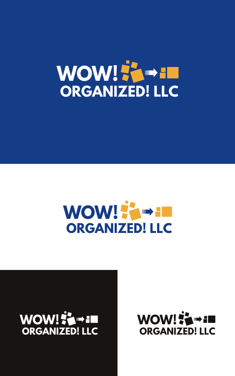
Logo for a Professional Organizing business called WOW! Organized! LLC
¿Quieres ganar un trabajo como este?
Este cliente recibió 165 diseños de logo de 35 diseñadores. Eligieron este diseño de logo de 3-ikE como el diseño ganador.
Únete gratis Encuentra trabajos de diseño- Garantía
-
 US$250
-
 165 diseños
-
 35 diseñadores
Resumen de Diseño de Logo
I started my own Professional Organizing business, where I help people who feel overwhelmed declutter and organize their spaces, after which they are happy, excited and feel as if a weight has been lifted from them.
I would like a logo for my business that demonstrates this to potential clients.
The logo should be color, but also be able to translate to grayscale.
The logo will be used on business cards, web site, client forms, class handouts, etc.
Objetivo del mercado(s)
My target audience is primarily women. They are are willing and able to pay me to help them bust through the dam which is holding them back from accomplishing something. They come to be feeling overwhelmed and leave feeling happy, peaceful and energized to move forward on some projects on their own, or they call me back to help them tackle more projects. My clients are happy and excited after I work with them. That's where the WOW! part of the business name comes from. It's as if I've performed some magic for them. I save my clients money and time and give them some peace.
Tipo de industria / entidad
Professional Service
Texto del logo
WOW! Organized! LLC
Estilos de fuente para usar
Mira y siente
Cada control deslizante ilustra las características de la marca del cliente y el estilo que debe comunicar el diseño de tu logotipo.
Elegante
Atrevido
Juguetón
Serio
Tradicional
Moderno
Atractivo
Profesional
Femenino
Masculino
Vistoso
Conservador
Económico
De Alta Gama
Requisitos
Debes tener
- Because I declutter and organize spaces, the logo design must be clean and calming, showing how I can fix my client's feelings of being overwhelmed.
- Logo should work in color and in grayscale.
- See attached logo file of colors and font I like.
- I want a graphic logo (see in the "nice to haves" section for description) in addition to the name of my business. This logo shall reflect to my clients what I can do for them.
Agradable de tener
- Here is a logo idea: On the left are some jumbled up shapes (rectangles or squares) in disarray, Then an arrow points to the right. On the right, there are now FEWER shapes than on the left and they are all neatly organized. The arrow's shaft starts off with smooth curves (demonstrating the temporary chaos that occurs during the work process) and then straightens out as it points to the new, calm, pieces. The design should looks clean, crisp and confident.
No debería tener
- No cursive fonts.
- No more than 2 or 3 colors (color requests in the "Must Have" sections.
- No pinks or pastels or pale colors.
- Fonts should not be thin, italic, difficult to read.