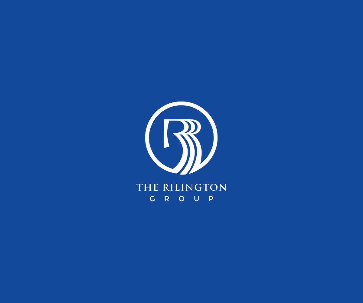
The Rilington Group Corporate Logo
¿Quieres ganar un trabajo como este?
Este cliente recibió 156 diseños de logo de 57 diseñadores. Eligieron este diseño de logo de Design Nation como el diseño ganador.
Únete gratis Encuentra trabajos de diseño- Garantía
-
 US$150
-
 156 diseños
-
 57 diseñadores
Resumen de Diseño de Logo
Creative Brief for “New Look” for The Rilington Group corporate logo…….
The Rilington Group’s core business is building new home developments in the Southern California region. The current logo (attached) was designed by our company co-founder to convey progress, innovation and development. All of these words are at the core of The Rilington Group’s business and corporate character. The “triple R” logo mark was designed to convey movement since our business is not static but rather fluid in nature. The company has evolved over the years and so has our logo and corporate colors. THE ONE THING THAT HAS REMAINED CONSTANT IS THE TRIPLE “R” LOGO MARK. THIS IS A SACRED COMPONENT OF OUR BRAND AND THE ORIGINAL LOGO MARK MUST REMAIN WITHIN THE NEW LOGO DESIGN.
One aspect that makes the current iteration of the logo difficult to work with is that it does not work in a stacked format. We are looking to update the logo and would like to take the “triple R” logo mark out of the name so it can stand alone as part of the overall corporate logo. We are not “married” to any particular “font”, so use your discretion on font choices.
The Rilington Group has a diverse audience; the logo needs to be professional and show “strength”, “quality”, and “integrity” so that it appeals not only to our new homebuyers, but also to our business partners and financial investors. The current color combination of Blue & Lime Green is no longer working. We would like to keep the “Rilington Blue” but do away with the lime green (too soft) and replace with a “strong / solid” color palatte to complement the Rilington Blue. (Browns, Black, Purples, Grays, etc.)
Also, the current logo has “the” and “group” in lower case letters………This does not have to stay that way if you think they would look better in upper case or combination on upper / lower. We would also like to see “the” and “group” not all in one line like it is currently…..Move around to what best fits your eye as the designer.
Objetivo del mercado(s)
Homebuyers / Investors / Business Partners
Tipo de industria / entidad
Building
Texto del logo
The Rilington Group
Mira y siente
Cada control deslizante ilustra las características de la marca del cliente y el estilo que debe comunicar el diseño de tu logotipo.
Elegante
Atrevido
Juguetón
Serio
Tradicional
Moderno
Atractivo
Profesional
Femenino
Masculino
Vistoso
Conservador
Económico
De Alta Gama
Requisitos
Debes tener
- Spelled out in Creative Brief attached.
Agradable de tener
- Spelled out in Creative Brief attached.
No debería tener
- n/a