"Rhodium", a VoIP application needs a logo design
¿Quieres ganar un trabajo como este?
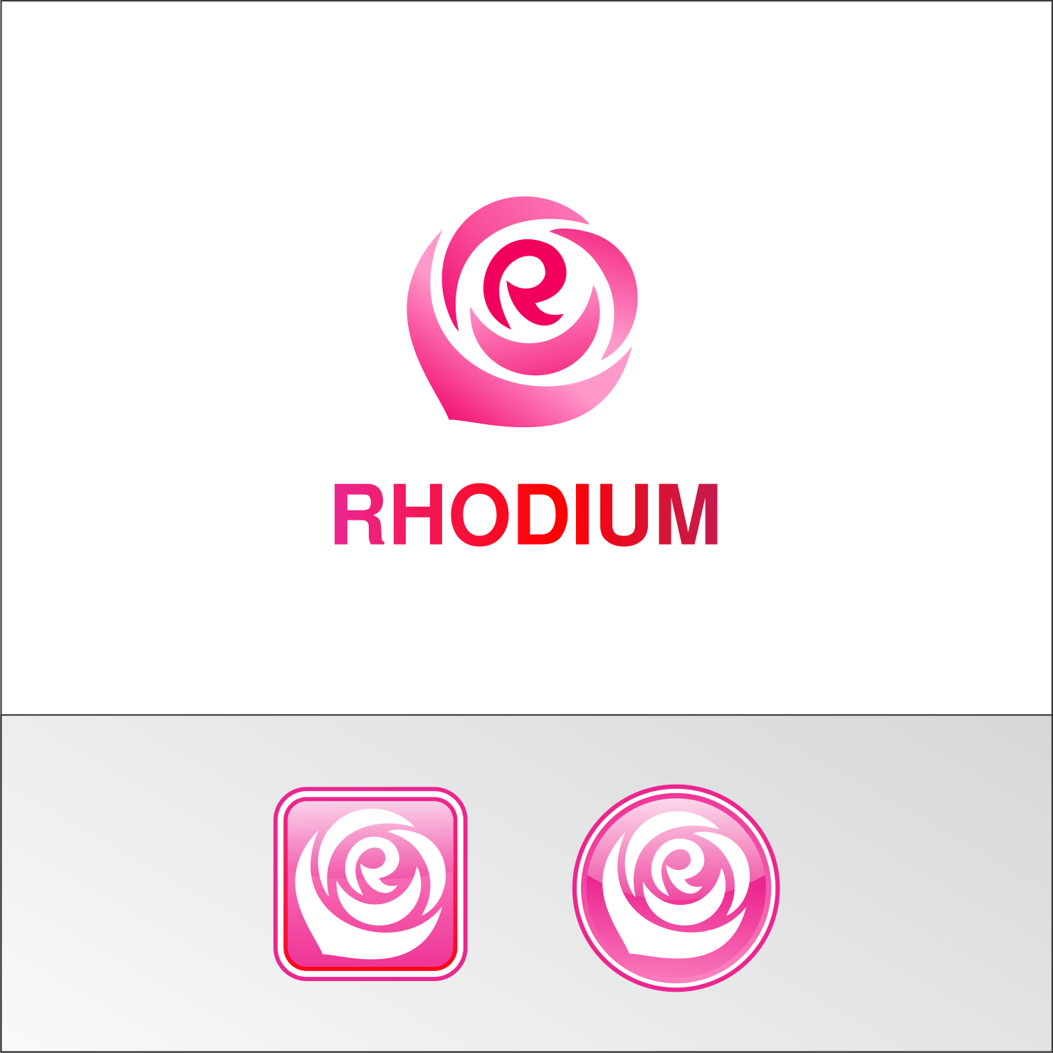
Este cliente recibió 317 diseños de logo de 108 diseñadores. Eligieron este diseño de logo de Joe Seph como el diseño ganador.
Únete gratis Encuentra trabajos de diseño- Garantía
-
 US$300
-
 317 diseños
-
 108 diseñadores
Resumen de Diseño de Logo
We need a logo design for a VoIP application named "Rhodium". Rhodium works as a combination of appliance and smartphone application and it is targeted to small to medium businesses. While the logo will be put both on appliance and on smartphone application, some emphasis is put on that the logo mark being an application icon. Rhodium is a chemical element with atomic number 45. It's named Rhodium because one of its chlorine compounds shows rosy color. Thus we want the logo color to be "rosy-red"-ish. The logo may include some image to suggest rose flower but not mandatory. Messages we want to deliver with the logo are; "friendly", "ease of use", "reliable".
Actualizaciones
Initially, we thought the rose is "nice to have". However, now we have so many good designs with rose, thus it is now "must have". We don't think we end up choosing a design without rose.
Added Sunday, February 5, 2017
Objetivo del mercado(s)
Small to Medium Businesses. The industry is a little bit conservative and the average age a bit higher thus prefer "friendly" than "super-cool".
Tipo de industria / entidad
Telecommunications
Texto del logo
Rhodium
Estilos de logo de interés
Logo abstracto
Conceptual / simbólico (texto opcional)
Logo de marca de nombre
Logotipo basado en palabra o nombre (solo texto)
Estilos de fuente para usar
Colores
Colores seleccionados por el cliente para ser utilizados en el diseño del logotipo:
Mira y siente
Cada control deslizante ilustra las características de la marca del cliente y el estilo que debe comunicar el diseño de tu logotipo.
Elegante
Atrevido
Juguetón
Serio
Tradicional
Moderno
Atractivo
Profesional
Femenino
Masculino
Vistoso
Conservador
Económico
De Alta Gama
Requisitos
Debes tener
- "Rhodium" wordmark logo and logo mark which is usable for smartphone icon.
Agradable de tener
- The logo that reminds "rose", or even explicitly showing "rose" somewhere may be nice but just a non-designer idea and you can completely ignore this.
- Many people relate rose with the letter "O" of "rhOdium", however, I'd want to see more idea relating the rose with "R", the initial letter. It is particularly nice when used as a smartphone icon.
- You can also ignore the color I chose below.