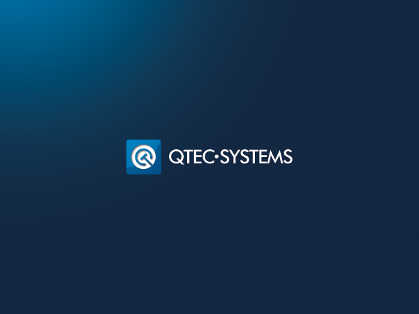
Refresh Logo Design for IT Services Business as part of rebranding

¿Quieres ganar un trabajo como este?
Este cliente recibió 58 diseños de logo de 14 diseñadores. Eligieron este diseño de logo de iamf como el diseño ganador.
Únete gratis Encuentra trabajos de diseñoResumen de Diseño de Logo
We are an innovative IT services business that is embarking on a rebranding program including new website, stationery and company positioning. Our core business is building VoIP systems for the mid market
We are starting with a updating / refresh of our logo. We want to retain the same company name and the same basic visual representation of our logo but are keen on exploring new ideas and designs to make it more contemporary and compelling.
The existing colours of black and silver are too muted, the font is boring and the positioning of the text compared to the logo could possibly be moved.
We have a new sister company, Coloured Lines, with a fresh logo (attached) and it would be good to see if we can get the Qtec logo to share some affinity with the Coloured Lines one, albeit retaining it's own identity.
Actualizaciones
Project Deadline Extended
Reason: I have been delayed in reviewing the designs over this holiday period and I appreciate that many designers are also having holidays at this time, so an extension gives everyone a little more breathing space...
Added Friday, December 30, 2011
Objetivo del mercado(s)
Businesses only, IT management or executive management
Tipo de industria / entidad
Business
Texto del logo
Qtec Systems
Estilos de logo de interés
Logo abstracto
Conceptual / simbólico (texto opcional)
Mira y siente
Cada control deslizante ilustra las características de la marca del cliente y el estilo que debe comunicar el diseño de tu logotipo.
Elegante
Atrevido
Juguetón
Serio
Tradicional
Moderno
Atractivo
Profesional
Femenino
Masculino
Vistoso
Conservador
Económico
De Alta Gama
Requisitos
Debes tener
- Must reproduce in both electronic and paper forms easily.
(The initial design of the logo used a metallic silver ink which was a nightmare to print)
The logo should also reproduce in B&W as well as colour (or at least in a grey scale)