Academic group needs icon set for web app supporting patients making health decisions
¿Quieres ganar un trabajo como este?
Este cliente recibió 18 diseños de ícono de 9 diseñadores. Eligieron este diseño con ícono de bdesigner9 como el diseño ganador.
Únete gratis Encuentra trabajos de diseño- Garantía
-
 C$190
C$190
-
 18 diseños
-
 9 diseñadores
Resumen de Diseño Con Ícono
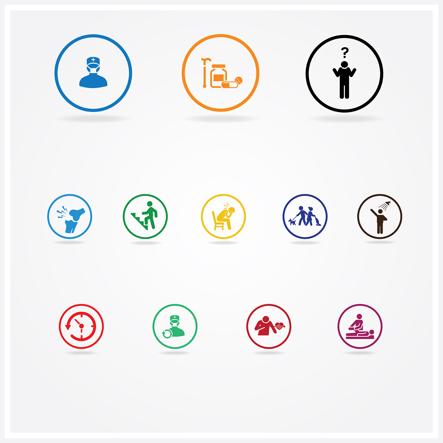
We require a set of 12 small icons for use in our web application, which helps patients make choices between treatments. Each treatment has different features.
Icons 1 to 3 refer to the treatments themselves and should be twice the width as the height (96x48) and will be in the headings of a table describing each treatment.
• Icon 1 is for knee replacement surgery – we need a visual of a knee with a surgeon.
• Icon 2 is for non surgical treatment (pain meds/ walking aid/ physiotherapy/ weight management).
• Icon 3 is for ‘not sure’ – this will be for when a patient is not sure which option they prefer.
Icons 4 to 12 should be square (48x48) and will be in the rows of the table. These should be generic and not related to knee pain unless they specifically relate to surgery.
• Icon 4 is for pain. This section will describe how much pain the patient might have after treatment.
• Icon 5 is for mobility. This section will describe how the patient’s mobility will change after treatment.
• Icon 6 is for anxiety /depression. This section will describe how the patient’s anxiety/depression will change after treatment.
• Icon 7 is for usual activities defined as work, study, housework, family of leisure activities. This section describes how the patient’s ability to conduct usual activities might change after treatment.
• Icon 8 is for self care such as washing and dressing themselves. This section describes how the patient’s ability to self-care might change after treatment.
• Icon 9 is for recovery period after surgery and refers to the time this might take.
• Icon 10 is for chance of repeat surgery – where the chance the surgery might not be successful.
• Icon 11 is for complications in surgery ranging from mild to serious.
• Icon 12 is for the need of physiotherapy after surgery or for non surgical treatments.
Objetivo del mercado(s)
patients of all ages including over 60
Tipo de industria / entidad
Health
Colores
Colores seleccionados por el cliente para ser utilizados en el diseño del logotipo:
Mira y siente
Cada control deslizante ilustra las características de la marca del cliente y el estilo que debe comunicar el diseño de tu logotipo.
Elegante
Atrevido
Juguetón
Serio
Tradicional
Moderno
Atractivo
Profesional
Femenino
Masculino
Vistoso
Conservador
Económico
De Alta Gama
Requisitos
Debes tener
- Keep the Icons as clean and simple as possible.
- The deliverable should be made through a vector program (e.g. Illustrator)
- Only use black white blue and orange
Agradable de tener
- for a style, please look at the https://thenounproject.com/ or the winner of this contest
- http://icon.designcrowd.ca/contest.aspx?id=138593