Baby Care Print Log for Nannies and Parents- Creating a brand/style I can use across different forms
¿Quieres ganar un trabajo como este?
Este cliente recibió 25 diseños de impresos de 10 diseñadores. Eligieron este diseño de impresos de kousik como el diseño ganador.
Únete gratis Encuentra trabajos de diseño- Garantía
-
 US$185
-
 25 diseños
-
 10 diseñadores
Resumen de Diseño de Impresos
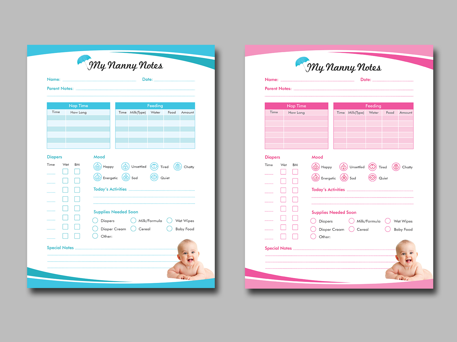
I am creating a notebook for babysitters to use to communicate with parents about the children they care for. I will be creating many different forms (emergency contacts, daily logs, shopping lists, etc.)
I need a look and feel from which to style these forms from. I am starting by designing the daily baby care log. I need a designer to take my Word doc with just text on it, and create a visual approach to make this visually appealing.
I do not want this to be extremely "babyish" with cartoon styling. I want it to be more of a professional looking style. I would like to be able to color each different document a different color palette, yet keep the similar look and feel. My logo is attached for inspiration. I use real photography across my website mynannynotes.com.
Actualizaciones
I will be re-designing my Wordpress website based on what design I like best and also will need other forms completed once I pick a design. I am hoping to work with someone who I can hire for further development needs as well. Added Saturday, February 11, 2017
Objetivo del mercado(s)
Professional Parents
Tipo de industria / entidad
Education
Mira y siente
Cada control deslizante ilustra las características de la marca del cliente y el estilo que debe comunicar el diseño de tu logotipo.
Elegante
Atrevido
Juguetón
Serio
Tradicional
Moderno
Atractivo
Profesional
Femenino
Masculino
Vistoso
Conservador
Económico
De Alta Gama
Requisitos
Debes tener
- color, pop, visual appeal
- Please use the color in my logo and any complementary colors that you think work well with it. I definitely like colored patterns, ombre, colored backgrounds, etc. I'd prefer for it not to be completely white with only pops of color here and there.
Agradable de tener
- My logo somewhere subtly on the form
- Photography elements
No debería tener
- cartoon images of babies, etc. I use real photography across my website with the exception of my logo umbrella.