Minimalist workdmark for Seattle marketing start-up
¿Quieres ganar un trabajo como este?
Este cliente recibió 286 diseños de logo de 92 diseñadores. Eligieron este diseño de logo de srinup9492 como el diseño ganador.
Únete gratis Encuentra trabajos de diseño-
 US$225
-
 286 diseños
-
 92 diseñadores
Resumen de Diseño de Logo
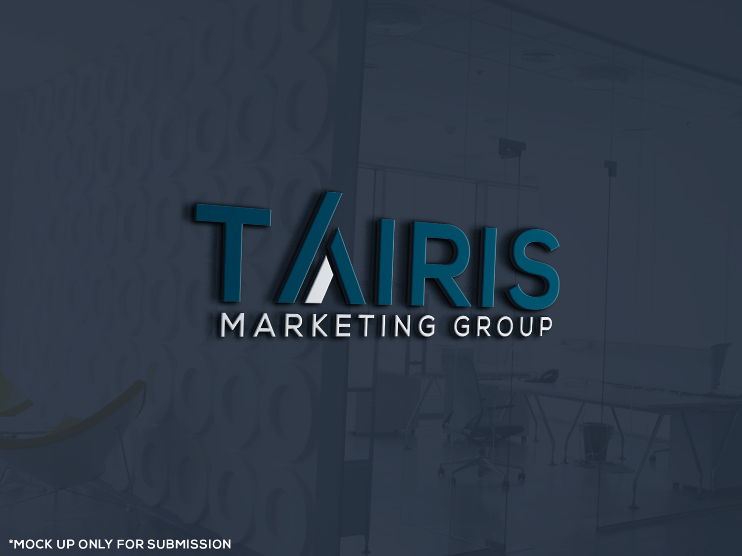
We are a start-up marketing consultancy/agency in Seattle dedicated to increasing brand awareness, business size and revenue for real estate developers, construction companies, home builders and architects/engineers. We provde experienced direction in developing strategies and implementing marketing plans and campaigns that deliver results.
We are looking for a simple yet bold wordmark with clean lines that will stand out against other Seattle agencies. Looking for something uniqure with in the mark. Refer to identity.pdf for examples.
The word "Tairis" should be emphasized and could be the only word if that amkes sense for your design. Could include "Marketing" with "Group", if that balances the design. However, the secondary words should have heavy lines, so they don't get lost in small print. Do not want any icons.
It should be contemporary, but not trendy. It should be masculine or gender neutral, but not feminine. Prefer sans serif fonts types. No cursive, handwritten or brush fonts. Colors we prefer are included in palette.pdf.
The final design should communicate experience, style and power.
Actualizaciones
Project Deadline Extended
Reason: Hi, All.
Looking for more designs - something that really captures the simple, yet powerful aesthetic we desire. Feel free to get creative with the "air" in Tairis. I don't think that's been considered much yet. Could be fun.
Oh, please keep to one or two colors in the design.
Thanks, Deanna
Added Wednesday, February 22, 2017
Objetivo del mercado(s)
Real estate developers. Construction companies. Home builders. Architects/engineers.
Tipo de industria / entidad
Marketing
Texto del logo
Tairis Group
Estilos de logo de interés
Logo de marca de nombre
Logotipo basado en palabra o nombre (solo texto)
Estilos de fuente para usar
Mira y siente
Cada control deslizante ilustra las características de la marca del cliente y el estilo que debe comunicar el diseño de tu logotipo.
Elegante
Atrevido
Juguetón
Serio
Tradicional
Moderno
Atractivo
Profesional
Femenino
Masculino
Vistoso
Conservador
Económico
De Alta Gama
Requisitos
Debes tener
- Use darker colors as the main, and only spot with lighter colors.
- The word "Tairis" is the focal point. Sans serif fonts.
Agradable de tener
- Something unique within the mark.
No debería tener
- Line breaks. Serif fonts. Cursive or handwriting. Brush strokes.