Medical Centre Website
¿Quieres ganar un trabajo como este?
Este cliente recibió 86 diseños web de 26 diseñadores. Eligieron este diseño web de OM como el diseño ganador.
Únete gratis Encuentra trabajos de diseño- Garantía
-
 A$360
A$360
-
 86 diseños
-
 26 diseñadores
Resumen de Diseño Web
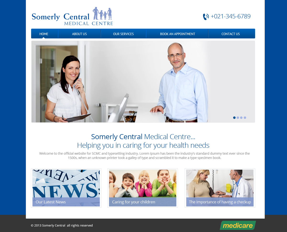
We need a new design for a medical centre based in Perth, Western Australia called 'Somely Central Medical Centre'.
The medical centre does general practitioner work including general checkups, ecg, heart checks, woman's health and more servicing children and adults. They also do home visits on occasions where the patient cannot attend the centre.
They would like an information/brochure website where visitors can read up on the practice, send email and view their location.
The client wish the design to be clean, fresh and light. The main colours are a light purple/blue and to a dark navy blue. The client would not want the logo to be altered in any way. This includes changing the words colours or the image.
The final design should represent a loving, family friendly practice where patients can come to receive the best treatments.
We just need the end product to be presented to un in a layed psd format. The fonts must be as per the W3C standards.
**IMPORTANT**
I have received heaps of skype invites in the past. To treat everyone fairly, I do not add people to my skype list as in the past people expected us to give them the prize. If you have questions, please ask them in design crowd as it may benefit others who are also designing the site. If I need to, I will send a message to the user.
Actualizaciones
Hi Designers,
Most designs we have received have been overly cluttered. Are you able to simplify the designs.
Cheers, Cameron
Added Friday, October 18, 2013
Project Deadline Extended
Reason: As requested by some designers
Added Sunday, October 20, 2013
Hi Designers,
Added Monday, October 21, 2013
Designers,
Added Monday, October 21, 2013
Tipo de industria / entidad
Medical
Mira y siente
Cada control deslizante ilustra las características de la marca del cliente y el estilo que debe comunicar el diseño de tu logotipo.