Grocery store half gallon water carton
¿Quieres ganar un trabajo como este?
Este cliente recibió 40 diseños de empaque de 13 diseñadores. Eligieron este diseño de empaque de MadeInYarm como el diseño ganador.
Únete gratis Encuentra trabajos de diseño- Garantía
-
 US$270
-
 40 diseños
-
 13 diseñadores
Resumen de Diseño de Empaque
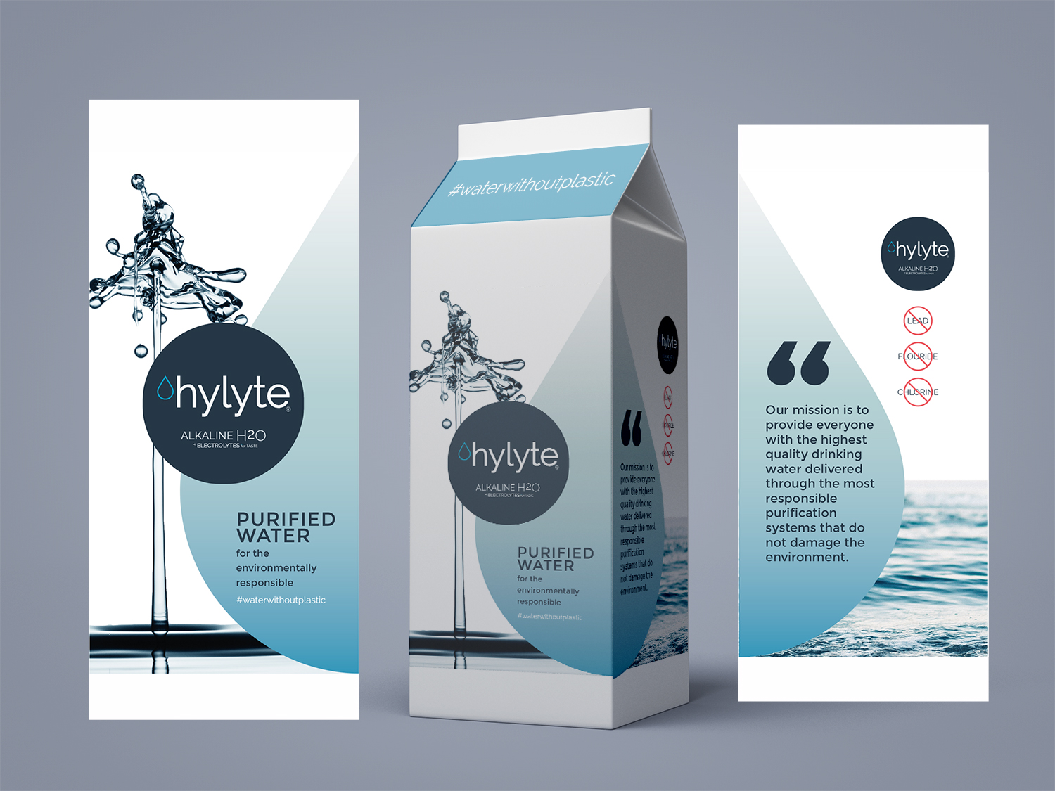
We need a 4 sided design for a standard half gallon carton (Evergreen packaging 3.764" x 3.764") you'd see in a grocery store. For the barcode 1.25 W x 1 H inches will be fine for now. I'm assuming we can tweak these things later? I attached a picture of our bulk water machines for further context around the brand. Our product is alkaline water. We want to emphasize our differentials vs. the competition. On the store shelf that will be a cost effective delivery of alkaline water in an eco-friendly container. At a company level it's the statement below. We're open to how to best integrate this neatly and cleanly onto the package.
Our mission is to provide everyone with the highest quality drinking water delivered through the most responsible purification systems that do not damage the environment.
Below are some design considerations from Evergreen packaging
Design Considerations
• Refer to High Definition Flexo Digital File Submission Guidelines.
• Large solids should be used as the 5th color. The reproduction of large background solids by
process inks will not deliver optimum quality.
• When black art needs to be “rich” black, add a 30M-30C-30Y to the 100% black area.
• Thin lines and heavy solid patches in the same color should be avoided, due to flexo
limitations.
• Do not use type styles with combination thick and thin strokes.
• Do not use type styles with fine serifs.
• Do not use condensed type styles.
• Do not use TrueType fonts.
• Embedded fonts must include the font in the file.
• Customers must confirm that a fitment will be used and what size is needed in order to create
the correct design for the gable top package. If there is no fitment, disregard the fitment area
and both gable tops will be identical.
• It is recommended to stay within the panel fold dash lines if copy or art is critical to the fold.
• It is recommended to stay outside the fitment and window dash lines if copy or art is critical
to the die cut.
Actualizaciones
Project Deadline Extended Reason: We need to gather more information on fonts, barcodes, and exact specs to provide designers with everything they need. Added Saturday, March 11, 2017
Objetivo del mercado(s)
Pretty large. Health conscious consumers who already purchase water from the grocery store.
Tipo de industria / entidad
Grocery Store
Estilos de fuente para usar
Mira y siente
Cada control deslizante ilustra las características de la marca del cliente y el estilo que debe comunicar el diseño de tu logotipo.
Elegante
Atrevido
Juguetón
Serio
Tradicional
Moderno
Atractivo
Profesional
Femenino
Masculino
Vistoso
Conservador
Económico
De Alta Gama
Requisitos
Debes tener
- Our logo, alkaline water noted, some form of our story told, 4 sides of graphics, space for barcode, space for nutrition facts. Example pictures attached.
Agradable de tener
- Clean, minimalistic, desirable to put in your cart.
- We're also open to something on the design that emphasizes that we believe in a world without plastic. #waterwithoutplastic, #nomoreplastic ect. Just an idea to float out there.
No debería tener
- Too many different colors, too wordy