Web App Dashboard Design for Healthcare Company
¿Quieres ganar un trabajo como este?
Este cliente recibió 54 diseños web de 6 diseñadores. Eligieron este diseño web de pb como el diseño ganador.
Únete gratis Encuentra trabajos de diseño- Garantía
-
 US$230
-
 54 diseños
-
 6 diseñadores
Resumen de Diseño Web
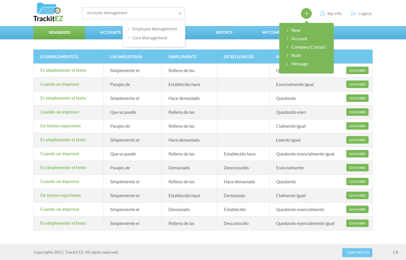
We have developed a simple web application with 3 navigation menus. We like the current design (very much modeled after Quickbooks), but we want to explore UI options for the branding, header, menus, and footer that we may not have considered.
The attached screenshots show the layout and two menu "hover" views as they currently exist.
This web application is used by employees only.
Menu 1 - Module Menu:
Allows the user to switch easily between Account, Employee, and Care Management.
Menu 2 - Reports Menu
Allows user to view available reports within each Module.
Menu 3 - Admin Menu
Allows the user to easily create new content types within each module.
Use our branded colors and font.
Colors:
Logo Blue (dark): 00c0f3
Logo Blue (light): 44c8f5
Nav Blue: 0994d0
Green: 71b44b
Grayscale: (not specified)
Font:
Lato (Google Font)
Objetivo del mercado(s)
Internal staff.
Tipo de industria / entidad
Healthcare
Número de páginas requeridas
3 page
Estilos de fuente para usar
Gustan otros estilos de fuente:
- Lato (Google Font)
Colores
Colores seleccionados por el cliente para ser utilizados en el diseño del logotipo:
Mira y siente
Cada control deslizante ilustra las características de la marca del cliente y el estilo que debe comunicar el diseño de tu logotipo.
Elegante
Atrevido
Juguetón
Serio
Tradicional
Moderno
Atractivo
Profesional
Femenino
Masculino
Vistoso
Conservador
Económico
De Alta Gama
Requisitos
Debes tener
- It's really a one page design, but we want to see the two "hover" views for the Module Menu and the Admin Menu.
- It should also be very clear which "Report" page the user is on (the active menu link).
- Must use branded colors, font, and logo.
- Logo Blue (dark): 00c0f3
- Logo Blue (light): 44c8f5
- Nav Blue: 0994d0
- Green: 71b44b
- Grayscale: Designer may choose
Agradable de tener
- It would be nice to have simple uncluttered payouts.
No debería tener
- The design should not have menu options exposed by default.