Youth Musical Theater Training Studio
¿Quieres ganar un trabajo como este?
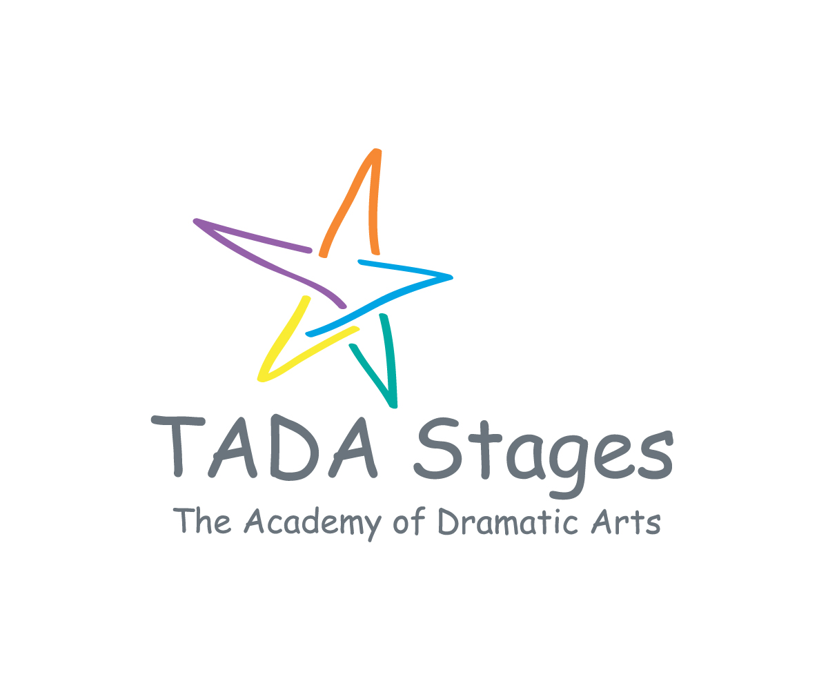
Este cliente recibió 163 diseños de logo de 51 diseñadores. Eligieron este diseño de logo de LDYB como el diseño ganador.
Únete gratis Encuentra trabajos de diseño-
 US$250
-
 163 diseños
-
 51 diseñadores
Resumen de Diseño de Logo
We need a logo design for a youth musical theater training studio based in Manhattan Beach, CA. The company is called "TADA Stages". TADA stands for 'The Academy of Dramatic Arts. The logo shouls hold be appealing to mothers of young kids while also speaking to teens. We promote self-love and confidence-building through the arts. We celebrate each student's uniqueness and growth not only on the stage, but in life. The 'Stages' part of our company's title represents not only the stage of the theater, but the stages we have in life: the ups and downs, the trials and tribulations, the everyday motions we go through as children and young adults. The final design should communicate all of this. We'd also like to see the logo both with the actual The Academy of Dramatic Arts words, and with just the 'TADA' words.
Actualizaciones
Project Deadline Extended Reason: We have extended the deadline so we can get more creative ideas! Added Friday, March 31, 2017
Objetivo del mercado(s)
The logo shouls hold be appealing to mothers of young kids while also speaking to teens.
Tipo de industria / entidad
It Company
Texto del logo
TADA Stages
Estilos de fuente para usar
Mira y siente
Cada control deslizante ilustra las características de la marca del cliente y el estilo que debe comunicar el diseño de tu logotipo.
Elegante
Atrevido
Juguetón
Serio
Tradicional
Moderno
Atractivo
Profesional
Femenino
Masculino
Vistoso
Conservador
Económico
De Alta Gama
Requisitos
Agradable de tener
- We love the Whimsy Circle Theater Company logo you'll find at the top of the uploaded jpg. We love the watercolor/drybrushed look of the circle in the background. We'd like to see something like that, with rainbow colors instead, and with 'hand painted' stars instead of the leaves on the Whimsy Circle logo. Perhaps the stars can continue to get larger from bottom to top? Perhaps stars are all different colors? Or perhaps the watercolor background circle os only a few colors instead of all rainbow colors? Just thoughts here :)