Construction Logo that covers 9 different industries.
¿Quieres ganar un trabajo como este?
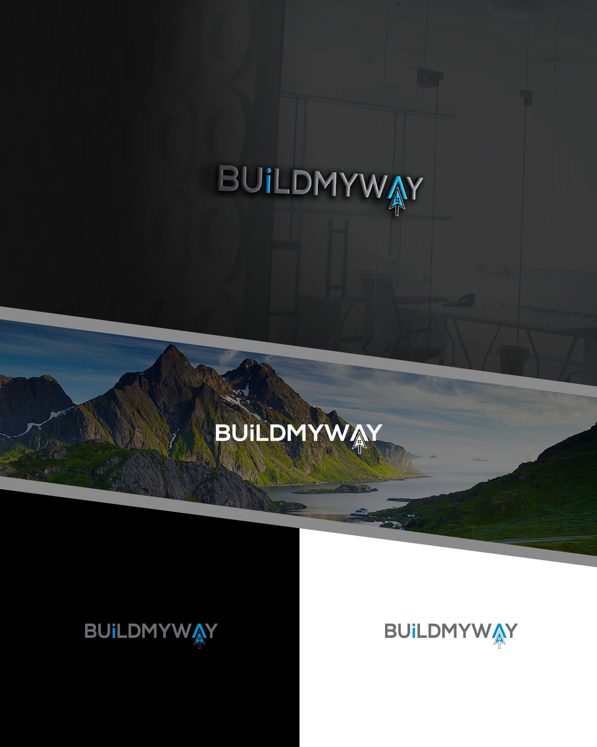
Este cliente recibió 322 diseños de logo de 69 diseñadores. Eligieron este diseño de logo de MF ki creation como el diseño ganador.
Únete gratis Encuentra trabajos de diseño- Garantía
-
 US$300
-
 322 diseños
-
 69 diseñadores
Resumen de Diseño de Logo
We are a company that works in 9 different industries:
Roofing, Framing (carpentry), Concrete, Flooring, Stone Works, Siding, Electrical, Plumbing, Ceramic Tile
We are a mobile app software company that provides services to construction industries by collecting their news, products information and 3D images for installations. We then display these industries' information in separate apps for construction professionals to view on the job.
Below, in the attachment, is our logo for the Ceramic Tile industry. We like this logo because it's simply and easy to gather all its information.
Objetivo del mercado(s)
Construction Trades for professionals
Tipo de industria / entidad
Construction
Texto del logo
BuildMyWay
Estilos de logo de interés
Logo con emblema
Logo contenido dentro una forma / figura
Logo con personaje
Logo con ilustración o personaje
Estilos de fuente para usar
Colores
Colores seleccionados por el cliente para ser utilizados en el diseño del logotipo:
Mira y siente
Cada control deslizante ilustra las características de la marca del cliente y el estilo que debe comunicar el diseño de tu logotipo.
Elegante
Atrevido
Juguetón
Serio
Tradicional
Moderno
Atractivo
Profesional
Femenino
Masculino
Vistoso
Conservador
Económico
De Alta Gama
Requisitos
Debes tener
- Simple design that includes all the industries mentioned. Don't worry about the icons if you use them in the design, we can work on this together.
- Soft light colors
Agradable de tener
- Concerning latest attachment "BMW Logo Example":
- Use your imagination. This mockup is only a starting point. Create a logo using the Equilateral Triangle as a symbol to represent 3 industry components. Within the triangle, I added a simple design to illustrate "i" information.
- The finger that looks like it "clicks" represents how we tap on our mobile phones bringing together the software side of who we are in our company.
- Thanks
No debería tener
- Should not be too busy looking. Eye catching and different is a plus.