Children's nonprofit golf tournament logo
¿Quieres ganar un trabajo como este?
Este cliente recibió 65 diseños de logo de 23 diseñadores. Eligieron este diseño de logo de Jay Design como el diseño ganador.
Únete gratis Encuentra trabajos de diseño-
 US$150
-
 65 diseños
-
 23 diseñadores
Resumen de Diseño de Logo
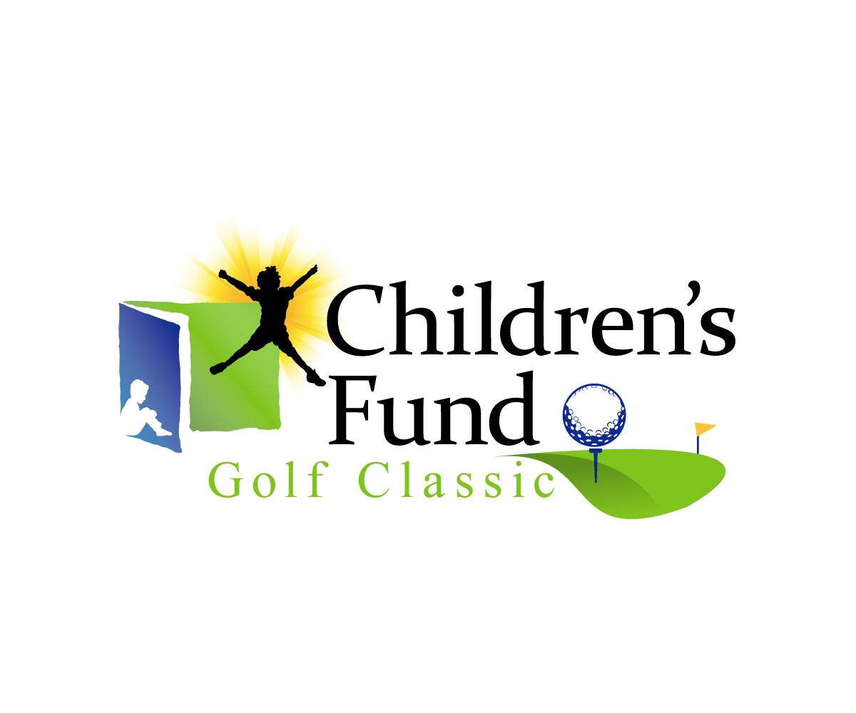
This project requires the creation of a logo for a golf tournament for Children's Fund, a 30 year old nonprofit in San Bernardino, CA. We would like the new golf classic logo to be a hybrid of our Children's Fund logo. If you look at the logo we designed for our 30th anniversary, you can see how the original nonprofit logo is still entact but we've added a special element (the 30) in the bottom right side of the logo. We want to stick to this methodology and use the original nonprofit logo for our golf classic logo, but place something like a golf ball in the bottom right hand side of the logo. We want to keep the original nonprofit logo in place, but remove the tagline and insert "Golf Classic" in there with some graphic element in the bottom right of the logo.
Objetivo del mercado(s)
high income, golfers, people who want to support children.
Tipo de industria / entidad
Non Profit
Texto del logo
Children's Fund Golf Classic
Estilos de fuente para usar
Mira y siente
Cada control deslizante ilustra las características de la marca del cliente y el estilo que debe comunicar el diseño de tu logotipo.
Elegante
Atrevido
Juguetón
Serio
Tradicional
Moderno
Atractivo
Profesional
Femenino
Masculino
Vistoso
Conservador
Económico
De Alta Gama
Requisitos
Debes tener
- Must have the original nonprofit logo in it (Children's fund with the blue and green boxes, the yellow starburst and the two kid shadows.) Do not use the tagline. Must have some graphic element in the bottom right side of the logo (like we did in the provided sample 30th anniversary logo.)
Agradable de tener
- golf ball, tee, golf flag
- Colors of our logo. Do not add any additional colors.
- Blue: CMYK: 100/68/0/12
- Yellow: 0/24/94/0
- Green: 50/0/100/0
No debería tener
- too much...want to keep it pretty simple and not stray too much from the original feel and tone of the nonprofit logo.