Clean, unique logo for mapping service
¿Quieres ganar un trabajo como este?
Este cliente recibió 184 diseños de logo de 62 diseñadores. Eligieron este diseño de logo de beisone1 como el diseño ganador.
Únete gratis Encuentra trabajos de diseño-
 US$150
-
 184 diseños
-
 62 diseñadores
Resumen de Diseño de Logo
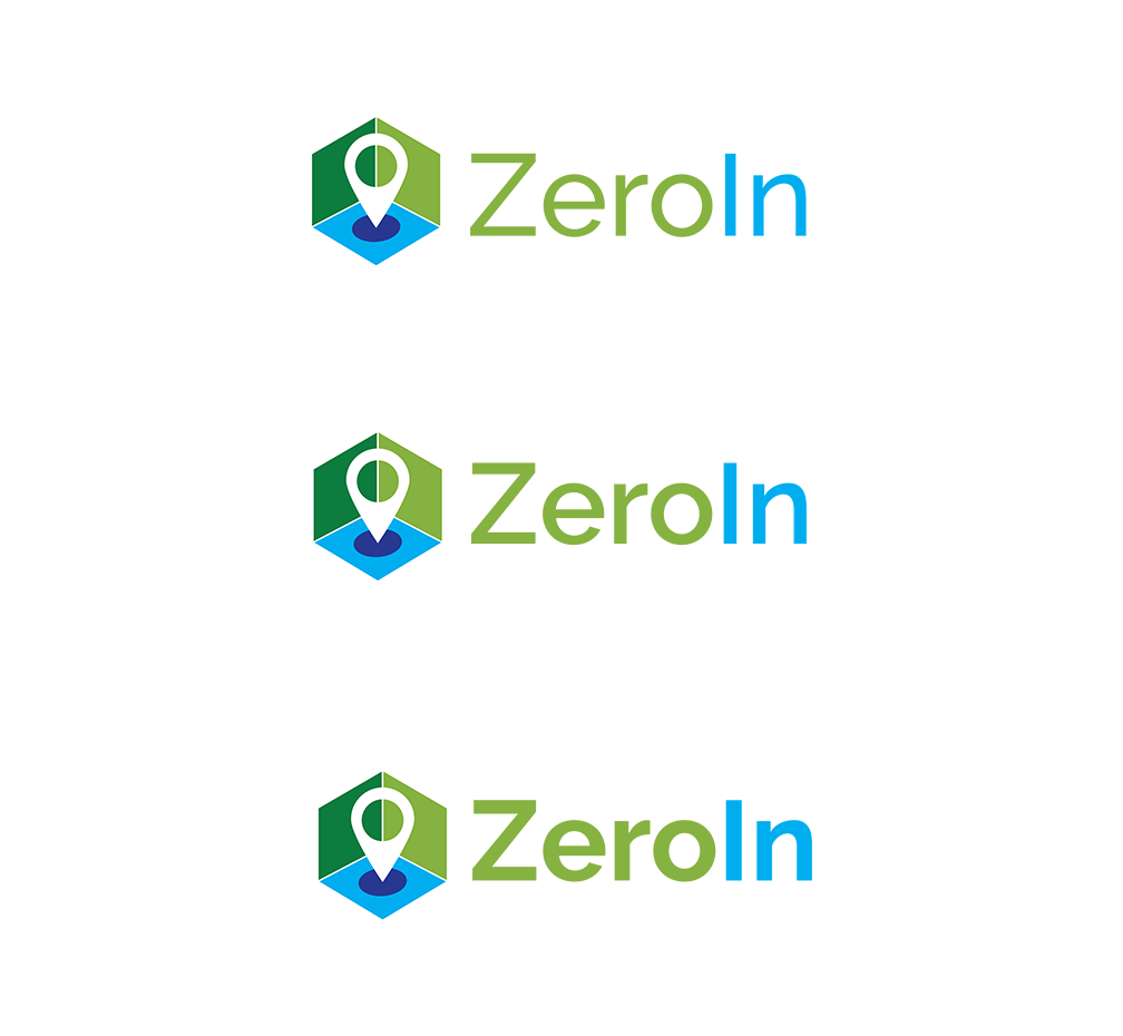
We are looking for logo ideas for a new mapping service we are developing. The name of the service is ZeroIn. The meaning of the name, which needs to be visually conveyed in the logo itself, comes from "Zeroed in" and points to the highly localized, detailed and simple-to-use, high quality nature of the mapping interface we are developing. We do not want a logo icon or distracting graphical elements incorporated within the text/font of the name itself, for the urpose of good readability. Idelly, Zero" and "In" should be two different colors to differentiate the two words and help avoid reading the "I" as a lower case "L". The logo (icon and text) also needs to read well in small sizes. In short the logo needs to visually convey "getting to a highly localized level on a map". The attached image shows the approximate level of "localization" we are dealing with.
Tipo de industria / entidad
It Service
Texto del logo
ZeroIn
Estilos de logo de interés
Logo abstracto
Conceptual / simbólico (texto opcional)
Estilos de fuente para usar
Colores
Diseñador para elegir los colores que se utilizarán en el diseño.
Mira y siente
Cada control deslizante ilustra las características de la marca del cliente y el estilo que debe comunicar el diseño de tu logotipo.
Elegante
Atrevido
Juguetón
Serio
Tradicional
Moderno
Atractivo
Profesional
Femenino
Masculino
Vistoso
Conservador
Económico
De Alta Gama
Requisitos
Agradable de tener
- Two different colors used for Zero and In.. differentiate the two words and help avoid reading the "I" as a lower case "L"
No debería tener
- Should not incorporate the icon into the text