Redo logo design to be more professional
¿Quieres ganar un trabajo como este?
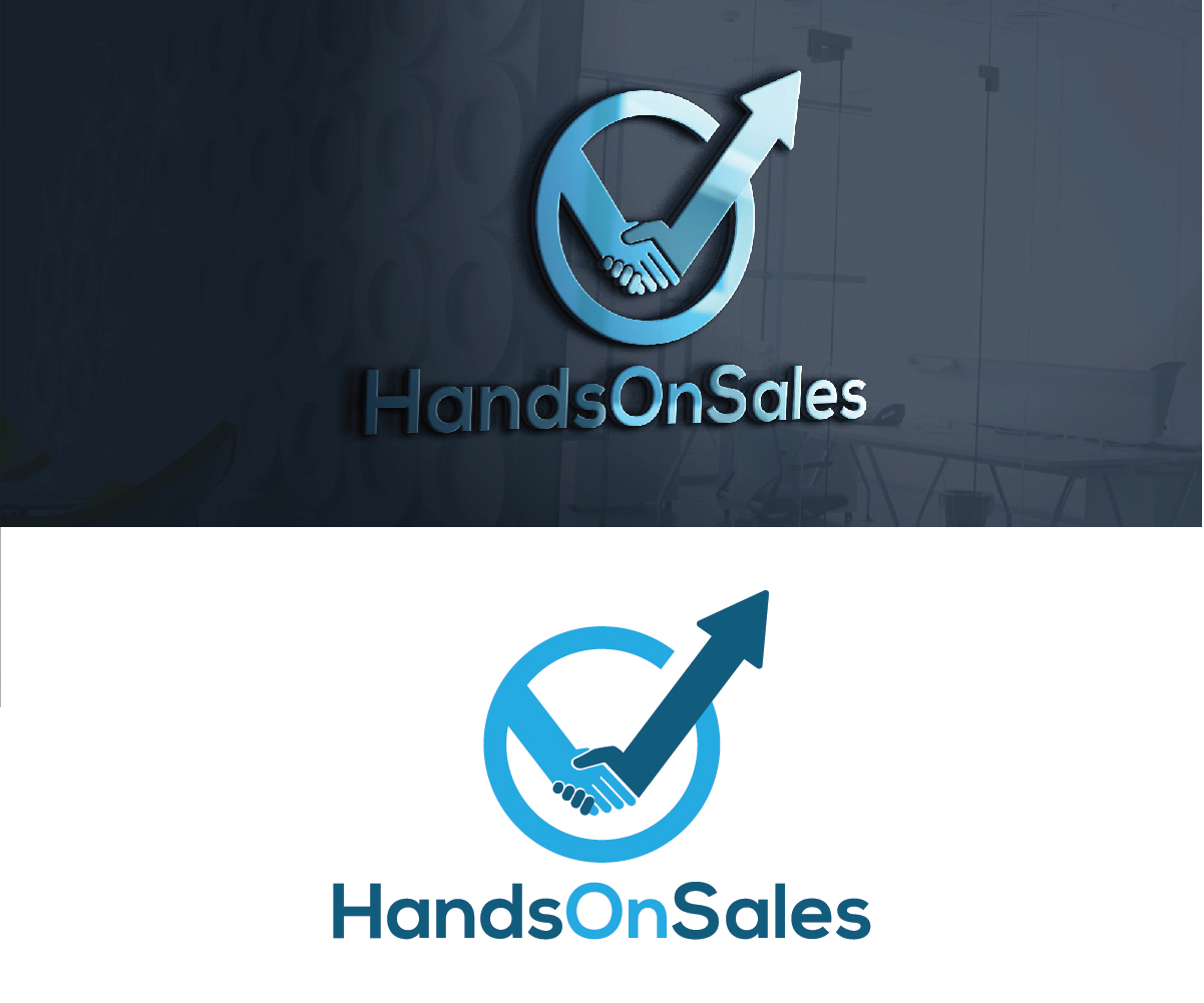
Este cliente recibió 109 diseños de logo de 43 diseñadores. Eligieron este diseño de logo de creativemood438 como el diseño ganador.
Únete gratis Encuentra trabajos de diseño-
 US$150
-
 109 diseños
-
 43 diseñadores
Resumen de Diseño de Logo
I have had a logo for some years now, but it has to appear more professional. By Professional I mean simpler and more modern, a logo which signals trust. Handsonsales helps B2B companies to improve their results, by working HandsOn the businesss, thats why the original idea with the two hands breaking the curve. I like the logo to show two hands holding a curve, that had a downwards trend and is pushed to new highs by the other. So Improve the graphical quality and make it simpler, perhaps a different frame if any.
Objetivo del mercado(s)
Business owners and CEO...so High level business men
Tipo de industria / entidad
It Professional
Texto del logo
HandsOnSales
Estilos de logo de interés
Logo pictórico / combinado
Un objeto del mundo real (texto opcional)
Logo abstracto
Conceptual / simbólico (texto opcional)
Colores
Diseñador para elegir los colores que se utilizarán en el diseño.
Mira y siente
Cada control deslizante ilustra las características de la marca del cliente y el estilo que debe comunicar el diseño de tu logotipo.
Elegante
Atrevido
Juguetón
Serio
Tradicional
Moderno
Atractivo
Profesional
Femenino
Masculino
Vistoso
Conservador
Económico
De Alta Gama
Requisitos
Debes tener
- The two hands that change the curve from downwards to going higher that the highest in the past. It needs to be simplistic