Niagara Falls Entrance Sign
¿Quieres ganar un trabajo como este?
Este cliente recibió 6 diseños de señalización de 2 diseñadores. Eligieron este diseño de señalética de JCC como el diseño ganador.
Únete gratis Encuentra trabajos de diseño-
 C$140
C$140
-
 6 diseños
-
 2 diseñadores
Resumen de Diseño de Señalética
I envision:
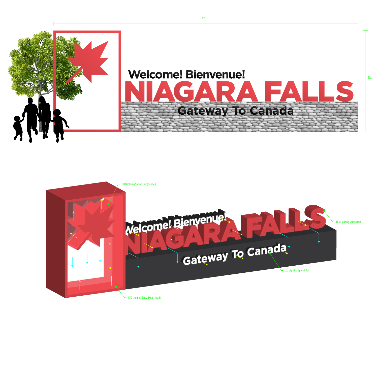
Approximately 10' by 30' sf monument in landscaped area.
Platform consisting of concrete pad with River Rock (large round stone) about 3' high and 3' deep
Shaped sign structure (similar to what we old folks would call a half barrel canopy look) to look like the top edge of a waterfall. On the returning edge I would like a Canadian Maple Leaf in all of its' glory.
I would like a large set of face lit LED letters to dominate the 6' X 30' side. The Rock doesn't need to go up that high. Give me nice bright red letters on a white back ground. Copy is Niagara Falls in upper and lower case. Simple but elegant font.
The maple leaf could be white on a red band that continues across the front under the Niagara Falls letters. In that front red band, give me white letters reading Welcome! Bienvenue! And to the right of these letters I would like a 4' X 12' X 10mm RGB message centre.
On the display, pick any number of high res professional photos of the falls with the various phrases or slogans listed and with one shown.
- Gateway To Canada
- Honeymoon Capital of The World
- be nf
- Canada's Play Place
- Taste - Hear - See - Feel - Smell
I would like to see water coming out from above and over the stones and would think that supplementary flood lighting of the rocks and water would be cool.
Client is looking for a landmark sign not unlike the Hollywood sign, Welcome to Los Vegas sign or the Toronto civic centre sign.
Thanks,
Ken
Actualizaciones
Project Deadline Extended
Reason: Want to give another day or two to finish up in case someone just didn't quite finish on time.
Also, would be nice to get some feedback as to what would have motivated a better response.
Added Sunday, June 25, 2017
Objetivo del mercado(s)
Tourist resort
Tipo de industria / entidad
Concrete
Estilos de fuente para usar
Colores
Colores seleccionados por el cliente para ser utilizados en el diseño del logotipo:
Mira y siente
Cada control deslizante ilustra las características de la marca del cliente y el estilo que debe comunicar el diseño de tu logotipo.
Elegante
Atrevido
Juguetón
Serio
Tradicional
Moderno
Atractivo
Profesional
Femenino
Masculino
Vistoso
Conservador
Económico
De Alta Gama
Requisitos
Debes tener
- WOW FACTOR!
- Need I say more?
- Ok, legibility, good taste, high quality, ageless, National pride (Canada).
- Green as in environmental. LED lighting.
- Befitting monument to a National pride and a tourist Mecca.
Agradable de tener
- As above. No shortcuts.
No debería tener
- Logos, advertisers, ta picky lighting.