Branding for a Diabetic Coaching Program that is going to going to help Diabetic's with Insulin res
¿Quieres ganar un trabajo como este?
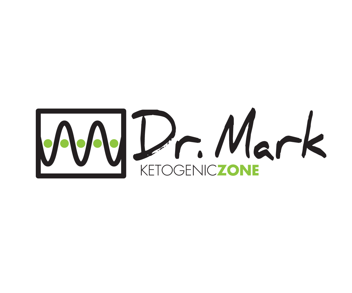
Este cliente recibió 80 diseños de logo de 28 diseñadores. Eligieron este diseño de logo de 808Miles como el diseño ganador.
Únete gratis Encuentra trabajos de diseño- Garantía
-
 US$170
-
 80 diseños
-
 28 diseñadores
Resumen de Diseño de Logo
I am looking for a CATCHY look to get people to understand that there IS a ZONE that all diabetics can get to that will help them not be dependent on SO much insulin. I am looking for a look that will be branded on books and newsletters, emails, and click funnels.
we will be using 4 primary ways to target people, and all of them will be ZONE specific. So the word Zone is a big deal
Objetivo del mercado(s)
Type 1 and Type 2 diabetics, people who are seeking to get better with their health and are diabetic.
Tipo de industria / entidad
Health Product
Texto del logo
Dr. Mark with Ketogenic Zone incorporated into it.
Estilos de logo de interés
Logo abstracto
Conceptual / simbólico (texto opcional)
Estilos de fuente para usar
Colores
Colores seleccionados por el cliente para ser utilizados en el diseño del logotipo:
Mira y siente
Cada control deslizante ilustra las características de la marca del cliente y el estilo que debe comunicar el diseño de tu logotipo.
Elegante
Atrevido
Juguetón
Serio
Tradicional
Moderno
Atractivo
Profesional
Femenino
Masculino
Vistoso
Conservador
Económico
De Alta Gama
Requisitos
Debes tener
- I want Dr. Mark to stick out different than the website name.
- A catchy look...one that is bold in concept.
- I am not sure if I want to add the .com to the end of the words: Ketogenic Zone.
- Or let the word Ketogenic Zone stand on it's own.
Agradable de tener
- look at how i laid out the words ketogenic zone on the image i sent over and where a cool graphic could fit. i would like to have something like a target or arrow to be used for the graphic....a good graphic is what we will use in all of the emails we use.
- I have sent over a font that i thought looked good...and not so "normal like others"
- it's called Nexa Rust Slab Black Shadow 01 Free
- it has some dimension to it....
No debería tener
- I don't want this to be flimsy looking.
- I don't want this to look like a cookie-cutter thing.
- I have sent over a font that i thought looked good...and not so "normal like others"
- I am not sure if I want a typewriter looking font for Dr. Mark or a handwritten font.