Private Investment Capital Company Needs an Iconic Logo Design
¿Quieres ganar un trabajo como este?
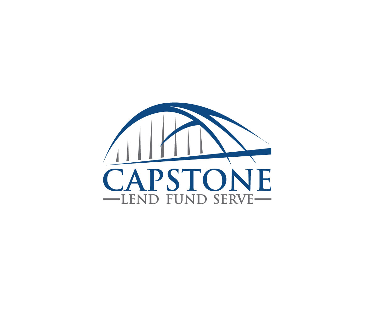
Este cliente recibió 161 diseños de logo de 36 diseñadores. Eligieron este diseño de logo de Spark Bird Tree como el diseño ganador.
Únete gratis Encuentra trabajos de diseño- Garantía
-
 US$250
-
 161 diseños
-
 36 diseñadores
Resumen de Diseño de Logo
We are looking for a logo that is iconic… representative of our industry: sleek, financial, powerful, symbolic but with a clean, tech industry edge that is instantly recognizable at first glance. Many modern companies use all lower case so we are open to that for sure… but not married to the idea if CAPITAL letters flow better with other elements we desire to be displayed. Our company provides investment capital primarily for real estate projects that is sometimes called “bridge funding”.
By symbolic we basically mean 2 things:
(1) Symbolic of the word “Capstone”: the capstone is traditionally a stone that “caps” a wall or monument (for instance, the piece that sits atop the pyramids as an example).
(2) Symbolic of a “bridge” and Austin, Tx: In this case, we would like to see an original interpretation of the iconic Pennybacker Bridge (aka the “360 Bridge”) in Austin, Texas as the “CAP” in our logo. Our investment funding is often a bridge for businesses
The “bridge” pic is from a logo of a charity group we are affiliated with… it is an original artistic interpretation of the 360 Bridge (I have also attached several pics of that bridge to inspire you.) While we can’t use the exact interpretation of the bridge logo pic, we would love to see you catch the same vibe they did. That’s why we are attaching several “actual” pictures of the bridge from different angles.
***Just a side note, we do like the idea of the bridge being TWO colors – one for the suspension arches and one for the road.
WARNING ABOUT THE CONCEPT/MOCK-UP LOGOS: We have attached concept mock-up designs so we could get a clearer picture of what we are trying to go for and I have verbally laid out what those look like… These were very “simply” put together and I have debated even attaching them so you wouldn’t get locked onto an exact look and lose your creativity. But I’m going to attach a couple of them and then let you create something much better!
FAVORITE LOGO TO CLOSELY EMULATE: The Frontier logo that is attached is hands down our favorite logo we’ve gathered in our research. It clearly has the look we are after and fits most of our design desires. It seems a little “clunky” or “bulky”, almost a bit busy, and it may be all the capital letters, but it’s not super sleek. (that is the reason we attached the logo “CRUNCHFUND” because of the sleek clean look)… and also like the CRUNCHFUND logo if the word CAP and STONE were different colors and it worked well with the design, that would be cool to take a look at… Also, Like the Frontier logo… We too have 3 words we want to incorporate into our logo:
“Lend. Fund. Serve” - It is important that the words appear in this order but the periods in between the words aren’t absolutely necessary, in fact, the Frontier logo incorporates the separation of the words into the logo without periods... we like that actually, but once again, not as busy looking. Get creative.
VERY IMPORTANT: WE ARE ATTACHING OUR OWN VERY SIMPLISTIC LOGO MOCK-UPS TO HELP GIVE YOU A VISUAL OF THE “CONCEPT”. WE WERE VERY HESITANT TO ATTACH THEM BECAUSE WE DO NOT WANT TO LIMIT YOUR CREATIVITY AND LOCK YOU IN ON A CERTAIN DESIGN WITH ONLY A TWIST... BUT IF YOU CAN FIND A WAY TO TAKE THAT "CONCEPT" AND MAKE IT AWESOME IN A WAY THAT MEETS OUR DESIRES, THEN GREAT... THAT'S THE GOAL!
Color Combos of interest and we are most definitely interested in color combination you may feel led to try based on our vision and comments laid out above… it could be a combination or mixing with the colors below as well… and as I said we are open to new colors that fit the venture capital, private equity, investment, financial industries:
Blue #06569b
Green #89bd40
Gray #999999
Blue #183c57
WE ARE ALSO VERY WILLING TO LOOK AT OTHER COLORS IN THE BLUES, GREENS, GRAYS AND BLACKS...
In summary, like the Frontier logo, we want the word Capstone to be prevalent with YOUR ORIGINAL artistic interpretation of the Bridge (like the logo pic of the Bridge) as a CAP and the 3 words: Lend, Fund, Serve below in some form.
Get creative and have fun! We are always available for any questions! Can’t wait to see the drafts! Thanks!
Objetivo del mercado(s)
Our target market is wealthy investors looking to invest in real estate AND client borrowers who are builders, developers, rehab contractors and experienced construction experts
Tipo de industria / entidad
Investment
Texto del logo
Capstone Lend Fund Serve
Estilos de logo de interés
Logo pictórico / combinado
Un objeto del mundo real (texto opcional)
Mira y siente
Cada control deslizante ilustra las características de la marca del cliente y el estilo que debe comunicar el diseño de tu logotipo.
Elegante
Atrevido
Juguetón
Serio
Tradicional
Moderno
Atractivo
Profesional
Femenino
Masculino
Vistoso
Conservador
Económico
De Alta Gama
Requisitos
Debes tener
- Everything is spelled out in detail in the original project description INCLUDING COLORS
No debería tener
- PLEASE SEE PROJECT DESCRIPTION