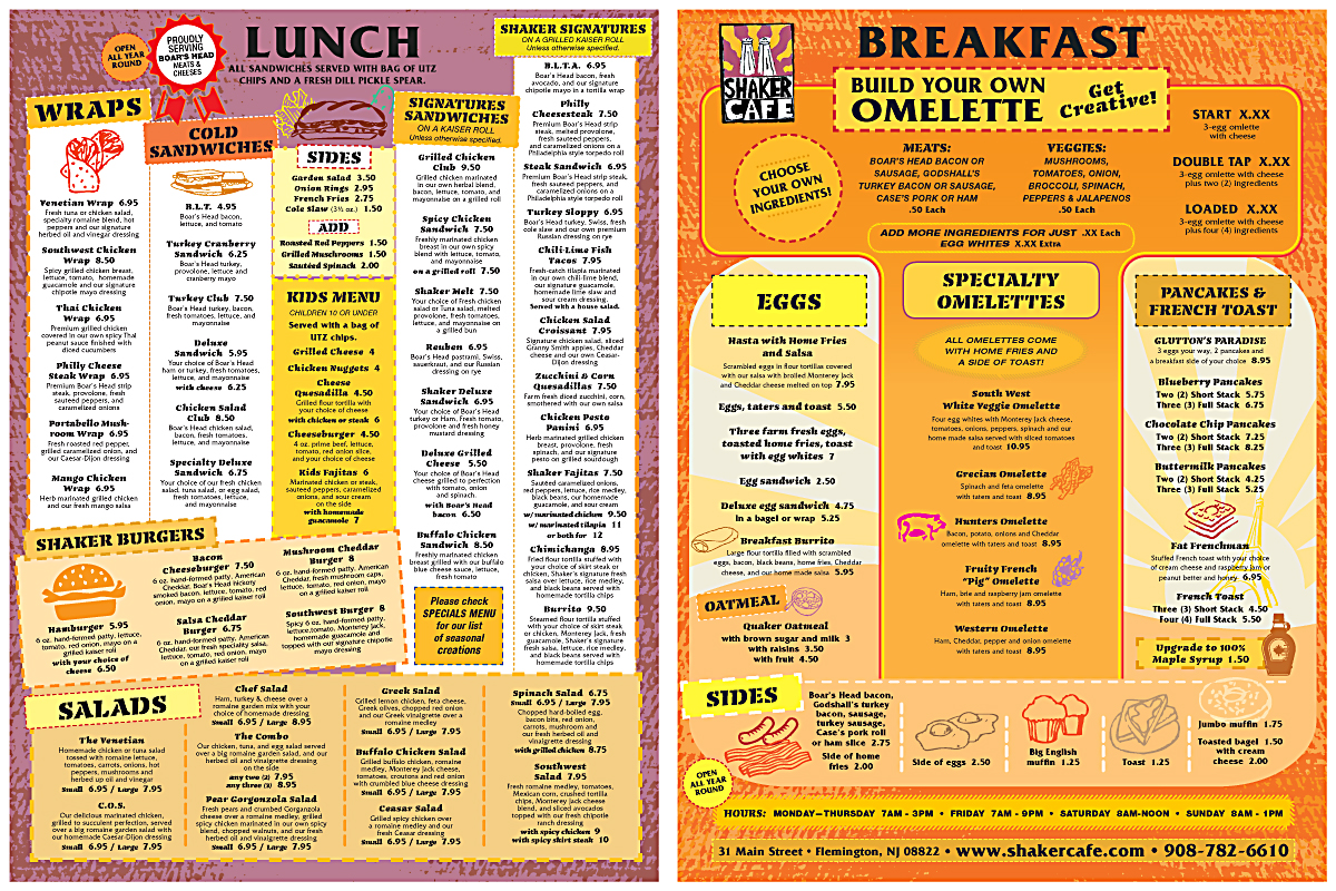
Shaker Cafe - Menu Redesign
¿Quieres ganar un trabajo como este?
Este cliente recibió 26 diseños de menú de 11 diseñadores. Eligieron este diseño de menú de PATRICK KING GRAPHICS como el diseño ganador.
Únete gratis Encuentra trabajos de diseño- Garantía
-
 US$325
-
 26 diseños
-
 11 diseñadores
Resumen de Diseño de Menú
What We Want
We're looking for a bold redesign of our current menu. Our current menu is tired and boring and does not accurately reflect our revitalization of the Shaker Cafe brand. Attachments will be submitted with the campaign for menu items.
Design Guidelines
• Creative use of typography and color. Think Bold, Fun, Loud and uninhibited.
• Fluid, easy to read, layout that emphasizes readability.
• The subtle, demure, look of typographic columns (examples below in resources)
• Creative use of 'wells' for menu item highlights as well as great boarders
• Loud typefaces as long as readability is the focus & emphasis.
• Small illustrations/icons but they must not effect or take the focus from the readability of the menu
• Big, oversized, menu that will look great on recycled paper
• Subtle watermarks/illustrations
• creative use of textures / highlights / section breaks
Menu Requirements
• 9”x12” paper size. Please notify us if your design works better in a different format.
• Oversized, designed for printing on recycled paper.
• Single Page Menu (use lunch on front and breakfast on back)
• Do not use $ or "..." in pricing. Please space all prices equally.
• Simplistic layout that emphasizes readability and logical navigation of menu items.
• Acceptable file types
• Photoshop
• Indesign
• illustrator
• Please contact us before you submit a design if you plan on using something else
• HTML/CSS would be a huge benefit. It's not a must, but it will definitely help you win the award.
• Must retain some of our current color scheme (red/orange/yellow – see attachments/website).
NOTE: Please download ALL attached resources for the project.
Actualizaciones
Current web site: www.shakercafe.com
Added Wednesday, October 30, 2013
please read attachment: shaker_menu_redesign_request.docx
Added Thursday, October 31, 2013
All,
Design Guidelines
•Creativeuse of typography and color. Think Bold,Fun, Loud and uninhibited.
•Fluid,easy to read, layout that emphasizes readability.
•Thesubtle, demure, look of typographic columns (examples below in resources)
•Creativeuse of 'wells' for menu item highlights as well as great boarders
•Loudtypefaces as long as readability is the focus & emphasis.
•Smallillustrations/icons but they must not effect or take the focus from thereadability of the menu
•Big,oversized, menu that will look great on recycled paper
•Subtlewatermarks/illustrations
•creativeuse of textures / highlights / section breaks
MenuRequirements
•9”x12”paper size. Please notify us if yourdesign works better in a different format.
•Oversized,designed for printing on recycled paper.
•SinglePage Menu (use lunch on front and breakfast on back)
•Donot use $ or "..." in pricing.Please space all prices equally.
•Simplisticlayout that emphasizes readability and logical navigation of menu items.
•Acceptablefile types
•Photoshop
•Indesign
•illustrator
•Pleasecontact us before you submit a design if you plan on using something else
•HTML/CSSwould be a huge benefit. It's not amust, but it will definitely help you win the award.
•Mustretain some of our current color scheme (red/orange/yellow – seeattachments/website).
Do Not Use
•Skeuomorphismin any way.
•Wedo not want any actual pictures of food on the menu (subtle illustrations /icons are great and encouraged).
•Typefacesthat are hard to read.
Added Tuesday, November 05, 2013
Project Deadline Extended
Reason: need to incorporate changes to menu / menu items
Added Tuesday, November 05, 2013
Please expect some new copy tonight (USA EST) for the breakfast menu items. Thanks!
chris
Added Thursday, November 07, 2013
COPY UPDATE: Please check new menu item listing (revision 3) for updated copy. Please revisit all menu items as I have grouped, consolidated, and eliminated some items.
Added Friday, November 08, 2013
DESIGN UPDATE: I added an omelette hero/jumbotron design that we'd like to use to display the omelettes on the breakfast menu. It doesn't have to be exactly like this one, it's just meant to be a guideline. Please take a look and see if you can fit it in to your design. Also, the copy has been updated for the breakfast & lunch menus.
Added Friday, November 08, 2013
Project Deadline Extended
Reason: Revised design changes not yet received.
Added Tuesday, November 12, 2013
Project Deadline Extended
Reason: Designer needs more tine to complete final submission. This will be the last extension. Thanks!
chris
Added Wednesday, November 13, 2013
Objetivo del mercado(s)
Women - 60% or more. Mostly professionals. 18-55.
Men - Professionals mostly. Judges, Attorneys, Agents, Ect. Ages 18-55.
Tipo de industria / entidad
Printing
Colores
Colores seleccionados por el cliente para ser utilizados en el diseño del logotipo:
Mira y siente
Cada control deslizante ilustra las características de la marca del cliente y el estilo que debe comunicar el diseño de tu logotipo.
Elegante
Atrevido
Juguetón
Serio
Tradicional
Moderno
Atractivo
Profesional
Femenino
Masculino
Vistoso
Conservador
Económico
De Alta Gama
Requisitos
Debes tener
- see menu requirements in task description.
Agradable de tener
- Design Ideas We Love
http://www.underconsideration.com/artofthemenu/archives/brickhouse_tavern.php
We like: typefaces, typographic columns & layout, use of butcher-block print, simplicity
We don't like: lack of bold, color lack of textures, lack of general vitality in the brand, no use of icons/illustrations
http://www.underconsideration.com/artofthemenu/archives/burgatory_bar.php
We like: typefaces, bold headers & section breaks, texturized typefaces, use of illustrations, and specifically we love how they did the 'custom creation' menu
We don't like: lack of bold color, lack of subtle texturing, little more use of illustrated icons would be nice
http://www.underconsideration.com/artofthemenu/archives/the_kickin_chicken.php
We like: use of bold colors, organization & layout, the section highlights are nice
We don't like: lack of textures, lack subtle illustrations/icons.
http://www.underconsideration.com/artofthemenu/archives/manchester_press.php
We like: use of textures, typefaces, layout & organization, single page menu
We don't like: lack of textures, lack of bold color, lack of icons and menu item hightlights
http://www.underconsideration.com/artofthemenu/archives/cozmo_caf.php
We like: use of texturing, typesfaces, layout & organization, creative use of illustrations/icons, bold colors
We don't like: not a huge fan of the bordering; and illustrations take up too much room for single page menu
http://www.underconsideration.com/artofthemenu/archives/for_enden_af_gaden.php
We like: creative use of typefaces, organization & layout, cool illustrations, oversized menu, section seperators are cool & unique
We don't like: lack of textures, menu items inside illustrations, typefaces can get hard to read in certain areas
No debería tener
- Do Not Use
• Skeuomorphism in any way.
• We do not want any actual pictures of food on the menu (subtle illustrations / icons are great and encouraged).
• Typefaces that are hard to read.