Re-Branding of Label for Natural Animal Supplement Company
¿Quieres ganar un trabajo como este?
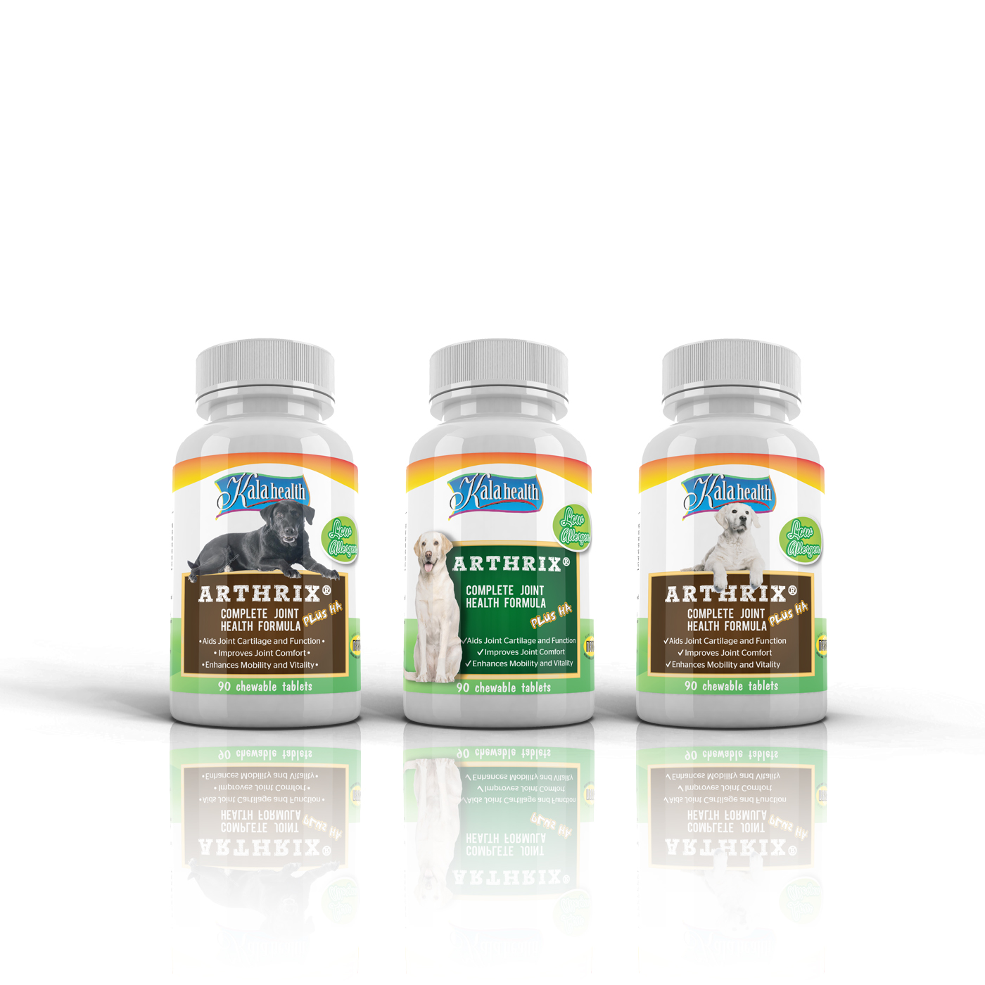
Este cliente recibió 36 diseños de viñeta de 10 diseñadores. Eligieron este diseño de etiqueta de Shark1 como el diseño ganador.
Únete gratis Encuentra trabajos de diseño- Garantía
-
 US$270
-
 36 diseños
-
 10 diseñadores
Resumen de Diseño de Etiqueta
We have been using the same label for over 20 years and its time for a change. Currently are using the same label with same colors for multiple products and just changing the name on the label. We are looking to update and breathe new life into the brand starting with our labels.
At this stage we are looking simply for ideas and concepts for the overall project. Once we find a "design concept" that works for us we would like to work with that designer and move through the entire product line.
Attached to this brief is images of our products as well as one of our competitors, Lintbells. We like the product line design that they have.
Objetivo del mercado(s)
We recognize that 85% of our customers are woman who LOVE their pets and we want to tailor our branding to be attractive to them.
Tipo de industria / entidad
It Company
Estilos de fuente para usar
Colores
Diseñador para elegir los colores que se utilizarán en el diseño.
Mira y siente
Cada control deslizante ilustra las características de la marca del cliente y el estilo que debe comunicar el diseño de tu logotipo.
Elegante
Atrevido
Juguetón
Serio
Tradicional
Moderno
Atractivo
Profesional
Femenino
Masculino
Vistoso
Conservador
Económico
De Alta Gama
Requisitos
Debes tener
- The labels/brand image must relay that we focus on All-Natural Products but also that we have a 20 year history of helping animals
- * We want to keep the basic Kala Health Logo
- * Currently the labels only have an image of a small dog and cat around the logo. We really would like to see a image of a dog (a different dog for each bottle, but at this time we only need to pick one for this original concept)
- * One of our key distributors insights were that because the bottles sit on shelves the image of the dog face should be "strong" i.e. evoke emotions that draw you in
- * When choosing the dog or a dog face we just need to be sure other images like it are available so that we have stock images for other bottle designs.
Agradable de tener
- I think we need to somehow keep the essence of the original label so that it does not look like and entirely new product label.....only because there is brand equity and recognition in the existing labels
No debería tener
- At this point in the project we are really OPEN to anything. We just need to see concepts of where this could go.