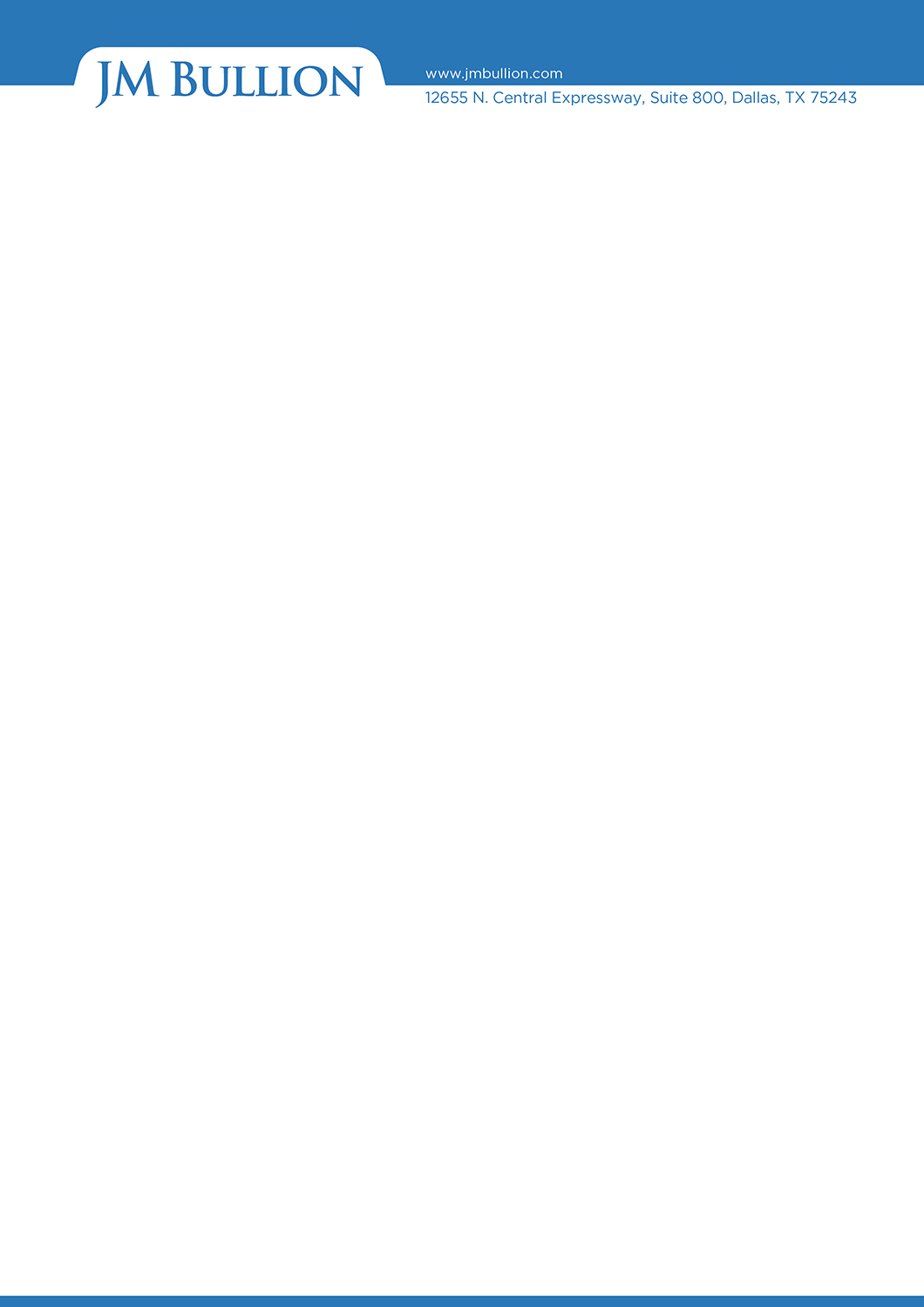
JM Bullion Corporate Letterhead

¿Quieres ganar un trabajo como este?
Este cliente recibió 15 diseños de papel membretado de 4 diseñadores. Eligieron este diseño de membrete de KabhTech Studio como el diseño ganador.
Únete gratis Encuentra trabajos de diseño- Garantía
Resumen de Diseño de Membrete
I have a corporate logo (uploaded). However, it may not be high enough quality for printing purposes, so the logo may need some work. I have a sample of letterhead (uploaded) that we currently use for electronic purposes only. The new design for letterhead does NOT need to look like the current electronic version -- in fact, I would prefer it doesn't. Additionally, I would like to be able to print this through moo.com. If your design includes something on the reverse side of the paper, that's okay (even cool!) -- moo.com can easily handle the printing of this. In summary I would like a letterhead design for print purposes, as well as an electronic version of the letterhead (to replace our current version) that can be used with Microsoft Word. Also, if you want to see how the logo on our website looks, go to www.jmbullion.com.
Tipo de industria / entidad
Printing
Colores
Colores seleccionados por el cliente para ser utilizados en el diseño del logotipo:
Mira y siente
Cada control deslizante ilustra las características de la marca del cliente y el estilo que debe comunicar el diseño de tu logotipo.
Elegante
Atrevido
Juguetón
Serio
Tradicional
Moderno
Atractivo
Profesional
Femenino
Masculino
Vistoso
Conservador
Económico
De Alta Gama
Requisitos
Debes tener
- At least the front side of a letterhead design using our current logo. A backside of the letterhead is optional. Must be able to print through moo.com. Also must have an electronic version of the final design to use with Microsoft Word. Also, if the logo I uploaded isn't high enough quality, the logo will need to be enhanced for printing purposes. The color that I picked on DesignCrowd's color wheel may not be the correct blue, so feel free to change that if necessary. Also, the address and website address can be in a contrasting color chosen by the designer.
Agradable de tener
- I like original ideas/designs. So have fun with it!
No debería tener
- Colors that are not in our current logo. If you would like to view it on our website, got to www.jmbullion.com