Major Australian Food and Wine Event Web Design Project
¿Quieres ganar un trabajo como este?
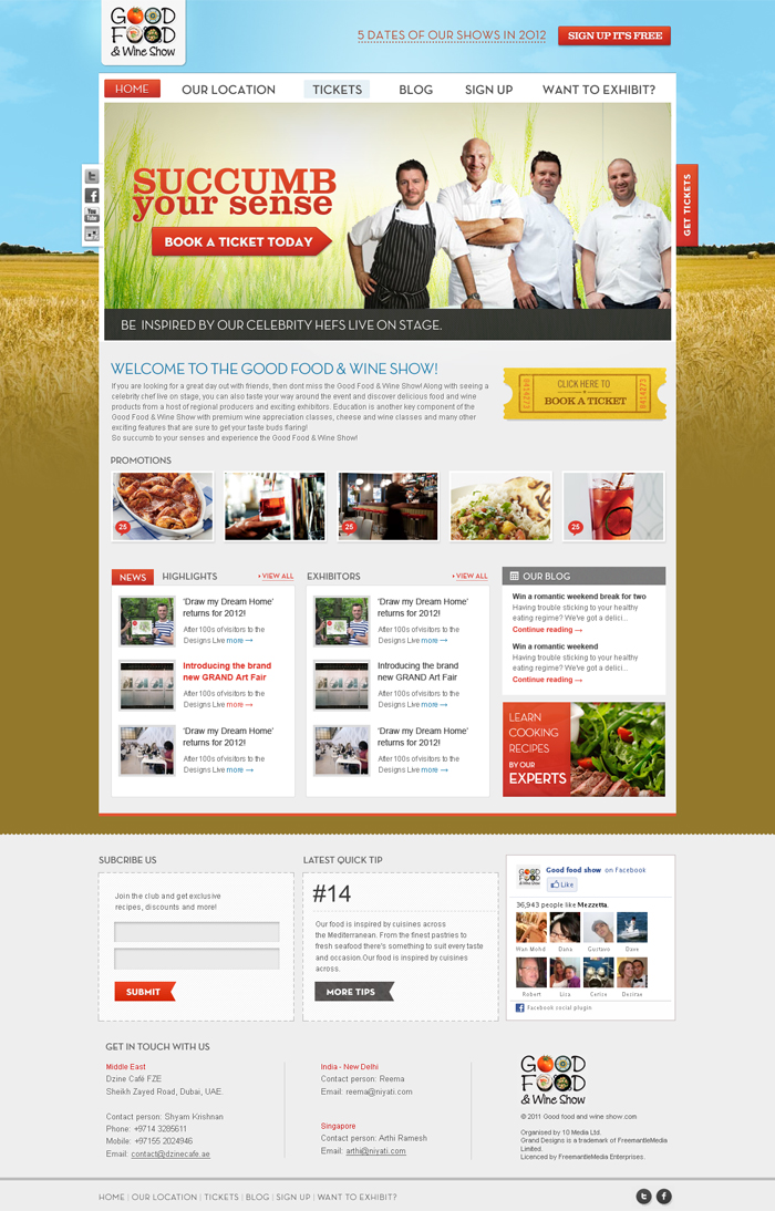
Este cliente recibió 76 diseños web de 20 diseñadores. Eligieron este diseño web de the-lion-king como el diseño ganador.
Únete gratis Encuentra trabajos de diseño- Garantía
-
 A$1460
-
 76 diseños
-
 20 diseñadores
Resumen de Diseño Web
The project will consist of 3 designs
The homepage
A city hub page
A general content page
The main audience who will visit the website will be (in Order of importance:
1) Visitors
- Mainly women 24 – 54 years (they are the main ticket buyers)
- In a relationship – so will go to the show with their partner
- In a good paying job or home maker – and who have disposable income to spend $30 a ticker
- Enjoy food, wine and going out
- Looking for a fun day out – although an event that is about food and wine – it is an event that most people will go to and have a fun day out – not too pretentious
A smaller proportion of the audience will be:
2) Exhibitors & sponsors ( both prospective and existing)
3) Media
Objectives:
- Functionality on home page and sub pages needs to be updated, clear, easy to navigate and inject a sense of ‘fun’ – need to make it look more professional
- Need to incorporate the many things that need to be on the home page and sub pages in a visually appealing manner
- Ensure the ‘Cons’ above are considered and reflected in functionality and design
- To not be too focus on the colours (these can be changed) – but focus on the functionality and overall design opportunities.
Approach:
Keywords to describe the Good Food & Wine Show:
Fun day out, discover, learn, indulge, entertaining
Other website examples:
Some great consumers event websites from the UK really make our website look basic and juvenile – and below are some examples of the presentation of how we would like our website to look like:
http://www.tastefestivals.com/london/ This website is clean, includes good social media integration and exudes a sense of fun. Their content pages, such as the features landing page also presents options in a clear and visually appealing way with a series of boxes including image and text http://www.tastefestivals.com/london/content/343/Features
http://www.granddesignslive.com/ - this is also a great website – and it incorporates all the elements we would be looking for on our homepage – but the background/skin also includes a sense of fun and cheekiness. Subpages also are consistent.
Features
• Its a fun day that offers great value for money
• Caters to all visitors, regardless of different levels of knowledge or interest in food, wine and cooking.
• Sample great quality food and wine products from hundreds of reputable exhibitors
• Learn more through many of the shows feature activities (Celeb Theatre, Wine Theatre, Cooking & Cheese Classes)
Functionality & Structure:
In a user friendly, easy to view way, we need to incorporate the following functionality elements on home page:
- main header (that will incorporate our current creative) with a ‘fun’ skin
- navigation tabs/references (hone, location, tickets, blog, sign up, exhibitors)
- navigation/content banner (rotating)
- Area for small intro about the show
- News and highlight section
- New exhibitors section
- Obvious Ticket call to action
- Obvious sign up call to action
- Social media buttons or links ( really like the moving gifs on the Grandesignslive.com site
- area for advertising (MREC size) to sell to exhibitors/sponsors
- Show dates for all 5 shows (maybe in main header)
Subpage layout is also important and needs to reflect the homepage – so would also like to see examples of how this would look and tie in with navigation – we generally have a lot of content on these pages, so clear navigation would be useful. – see below for further details of functionality for city Hubs
‘CITY HUB’ BRIEF
When navigating to each location the user will be taken to a ‘CITY HUB’ which should replicate design and content elements of a main HOME page, as well as reflect more specific information for each Show. Elements which must appear on this page are:
• FEATURES – which may be displayed in categories (in boxes, see appendix 1.0) which will link through to relevant content pages. Or in one box which will link through to a features page with all presented in boxes
• CHEFS – may be displayed as a separate icon box which will link to chefs page with bios, Celeb Theatre timetable etc.
• TICKETS – either a button or clear callout to purchase tickets
• PLAN YOUR DAY – may be displayed in a separate content box which will then link through to getting there, sample itineraries and downloadable pocket show guide for visitors to print before coming to the Show.
• WHO’S EXHIBITING – to link back to city specific exhibitor lists
Our current website is out of date and has the following inadequacies (www.goodfoodshow.com.au) -
The project will consist of 3 designs
The homepage
A city hub page
A general content page
The main audience who will visit the website will be (in Order of importance:
1) Visitors
- Mainly women 24 – 54 years (they are the main ticket buyers)
- In a relationship – so will go to the show with their partner
- In a good paying job or home maker – and who have disposable income to spend $30 a ticker
- Enjoy food, wine and going out
- Looking for a fun day out – although an event that is about food and wine – it is an event that most people will go to and have a fun day out – not too pretentious
A smaller proportion of the audience will be:
2) Exhibitors & sponsors ( both prospective and existing)
3) Media
Objectives:
- Functionality on home page and sub pages needs to be updated, clear, easy to navigate and inject a sense of ‘fun’ – need to make it look more professional
- Need to incorporate the many things that need to be on the home page and sub pages in a visually appealing manner
- Ensure the ‘Cons’ above are considered and reflected in functionality and design
- To not be too focus on the colours (these can be changed) – but focus on the functionality and overall design opportunities.
Approach:
To be perceived as a fun, entertaining event with something for everyone - website creative and navigation must reflect this.
Keywords to describe the Good Food & Wine Show:
Fun day out, discover, learn, indulge, entertaining
Other website examples:
Some great consumers event websites from the UK really make our website look basic and juvenile – and below are some examples of the presentation of how we would like our website to look like:
http://www.tastefestivals.com/london/ This website is clean, includes good social media integration and exudes a sense of fun. Their content pages, such as the features landing page also presents options in a clear and visually appealing way with a series of boxes including image and text http://www.tastefestivals.com/london/content/343/Features
http://www.granddesignslive.com/ - this is also a great website – and it incorporates all the elements we would be looking for on our homepage – but the background/skin also includes a sense of fun and cheekiness. Subpages also are consistent.
Features
• Its a fun day that offers great value for money
• Caters to all visitors, regardless of different levels of knowledge or interest in food, wine and cooking.
• Sample great quality food and wine products from hundreds of reputable exhibitors
• Learn more through many of the shows feature activities (Celeb Theatre, Wine Theatre, Cooking & Cheese Classes)
Functionality & Structure:
In a user friendly, easy to view way, we need to incorporate the following functionality elements on home page:
- main header (that will incorporate our current creative) with a ‘fun’ skin
- navigation tabs/references (hone, location, tickets, blog, sign up, exhibitors)
- navigation/content banner (rotating)
- Area for small intro about the show
- News and highlight section
- New exhibitors section
- Obvious Ticket call to action
- Obvious sign up call to action
- Social media buttons or links ( really like the moving gifs on the Grandesignslive.com site
- area for advertising (MREC size) to sell to exhibitors/sponsors
- Show dates for all 5 shows (maybe in main header)
Subpage layout is also important and needs to reflect the homepage – so would also like to see examples of how this would look and tie in with navigation – we generally have a lot of content on these pages, so clear navigation would be useful. – see below for further details of functionality for city Hubs
‘CITY HUB’ BRIEF
When navigating to each location the user will be taken to a ‘CITY HUB’ which should replicate design and content elements of a main HOME page, as well as reflect more specific information for each Show. Elements which must appear on this page are:
• FEATURES – which may be displayed in categories (in boxes, see appendix 1.0) which will link through to relevant content pages. Or in one box which will link through to a features page with all presented in boxes
• CHEFS – may be displayed as a separate icon box which will link to chefs page with bios, Celeb Theatre timetable etc.
• TICKETS – either a button or clear callout to purchase tickets
• PLAN YOUR DAY – may be displayed in a separate content box which will then link through to getting there, sample itineraries and downloadable pocket show guide for visitors to print before coming to the Show.
• WHO’S EXHIBITING – to link back to city specific exhibitor lists
Our current website is out of date and has the following inadequacies (www.goodfoodshow.com.au) -
- Dated design/layout
- Homepage too text heavy
- No content boxes that can be used for different features/areas (eg. News, Exhibitors etc)
- Uninspiring colours and skin(eg. grey background), does not reflect ‘a fun day out’
- Limited presence of social media platforms and lacks ‘community’
- No continuity in sub pages
- main banner too big – takes up too much space on homepage
Actualizaciones
Project Deadline Extended
Added Friday, February 03, 2012
Tipo de industria / entidad
Advertising
Mira y siente
Cada control deslizante ilustra las características de la marca del cliente y el estilo que debe comunicar el diseño de tu logotipo.
Elegante
Atrevido
Juguetón
Serio
Tradicional
Moderno
Atractivo
Profesional
Femenino
Masculino
Vistoso
Conservador
Económico
De Alta Gama
Requisitos
Debes tener
- As per above brief.
In addition:
Floating social media buttons on side
Wrap around image
Drop down menu (specifically for the location nav item)
To be perceived as a fun, entertaining event with something for everyone - website creative and navigation must reflect this.