New design for our charity business cards
¿Quieres ganar un trabajo como este?
Este cliente recibió 24 diseños de tarjeta de presentación de 4 diseñadores. Eligieron este diseño de tarjeta de presentación de Sandaruwan como el diseño ganador.
Únete gratis Encuentra trabajos de diseño-
 US$60
US$60
-
 24 diseños
-
 4 diseñadores
Resumen de Diseño de Tarjeta de Presentación
We are a small (but highly effective) suicide prevention charity in Australia looking to improve our brand. We recently rebranded in 2016 and have a new name and logo, but need new business cards designed. We are looking for something modern, bright, corporate, clean, cutting edge. It needs to work for the corporate sector, as thats to whom we are appealing for funding, but also to govt and public.
You have quite a free reign to design something cool, modern and a bit different. Use of logo is flexible - so show all or part, and get rid of or change the use of words underneath the logo. e.g. Drop second line (shown in grey) and just use name in one colour, or don't use name at all. Ok to use partial logo, for example ending off the card so its just strongly implied and not fully visible. Try us - we're looking for artistic!
Actualizaciones
Project Deadline Extended
Reason: Won't be able to complete this on 15th Aug so may as well give people more time for more designs. Many thanks.
Added Tuesday, August 15, 2017
Objetivo del mercado(s)
Corporate funders, therefore large multinationals and govt. Want to convey strength and professionalism despite very small organisation behind the scenes.
Tipo de industria / entidad
Charity
Información de contacto para la tarjeta del negocio
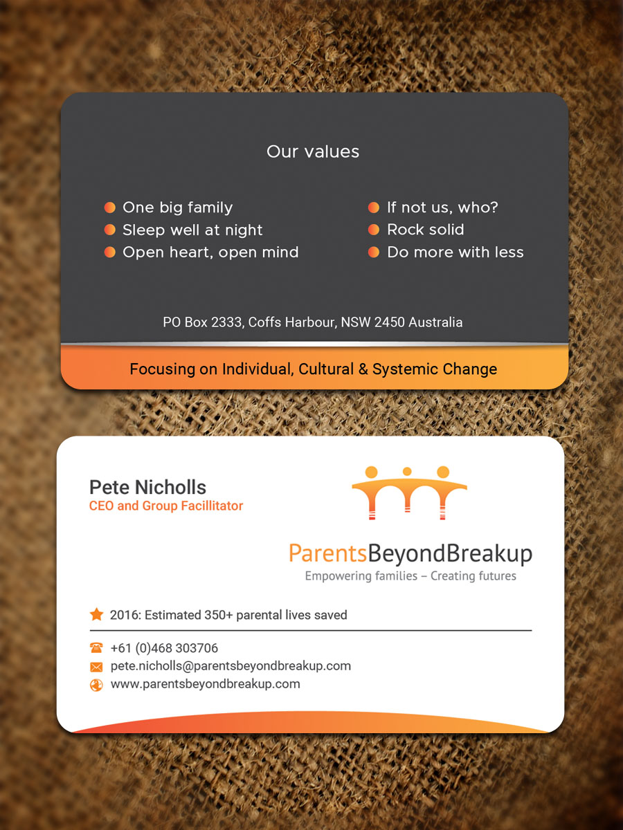
Pete Nicholls
CEO
Parents Beyond Breakup
+61 (0)468 303706
pete.nicholls@parentsbeyondbreakup.com
www.parentsbeyondbreakup.com
Estilos de fuente para usar
Colores
Diseñador para elegir los colores que se utilizarán en el diseño.
Mira y siente
Cada control deslizante ilustra las características de la marca del cliente y el estilo que debe comunicar el diseño de tu logotipo.
Elegante
Atrevido
Juguetón
Serio
Tradicional
Moderno
Atractivo
Profesional
Femenino
Masculino
Vistoso
Conservador
Económico
De Alta Gama
Requisitos
Debes tener
- Rear of card should list our organisational values and our address, so that the front is a cleaner, minimal design. Values (bolder) and address (subtle) are:
- One big family
- Sleep well at night
- Open heart, open mind
- If not us, who?
- Rock solid
- Do more with less
- PO Box 2333, Coffs Harbour, NSW 2450 Australia
- The values might be floating and in background, as long as legible. Use of different shades for the values could work too.
- If there is room, and putting too much on the back of the card is not a problem, then adding our strategy would be great as well. This is:
- Focus: Individual, Cultural, Systemic.
Agradable de tener
- Minimal colours, definitely the logo Ochra (colour of Australian earth) but then perhaps shades of grey to black only, alongside this.
- Am ok with having partial logo, meaning it goes off the card or use of just the curves - no need for entire logo to be displayed. The logo can be 'implied' if not fully displayed, but should be obviously branded as PBB due to enough of the logo showing. Happy for full logo to be showing too. Just want to give artists / designers free reign to go a bit funky, as far as thats possible with a corporate card!
- Please remove last grey line from logo if using whole logo, as that is now superfluous and not used. Also, the name 'Parents Beyond Breakup' under the image of the logo can be one colour for a cleaner look - so either ochre to match logo of some greyscale.
No debería tener
- Cannot have anything that is gender specific as we support mums, dads, kids, same sex parents - thats why our logo implies two parents and a child but the parents gender cannot be seen and the colours represent Australia (ochre soil) versus something that might be associated with a gender.