Bring our Interclub Association into the modern age - Figure Skating!!
¿Quieres ganar un trabajo como este?
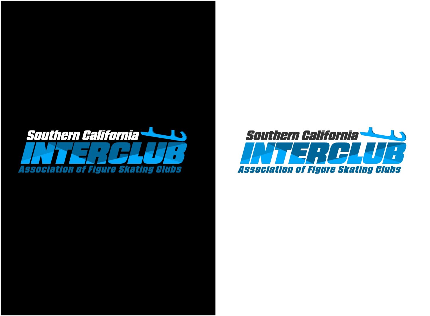
Este cliente recibió 34 diseños de logo de 4 diseñadores. Eligieron este diseño de logo de Kero como el diseño ganador.
Únete gratis Encuentra trabajos de diseño-
 US$225
-
 34 diseños
-
 4 diseñadores
Resumen de Diseño de Logo
We are trying to adopt a new Logo for an association of Figure Skating clubs in Southern California. The chair hates all the California Cliches (Sun, Beach, Etc), so the board opted to go with a stylized version of our Name and forgo a "picture". We want it to imply skating/ice without being too literal. It will need to be printed on various paperwork, as well as possibly embroidered or screen printed on items we give away/sell. Our full name is very long - but on a day-to day basis, locally, we are just "Interclub". We do need the rest of the name to distinguish ourselves from all the other Interclubs around the country, but it does not need to be the focus. The two final images we liked of what the committe drafted are attached. The debates we are having and need professional eyes and advise on are: 1) should the words be centered; or left justified. 2) What will the logo look like if we use it without the graduated blue oval (since we know that will not work well in some applications). 3) Is there a way to have a more interesting font that the stock ones we have access to. 4) Can a real artist draw the bade better/with a suggestion of the toe picks. 5) are we missing something way better because we have no idea what we are doing ? I also uploaded the OLD logo (globe with a lot of junk piled in front, with bad resolution) - so you can see where we started. In the 50's. That is where we started!!!
Actualizaciones
Project Deadline Extended
Reason: We had no idea we woud love so many things!!! Part of our committe is working during the week - so I want to add some more days (and another weekend) so they are all able to see everything!!!
Added Monday, August 14, 2017
Objetivo del mercado(s)
Parents (20-25 year olds) and Skaters (5-21 year olds). Sponsors (businesses who donate goods or services.
Texto del logo
Southern California Interclub Association of Figure Skating Clubs.
Estilos de logo de interés
Logo abstracto
Conceptual / simbólico (texto opcional)
Logo de marca de nombre
Logotipo basado en palabra o nombre (solo texto)
Estilos de fuente para usar
Colores
Colores seleccionados por el cliente para ser utilizados en el diseño del logotipo:
Mira y siente
Cada control deslizante ilustra las características de la marca del cliente y el estilo que debe comunicar el diseño de tu logotipo.
Elegante
Atrevido
Juguetón
Serio
Tradicional
Moderno
Atractivo
Profesional
Femenino
Masculino
Vistoso
Conservador
Económico
De Alta Gama
Requisitos
Debes tener
- The full name of the organization. Some reference linking us to figure skating - even if "impressionistic".
Agradable de tener
- A feel of smooth motion/movement. I suggested colors - but we are open to your suggestion on that.
No debería tener
- Any California Cliches: Palm Trees, Beaches, Flip-Flops, etc...