rework current logo's + add new one same style
¿Quieres ganar un trabajo como este?
Este cliente recibió 31 diseños de logo de 9 diseñadores. Eligieron este diseño de logo de Freddie Paul como el diseño ganador.
Únete gratis Encuentra trabajos de diseño- Garantía
-
 €100
€100
-
 31 diseños
-
 9 diseñadores
Resumen de Diseño de Logo
Rework current logo's :
- thickness of box symbol must be aligned with non bold character font drawing line's thickness
- be mindful of white spacing in symbol, we think it is better this is uniformed spaced (beginning, end and side/top size face)
- respect uniform spacing and gridlines over the total logo (text top & bottom should be aligned to top & bottom of the sides heights of the logo symbol
- new logo based on same design guidelines for product name "Tablethousing.com" (tablet in bold)
- size of symbol part and font size should be same for 3 variations
- input is requested how visually the right alignement vertically is done between first symbol part and text part.
Current logo's need to be put also in vector format.
Obviously is everbody with a bright out-of-the-box idea welcome : we are open for it
Actualizaciones
Project Deadline Extended Reason: No realistic deadline. Sorry for this. Added Sunday, September 17, 2017
Texto del logo
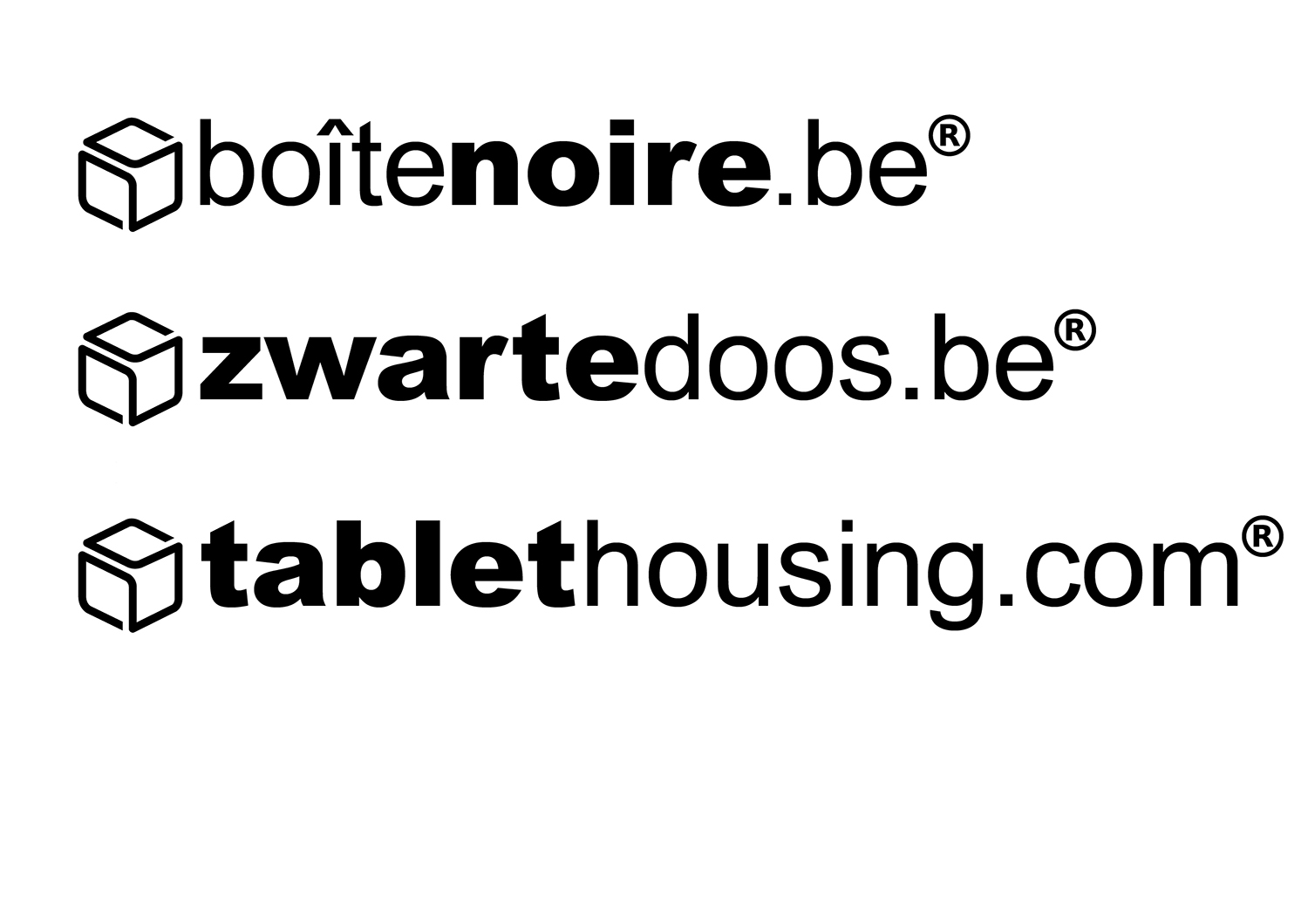
See current enclosed logo's. (zwartedoos.be, boîtenoire.be, tablethousing.com)
Estilos de logo de interés
Logo abstracto
Conceptual / simbólico (texto opcional)
Estilos de fuente para usar
Gustan otros estilos de fuente:
- Arial & Arial Black
Mira y siente
Cada control deslizante ilustra las características de la marca del cliente y el estilo que debe comunicar el diseño de tu logotipo.
Elegante
Atrevido
Juguetón
Serio
Tradicional
Moderno
Atractivo
Profesional
Femenino
Masculino
Vistoso
Conservador
Económico
De Alta Gama
Requisitos
No debería tener
- Color