Logo Design for Online Course
¿Quieres ganar un trabajo como este?
Este cliente recibió 109 diseños de logo de 41 diseñadores. Eligieron este diseño de logo de :) como el diseño ganador.
Únete gratis Encuentra trabajos de diseño-
 US$150
-
 109 diseños
-
 41 diseñadores
Resumen de Diseño de Logo
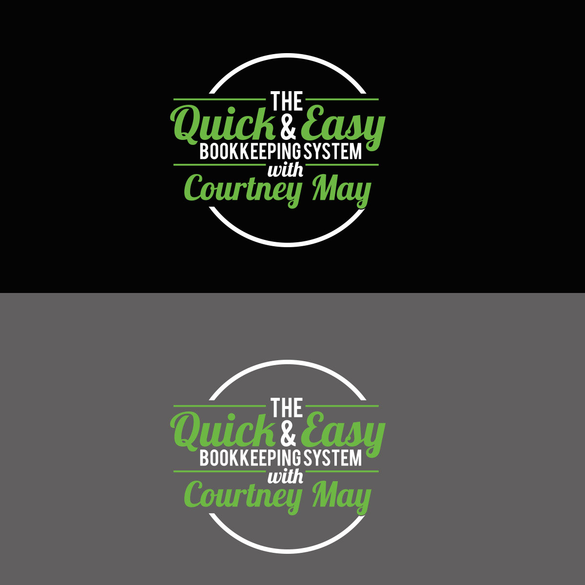
I need a logo for an online course I created. The course is called "The Quick & Easy Bookkeeping System with Courtney May". I have attached a logo that I like from another course that implements the instructor's name. I like this logo a lot and I would like to use the same mixture of fonts that this designer used. Obviously I do not want to copy this logo exactly but I like the way it pops off the page, is very dynamic and strong. Since I am a QuickBooks ProAdvisor I use the QuickBooks green in my logo for my business and I would like to implement this same shade of green where you see red in the other logo I attached. I would like to see the wording as white and also maybe another color that would accent the QuickBooks green (maybe black). Please give me options on the coloring. You can see the QuickBooks logo and color at this website: https://quickbooks.intuit.com/ .
Actualizaciones
Project Deadline Extended
Reason: I need more time to decide. Thank you for your efforts.
Courtney
Added Thursday, November 2, 2017
Objetivo del mercado(s)
Business owners/entrepreneurs looking for an easy to follow bookkeeping system.
Tipo de industria / entidad
Online
Texto del logo
The Quick & Easy Bookkeeping System with Courtney May
Estilos de fuente para usar
Gustan otros estilos de fuente:
- I like the combination of fonts or something similar to the logo I attached for "Courses That Convert"
Colores
Diseñador para elegir los colores que se utilizarán en el diseño.
Mira y siente
Cada control deslizante ilustra las características de la marca del cliente y el estilo que debe comunicar el diseño de tu logotipo.
Elegante
Atrevido
Juguetón
Serio
Tradicional
Moderno
Atractivo
Profesional
Femenino
Masculino
Vistoso
Conservador
Económico
De Alta Gama
Requisitos
Debes tener
- All the words in the "Logo Text". The word "The" can be smaller. Please see the logo for "Courses That Convert" that I attached as a great example.
No debería tener
- I would think with so many words in the logo that it would be better not to have too many graphics. I will let you make that call.