Mobile Marketing Business needs a UNIQUE web design that makes users stop, adore and engage!
¿Quieres ganar un trabajo como este?
Este cliente recibió 65 diseños web de 15 diseñadores. Eligieron este diseño web de Fielding Ideas como el diseño ganador.
Únete gratis Encuentra trabajos de diseño- Garantía
-
 US$855
-
 65 diseños
-
 15 diseñadores
Resumen de Diseño Web
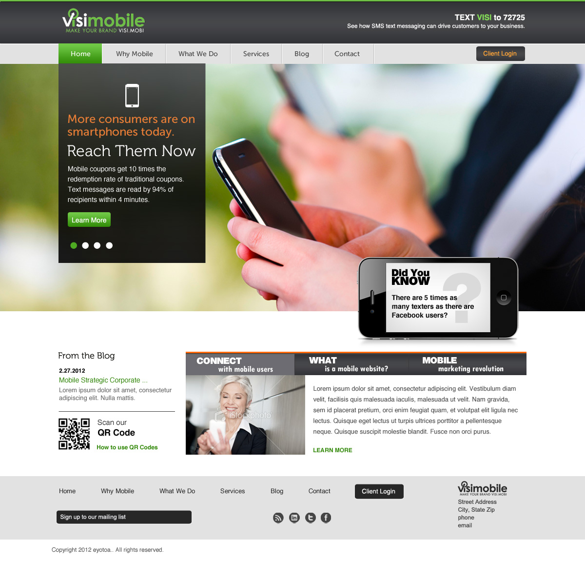
Unique web design for a new division of our company. Based in Los Angeles, VisiMobile is a mobile marketing company offering mobile optimized websites, sms marketing, strategic and analytic consultation services. We are a b2b model targeting a wide range of industries and business sizes. Our parent company is Visibility Online. Visimobile needs to reflect a progressive nature, confidence, and experience - yet affordable to any business that wants to reach the mobile consumer. We want to avoid a dark website or one that is too bland. The colors should be strong, yet not overly so.
Layout should be clean, focused, - avoiding a cluttered home page. Visitors should recognize WE ARE mobile marketing - it should resonate that WE differ from competitors - Site design should resonate our brand! We've noticed competitors sites start to look and feel like the same - where the visitor may quickly exit from the home page or first inner page. There are some sites that differ which we've listed below.
The audience will range from sophisticated marketers to a local business operator who is not web savvy. The site should welcome all - not intimidate some while wowing others. We understand it's difficult for websites to be a "one size fits all" - but in reviewing competitive sites, it's apparent no one site really leaves any key impression. We'd like Visimobile to be the one.
The site should invite user to engage with the site and compel them to contact us for a demo for a better understanding of how mobiele marketing is the ultimate one 2 one sales channel that can help them improve gross sales.
Site should not be "dark" which requires using white font - we do not want "wild" or "fluorescent" colors. A tasteful, classic balance of colors that provides a comfortable experience to engage.
We realize this challenge seems .. well extremely challenging but we're quite confident there is a "design ninja" lurking out there. Are YOU the one?
Happy to provide more details and info as needed.
Sample sites that we like and feel are unique to the industry and also a site that we feel is quite basic:
www.somoagency.com - clever use of banner area and using a slider to present services. However, labeling the sliders as such is a little difficult to read.
www.juicemobile.ca - clean, classic, minimalistic. Perhaps too minimal for our need but we like it. Nice use of the varying sizes and treatment of 3 promo boxes under main banner. Inner page layout is nice.
www.notixtech.com - clever, unique. Love the call to action box (adjacent to phone) offering 3 options for next steps. Inner pages are well designed - overall site is clean, easy to read and merchandises offerings effectively.
www.hollowearthmedia.com - clean, well merchandised but home page is a bit too cluttered. good use of colors, inner page layout is simple but effective.
www.sumotext.com - clean, simple easy to follow.
www.adfonic.com - pretty basic site - in fact, you could probably replace the logo with another marketing company, etc. and the site would most likely work. We would prefer to avoid this stigma for VisiMobile!!
NOTE: our logo uses a bright green that may limit it's use for mostly accents, etc. We like the contrast of colors used on www.motricity.com and www.lunchshow.com.au/ using the dark gray background and other colors to bring some life.
If you google "mobile marketing company", "mobile marketing services", "text messaging services", etc.. you'll notice 2 distinctive categories: amazing - like what the heck were they thinking.. and yawn - like here's another one that looks like the other..
Actualizaciones
Thank you everyone for the submissions - while they are nice, I have to say they fall into the category we were hoping to avoid (yawn, this one looks like all the other company sites)..
Added Thursday, February 16, 2012
Thanks for your participation - please stay tuned for an update to the brief along with some copy to populate the home page.
Added Friday, February 17, 2012
UPDATE! We have INCREASED the award in hopes of inspiring you great designers to entice your imagination and creative genetics!
Added Friday, February 17, 2012
Project Deadline Extended
Reason: Attention all designers - this is the final extension! There are some great comps rolling in so PLEASE get your designs in soon !!!
Added Saturday, February 25, 2012
Objetivo del mercado(s)
Quite diverse actually - from local businesses (e.g., trades, professional services, retail, restaurant, hospitality, etc.) to agencies.
Tipo de industria / entidad
Progressive
Mira y siente
Cada control deslizante ilustra las características de la marca del cliente y el estilo que debe comunicar el diseño de tu logotipo.
Elegante
Atrevido
Juguetón
Serio
Tradicional
Moderno
Atractivo
Profesional
Femenino
Masculino
Vistoso
Conservador
Económico
De Alta Gama
Requisitos
Debes tener
- Main banner of sort for messaging - would like to present 4-5 key messages that rotate/ fade on topics of SMS, mobile users, etc.
We were wondering if using mobile devices as somoagency.com did to feature messages - but perhaps this limits amount of text. Also like the www.cellit.com site with the banner rotating but also revealing portions of the slide before and after.
3-4 sections to promote key content that link to inner pages. These will feature some text - e.g., see www.juicemobile.ca - creative use of staggering box height and using script to reveal.
Main navigation = Home, Why Mobile, What We Do, Services, News (a blog), Contact. There will be 3-8 subpages for Why mobile, what we do, and services.
Footer - should contain email / text messaging sign up - see www.cellit.com for their optin in design.
Get in Touch- again, love how www.cellit.com has designed the "Get in Touch" call to action - not the typical button shape.
Blog - absolutely
Social icons - facebook , linkedin, and..?
Agradable de tener
- Not sure what we'd need here - unless you have an idea. We're open to suggestions despite our strong opinions stated so far..
No debería tener
- Avoid:
anything too extreme -
avoid cartoon type illustrations
heavy use of icons
extreme colors
font that is hard to read..