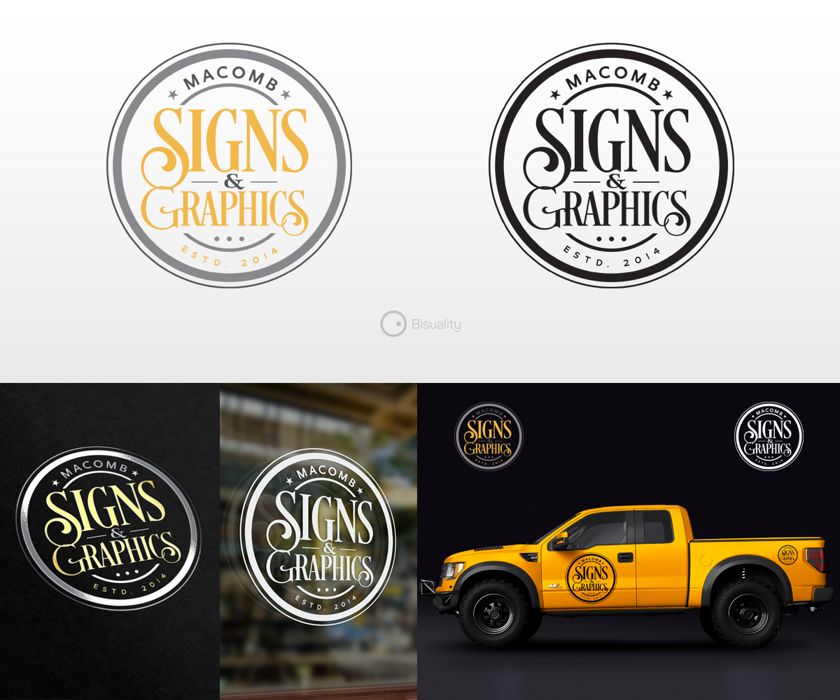
Company Logo for Macomb Signs and Graphics
¿Quieres ganar un trabajo como este?
Este cliente recibió 167 diseños de logo de 41 diseñadores. Eligieron este diseño de logo de Bisuality como el diseño ganador.
Únete gratis Encuentra trabajos de diseño- Garantía
-
 US$150
-
 167 diseños
-
 41 diseñadores
Resumen de Diseño de Logo
I need an updated, professional look for my sign and graphics company.
I have designed dozens of my own ideas but unfortunately I will never decide on my own logo. I need to leave the creation to someone else! My creativity and skill only go as far as my indecisiveness will allow. Because my company offers creative services, it is important for me to have a more creative logo to help represent what I can do and look more professional and exciting.
I am attaching some sample images, including what my old (first file) and current (2nd file) "boring" logo looks like, as well as some ideas I've come up with, followed by some designs that I've seen which I like.
Actualizaciones
Need extra days to review
Objetivo del mercado(s)
Small businesses, contractors, retail stores.
Tipo de industria / entidad
Outdoor Sign
Texto del logo
Macomb Signs & Graphics
Estilos de logo de interés
Logo con emblema
Logo contenido dentro una forma / figura
Estilos de fuente para usar
Colores
Diseñador para elegir los colores que se utilizarán en el diseño.
Mira y siente
Cada control deslizante ilustra las características de la marca del cliente y el estilo que debe comunicar el diseño de tu logotipo.
Elegante
Atrevido
Juguetón
Serio
Tradicional
Moderno
Atractivo
Profesional
Femenino
Masculino
Vistoso
Conservador
Económico
De Alta Gama
Requisitos
Debes tener
- I want my logo to have a vintage/retro appeal but still somewhat contemporary. I would like the design to contain a banner graphic, some sort of unifying shape (circle, polygon, etc.) or "badge" style. I'm okay with random lines, stars, accents,etc.
Agradable de tener
- I like the idea of an inline font, script font, and/or other simple retro fonts, or combination of these. 3D, chiseled or dimensional letters are nice.
- I prefer the ampersand instead of the word "and", which can be used as a creative element in the logo as well. "Macomb Signs & Graphics" is how it should read. I feel that emphasis should be on the word SIGNS. As an option, "Established 2014" can appear somewhere to help balance it out.
No debería tener
- I do NOT want to look like a sign painter or classic sign artist. My media is vinyl graphics, not gold leaf, painting or metal. I don't want it to look too weathered or antique. The image should be easy to reproduce in computer-cut vinyl or printed media.