P I L L A R Architecture needs a NEW LOGO
¿Quieres ganar un trabajo como este?
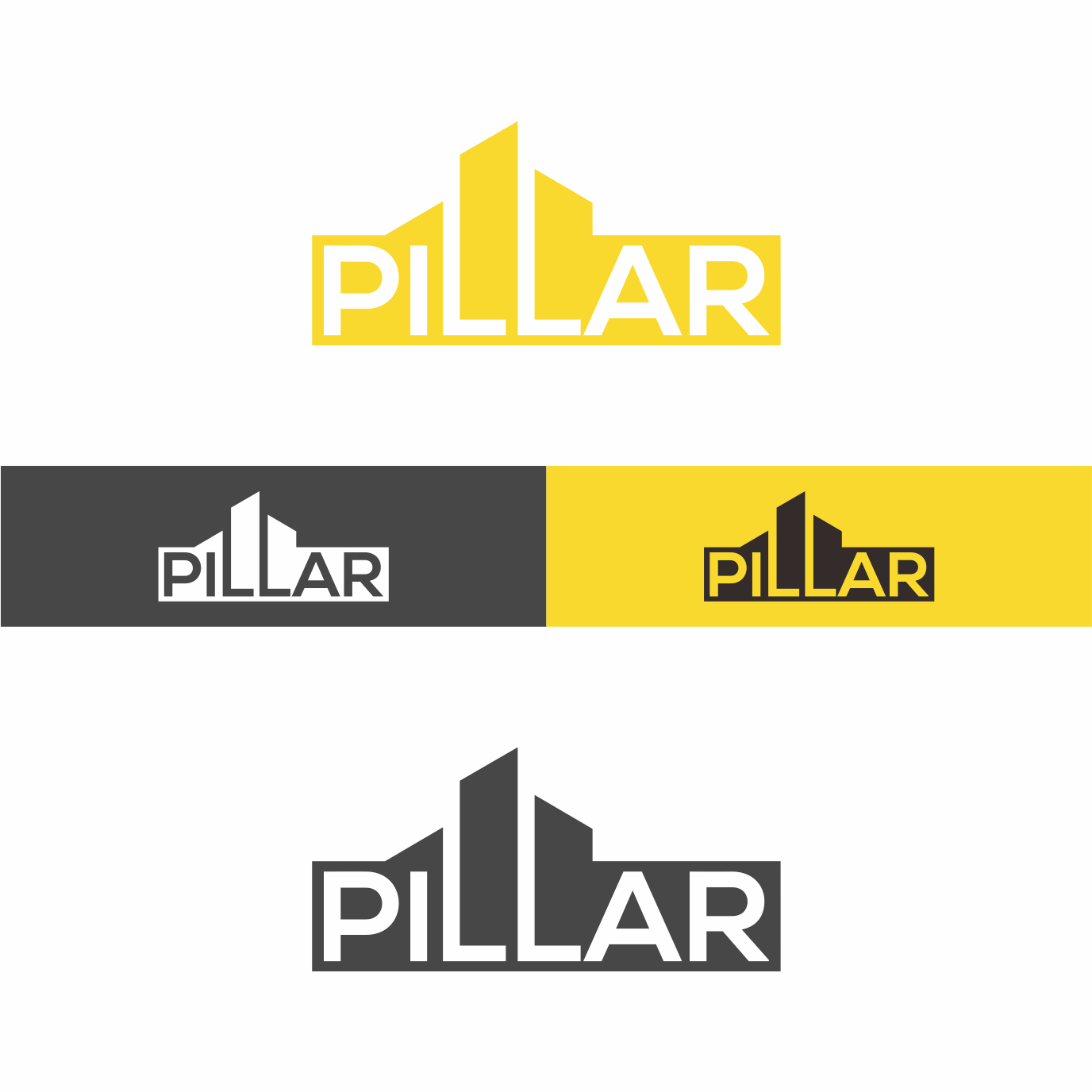
Este cliente recibió 464 diseños de logo de 158 diseñadores. Eligieron este diseño de logo de komarudin 2 como el diseño ganador.
Únete gratis Encuentra trabajos de diseño- Garantía
-
 A$270
A$270
-
 464 diseños
-
 158 diseñadores
Resumen de Diseño de Logo
Design a new logo 'Pillar' for my architecture business located on the Northern Beaches district of Sydney, Australia.
My architecture is timeless. I am influenced by Modernism. What this means is that it should not be too fussy, overly decorative or fashionable as it will expire too quickly. At a very simple level, it should be 'bold',not cursive or 'scratchy / sketchy'.
There is an obvious dynamic to explore with the 'double~L' of PILLAR.
I would like this to be used in a clever way. It might also be possible to use the 'i' too?
Refer to attached logo 'moodboard'. What I like about these logos is:
* Simplicity is important for me
* Pillar meaning - it stands on it own.
* The bold fonts matches the word. When we use light fonts, they don’t match the word.
Colours - I like the yellow, but it’s not essential for it to be yellow. I want a logo that can equally stand out in black + white.
The logo will be used on my website, business card, letterhead, invoice and drawing titleblocks.
Objetivo del mercado(s)
70% Home Owners
30% Builders
Tipo de industria / entidad
Architecture
Texto del logo
PILLAR
Estilos de logo de interés
Logo de marca de nombre
Logotipo basado en palabra o nombre (solo texto)
Logo con siglas
Acrónimo o logo tipográfico (solo texto)
Estilos de fuente para usar
Colores
Colores seleccionados por el cliente para ser utilizados en el diseño del logotipo:
Mira y siente
Cada control deslizante ilustra las características de la marca del cliente y el estilo que debe comunicar el diseño de tu logotipo.
Elegante
Atrevido
Juguetón
Serio
Tradicional
Moderno
Atractivo
Profesional
Femenino
Masculino
Vistoso
Conservador
Económico
De Alta Gama
Requisitos
Debes tener
- Simplicity.
- Black on white background (with potential to use colour.) so it can be used on letterhead, drawing titleblocks & website.
- Bold
Agradable de tener
- Potential option to use a colour in the 'double~L' device?? (Not essential, but if you have a great idea of any kind, let's see it!!)
- I've selected yellow. I like yellow, but its not a deal breaker ~ i'm happy for designer's to explore and experiment!
- Red, Blue, Yellow or Orange
- ** Note: as designers, if you think this is 'twee' or a rubbish idea, happy to explore/ consider bold ideas!
No debería tener
- Not cursive, sketchy.
- No 'Comic Sans' or anything close to it!