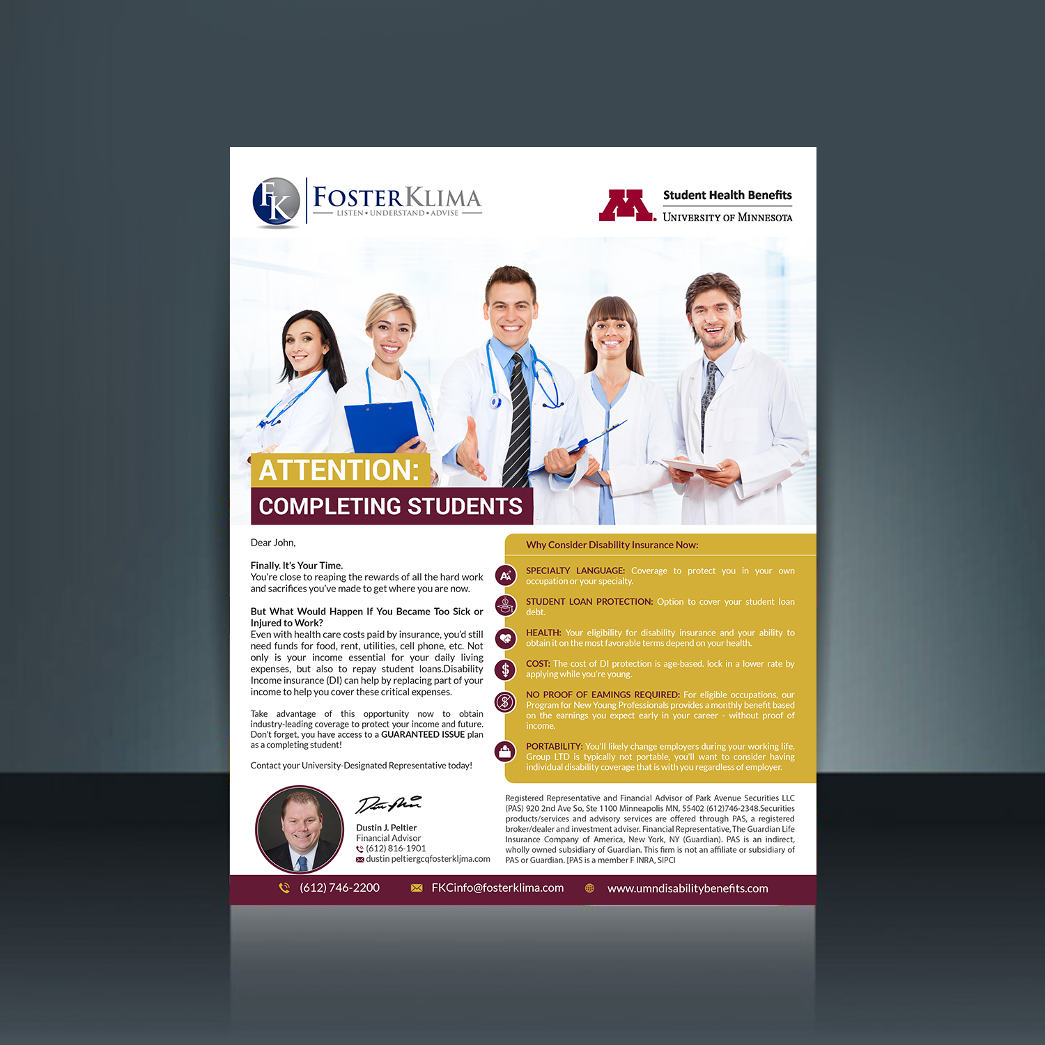
Univ of Minnesota disability insurance program

¿Quieres ganar un trabajo como este?
Este cliente recibió 22 diseños de brochure de 6 diseñadores. Eligieron este diseño de brochure de creative.bugs como el diseño ganador.
Únete gratis Encuentra trabajos de diseñoResumen de Diseño de Brochure
We are an endorsed vendor for disability insurance the the University of Minnesota. We work together with the University to promote this program. They send emails on our behalf but we send some too. I'm not confident the emails we send are as effective as they could be. I have attached examples of 2 versions of the same email we send students and residents. I would love your opinion on how to make these better and shorter. They are emails, not brochures. I have several others but starting with these. I would like to see consistency in all the pieces we email to the students and residents. I also feel like we have to many words in our pieces and they could be shortened up with better word smithing. Once we settle on a design of these emails and better wording I have about 5 other emails I would like to have looked at to coordinate with the one we are doing now. In each of these programs at the University we have an assigned Foster Klima representative. We do want to add their pictures to these too as one of the examples has.
Actualizaciones
I forgot to mention that I need both logo's in the email. The Foster Klima logo and the University of Minnesota Office of Student Health Benefits logo. Do you need an electronic version of the email? Let me know. Thanks
Added Wednesday, January 3, 2018
Objetivo del mercado(s)
students and medical residents
Tipo de industria / entidad
Insurance
Estilos de fuente para usar
Mira y siente
Cada control deslizante ilustra las características de la marca del cliente y el estilo que debe comunicar el diseño de tu logotipo.
Elegante
Atrevido
Juguetón
Serio
Tradicional
Moderno
Atractivo
Profesional
Femenino
Masculino
Vistoso
Conservador
Económico
De Alta Gama
Requisitos
Debes tener
- Short and worded to the point
- Can use maroon and gold coloring
Agradable de tener
- Easier to read
No debería tener
- Walls of words as students and residents dont have a lot of extra time on their hands.