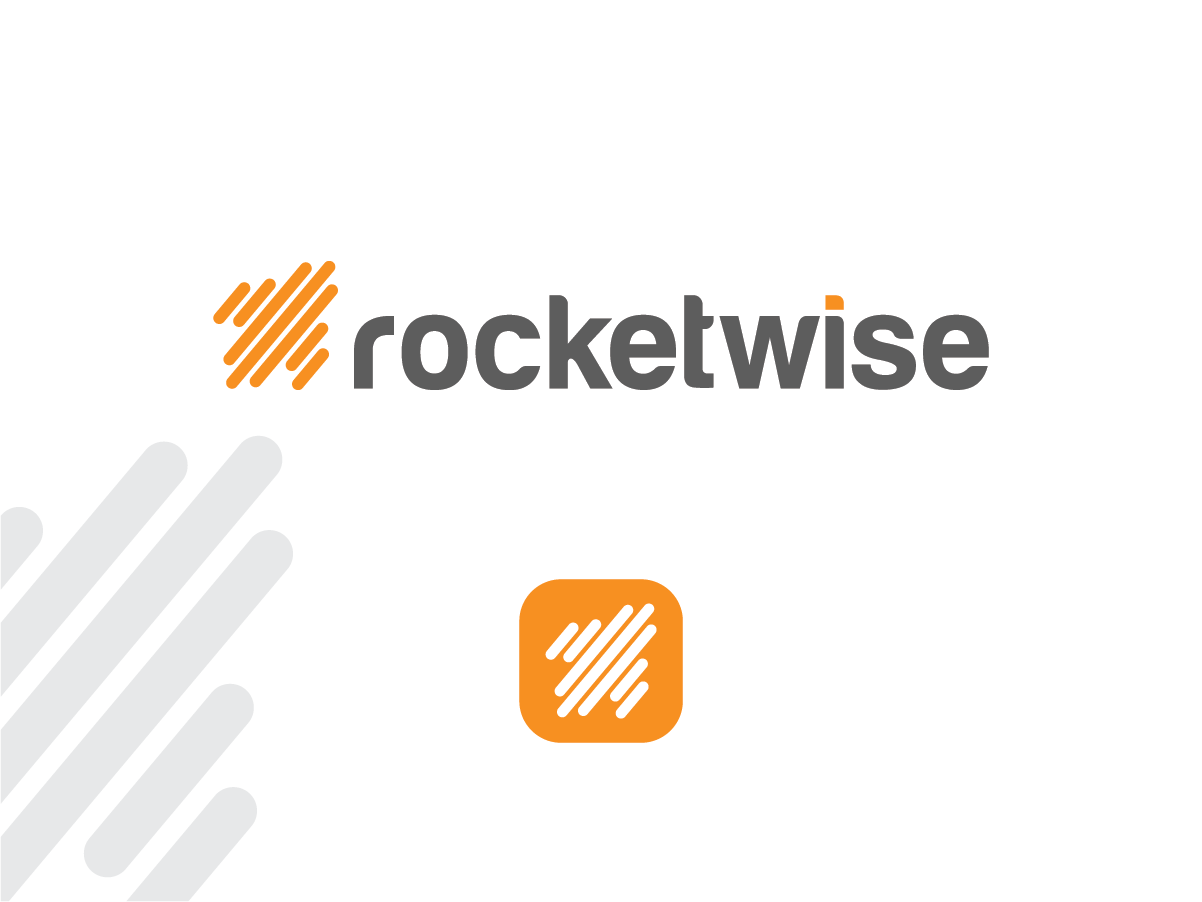
New Logo for Growing IT Services Firm

¿Quieres ganar un trabajo como este?
Este cliente recibió 187 diseños de logo de 67 diseñadores. Eligieron este diseño de logo de Alice J como el diseño ganador.
Únete gratis Encuentra trabajos de diseño- Garantía
Resumen de Diseño de Logo
We need a logo designed for our re-branded IT services firm called "rocketwise" (all lower case). We prefer orange/dark grays for logo, and it must be simple enough to convey well in a variety of formats: web, print, embroidery, etc. Logo (or recognizable part of the logo) must scale down to be used as an website ico or simple task bar icon.
I've attached our temporary logo for reference, but we need something much more polished.
Objetivo del mercado(s)
professional services firms
Tipo de industria / entidad
It Company
Texto del logo
rocketwise
Estilos de logo de interés
Logo pictórico / combinado
Un objeto del mundo real (texto opcional)
Logo abstracto
Conceptual / simbólico (texto opcional)
Estilos de fuente para usar
Colores
Colores seleccionados por el cliente para ser utilizados en el diseño del logotipo:
Mira y siente
Cada control deslizante ilustra las características de la marca del cliente y el estilo que debe comunicar el diseño de tu logotipo.
Elegante
Atrevido
Juguetón
Serio
Tradicional
Moderno
Atractivo
Profesional
Femenino
Masculino
Vistoso
Conservador
Económico
De Alta Gama
Requisitos
Debes tener
- Scaleable logo - a recognizable part of the logo must scale very small for use as ico on website and icon in Windows task manager tray. Also must look recognizable in single color variations - like black or white in places where color cannot be utilized. Depending on the design, may need an option for a "vertical" and "horizontal" variation. The logo I have attached is much wider than tall, so it is a "horizontal" type. Some logos lend themselves to having an image to one side of the word in a horizontal fashion, and the image can be moved to the top or bottom of the word for a more "squared off" or vertical appearance.
- Colors attached below are approximate - please use your judgement in choosing.
Agradable de tener
- I'd like to have some rocket imagery as part of the design, either tangible or suggested. Our brand is high tech, but approachable, with an emphasis on speed and consistency of service.
No debería tener
- Complex design elements that do not scale well, or translate to multiple media (like embroidery). Multitude of colors that make integration with other designs difficult.