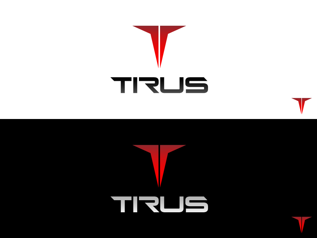
TiRus

¿Quieres ganar un trabajo como este?
Este cliente recibió 76 diseños de logo de 39 diseñadores. Eligieron este diseño de logo de keis604 como el diseño ganador.
Únete gratis Encuentra trabajos de diseñoResumen de Diseño de Logo
Our client is one of the world’s leading manufacturers of titanium, a material that is highly valued by aircraft manufacturers across the world due to its combination of lightness, strength and durability. Based in the Ural District of Russia and recently privatised after decades of state control, the client is now looking to rebrand itself as part of a drive to shed its old Soviet image and to attract new customers, partners and investors on the international stage.
It wants an image that is exciting and international.
The clients current logo is a paper airplane which we think ingeniously conveys the elements of strength and lightness that Titanium is known for. We are looking for a designer who can either imaginatively build on that graphic element of the company’s existing logo or produce a new and better graphic logo that would be better representative for the company who wants a more international image. The logo should incorporate the new company name – TiRus. TiRus is an amalgamation of Ti (titanium’s chemical symbol) and Rus (the abbreviation for Russia). Capitalise the letters T and R.
Texto del logo
TiRus