Our Almond Nulk needs new labels and logo as good as the product itself - the ultimate nut milk
¿Quieres ganar un trabajo como este?
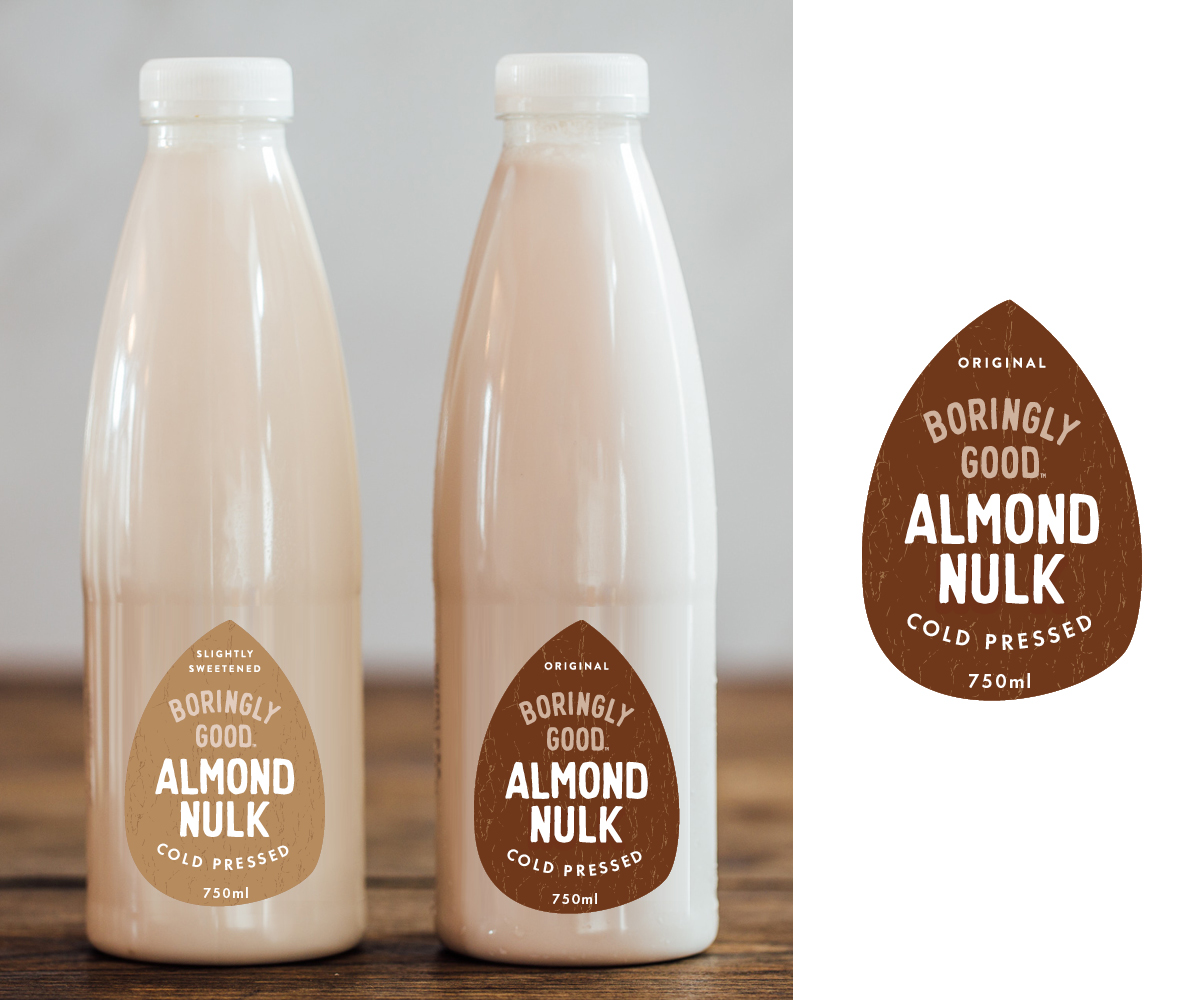
Este cliente recibió 82 diseños de empaque de 22 diseñadores. Eligieron este diseño de empaque de Bittersweet como el diseño ganador.
Únete gratis Encuentra trabajos de diseño- Garantía
-
 £170
£170
-
 82 diseños
-
 22 diseñadores
Resumen de Diseño de Empaque
What we do:
We are a cold-pressed Almond milk company. Our Nulk (nut milk) is as pure as can be - Nuts, water, salt - that's it. Our current design is good but it's not telling people why they should spend more on our product than the competitors.
What we need:
We would like to have improved designs (or totally new designs!) for:
Our Front and Back labels on our bottles
Our Logo (currently the same as the logo on the bottle but we're very happy to change it.
The key thing is to accentuate the words "Almond Nulk" over "Boringly Good" and to include the words "Cold-Pressed).
We're interested in both totally new designs and updates of our current design.
What we make:
Our Nulk is totally unique in UK and Ireland. The advantages of our Nulk over other non-dairy milks are:
1. Cold-pressed (we use cold-press and HPP technology so our product is never heated - keeps all the nutrients, flavour and creamy texture - all other UK/Ireland non-dairy milks are UHT)
2. Our nuts are activated before we press which increases the nutrient value in the Nulk
3. 10% Nuts (most almond milks have around 1-2%)
4. It's naturally creamy and delicious
5. We never use refined sugars (we only ever sweeten with dates), emulsifiers, flavourings, preservatives or any other nasties.
6. The ingredients list is so Boring it's good!
What we want to change:
The feedback we're getting from retailers and industry is that our brand name (Boringly Good) is too prominent on the label and that Almond Nulk (ie what the product actually is) isn't prominent enough. Nulk is our trademarked name so we want to make more of it and have Almond Nulk much bigger on the label. We're contemplating having Boringly Good as the strap line or just as the brand name but smaller than Almond Nulk. We also need to have the words "Cold-Pressed" on the front label to justify the premium price.
We need a front and a back label which is going to stand out on the fridge shelf as totally different and premium. At the moment we use an almond shaped label (see upload) that is a different colour for each of the flavours (Original (dark Brown), Slightly Sweetened (light brown), Strawberry (bright pink), Mango (bright orange). We like having two labels as they allow the creamy look and colour of the Nulk to show through the bottle (we don't want to cover it up). Our Original and Slightly Sweetened comes in 750ml (which look like old-fashioned milk bottles) and 330ml bottles, the flavours come in 250ml - at the moment we use the same label size for all different sizes but we're willing to change that if it looks better. We don't want a wrap around label. We currently have almond shaped labels which we like but we are willing to change if it looks good. Most of our competitors are in tetra pack. A couple are in opaque bottles so we like our bottle to show off the product.
The Original and Slightly Sweetened are the most important to get right as they are the genuine milk alternatives. The flavours are a secondary line of grab and go drinks so not the main focus of the brand.
We're about to go into more mainstream shops so we need the bottles to speak for themselves more. Until now we've been in shops where consumers are more likely to turn the bottle around and read the differences for themselves. Now we need the bottle to sell itself a bit more.
We're happy to totally shake up the label and branding if that's what works!
The Details:
Information that needs to be on each label:
Front Label:
Boringly Good Almond Nulk (Or Almond Nulk Boringly Good)
Cold-Pressed
Activated
750ml/330ml/250ml
Flavour (Original, Slightly Sweetened, Strawberry, Mango)
Back Label:
List of ingredients - we'd like to make this more front and centre to show how simple the product is (like naked bars) - for the Original version this is: Almonds, Water, Pink Himalayan Salt.
I'm Bored give me a shake
Separation is Natural
barcode
Nutritional panel
A blend of Almonds and water (this is our legal name so has to be on there somewhere)
Cold-pressed, cold-pressured
Our address: Nourish Foods, 4 Dawson Street, Armagh, BT61 7QT
facebook, twitter and instagram logos and our handle ItsBoringlyGood
Our website: ItsBoringlyGood.com
Keep chilled below 4degrees Celsius (or shortened to c)
Use within 3 days of opening
Vegan symbol
Use by date: see lid
Space Available for the labels:
750ml: 235mm circumference, 95mm high
330ml:185mm circumference, 85mm high
250ml: 165mm circumference, 75mm high
Our Brand Identity:
Our brand is all about being healthy without compromising taste or nutrients. We cold-press our product so it tastes better and retains more of its nutrients. We are scrupulously honest - what you see is what you get. We are quite playful with a tongue in cheek humour so happy to see fun ideas. We like to use the term Boring as a good thing! We're a premium brand that is basically the best that you can buy without making it yourself!
Other things that are true about our product that you could play around with or just to give you a feel for the product:
Works just like Milk
Just Nuts
No refined sugars
Nothing artificial
contains Nuts (loads of them)
Never heated
Creamy and delicious
Dairy-free
Soy-Free
Raw, Spanish Almonds
Activated Almonds
Our Logo is currently just the words "Boringly Good" the same as our label but what the logo is going forward will depend on the new labels. We'd like to create an improved logo around the same lines as the new labels.
Actualizaciones
Low designer entries
Objetivo del mercado(s)
Plant-Based, Premium, healthy eating, free-from, dairy-free, millenials. vegan
Tipo de industria / entidad
Food Production
Colores
Diseñador para elegir los colores que se utilizarán en el diseño.
Mira y siente
Cada control deslizante ilustra las características de la marca del cliente y el estilo que debe comunicar el diseño de tu logotipo.
Elegante
Atrevido
Juguetón
Serio
Tradicional
Moderno
Atractivo
Profesional
Femenino
Masculino
Vistoso
Conservador
Económico
De Alta Gama
Requisitos
Debes tener
- More prominence for "Almond Nulk" and less prominence for "Boringly Good".
- The words "cold-pressed" on the front of the label.
- See project description for the information we need on the back of the label
Agradable de tener
- Modern, bold, stand out designs that are both premium and approachable. A bit more artisan than mass-produced but modern not twee.
No debería tener
- should not be something that looks like other things on the shelf. Shouldn't look too mass produced or tacky.