Chainmaille Jewelry Business needs a logo design
¿Quieres ganar un trabajo como este?
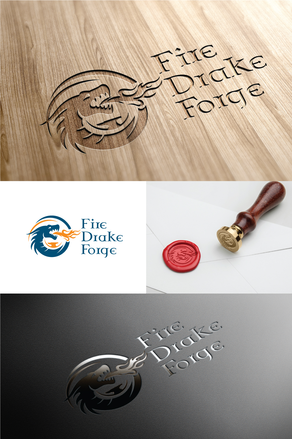
Este cliente recibió 138 diseños de logo de 51 diseñadores. Eligieron este diseño de logo de Leayer como el diseño ganador.
Únete gratis Encuentra trabajos de diseño- Garantía
-
 US$150
-
 138 diseños
-
 51 diseñadores
Resumen de Diseño de Logo
I am a Jewelry maker based in the Detroit Michigan Area. I work primarily in chainmaille, but I also do some wirework, which I am slowly expanding into. I am also expanding into pieces for the BDSM Market, including pieces like collars, bicep cuffs, harnesses, etc.
I primarily work in Copper, Silver, and Gold, with semi-precious gemstone beads included in some of my pieces. I am incorporating more pieces in stainless steel and Rubber
The main colors that I am currently using for my website are a dark blue background with orange text (think the colors of the Detroit Tigers Logo). My previous website was all done in greys, with an 80% grey background and light text
I have done some preliminary concept work, and have some things I sort of like, but I would like some fresh eyes and some fresh ideas.
The logo will be put to a lot of different uses, from my website (which will be getting completely redone at some point in the not-to-distant future) to hot-foil stamping on my packaging. For this reason, I'm looking for something that will look just as good the way you make it as it does reduced down to two-color only, with sharp edges and no blending.
Examples of my work can be seen at www.firedrakeforge.com. The photos were shot with a grey background, but I will be reshooting my pieces soon, and will use a background that is suitable to the eventual website design.
The attached files are some of the designs that I was playing around with. The tribal flame is an entirely original design. I like it and would kind of like to see some designs that incorporate it, but I'm also not so attached to it that I would choose a design that incorporated it over a better design without it. I have also included an early art piece that I did that might be redone into a logo concept, a dragon head inside a circle with flames breaking out of the circle.
The font that I used for those is called "Celtic Garamond the 2nd." I'm not married to it either. I do like it, but the R's look strange, and since there's an "r" in every word of the business name, that is an issue.
Objetivo del mercado(s)
Primarily the art show crowd. I'm aiming for a higher-end boutique look, My customers are about 70%women and 30% men. my bracelets are generally unisex designs, but I do have a lot of earrings and pendant designs as well. The overall look I am working toward with my show booth is a sort of High-end men's fashion meets apothecary vibe. Lots of dark wood shelves and tables, leather-covered displays, and probably navy blue ore grey curtains around the canopy.
Tipo de industria / entidad
Jewelry
Texto del logo
Fire Drake Forge
Estilos de logo de interés
Logo con emblema
Logo contenido dentro una forma / figura
Logo pictórico / combinado
Un objeto del mundo real (texto opcional)
Estilos de fuente para usar
Colores
Colores seleccionados por el cliente para ser utilizados en el diseño del logotipo:
Mira y siente
Cada control deslizante ilustra las características de la marca del cliente y el estilo que debe comunicar el diseño de tu logotipo.
Elegante
Atrevido
Juguetón
Serio
Tradicional
Moderno
Atractivo
Profesional
Femenino
Masculino
Vistoso
Conservador
Económico
De Alta Gama
Requisitos
Debes tener
- a Transparent Background. Sharp edges. many of the designs that I have uploaded have a blue background and an orange design, but this is only to show the color scheme of the current website. The website will be redesigned later, so the color choice is not fixed. The design should be something that looks good both on a website/business card, but also can produce a clean hot-foil stamp.
Agradable de tener
- Ideally the design would incorporate the full name, but I'm also interested in seeing designs without it. If one word were to be emphasized or larger than the others, it should be "Drake" because that is my name.
No debería tener
- Faded edges. Script fonts.