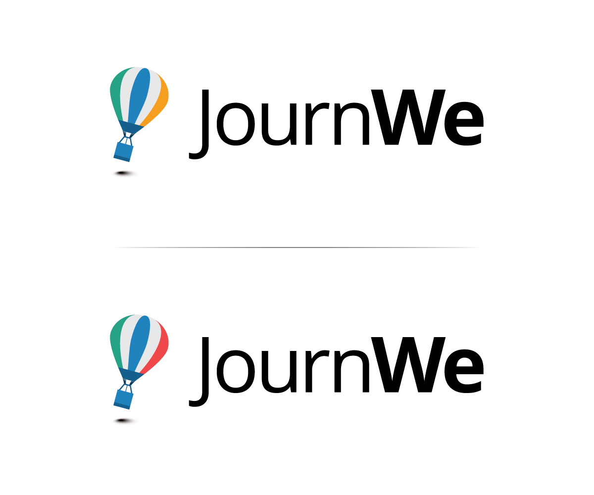
JournWe Logo
¿Quieres ganar un trabajo como este?
Este cliente recibió 108 diseños de logo de 28 diseñadores. Eligieron este diseño de logo de Neil como el diseño ganador.
Únete gratis Encuentra trabajos de diseño- Garantía
-
 €300
€300
-
 108 diseños
-
 28 diseñadores
Resumen de Diseño de Logo
Our Website JournWe.com needs a new logo.
JournWe is a group travel Website that helps you to start trips (adventures) with your friends. Our application solves decision making problems, such as: where to go, when to go, who is in the travel group? Furthermore, JournWe helps planning and organizing a group travel with additional features, such as discussion threads and shared to-do lists.
JournWe currently has a logo that consists of three colored circles which symbolize "make travel destination decision", "make travel time slot decision", and "invite additional friends to join the group travel". The current logo is attached. We would like to have a logo that is more catchy/memorable and interesting.
UPDATE:
We have just received an update from our designer we are working together with to design the homepage itself. We want to share them with you as they much better show how and where the logo will be used in future. The colors are not 100% final (the green and the blue are too close) but it will certainly go in this direction.
The first screen starting with "Willkommen zurück" is the home page. Here the logo will be used in the upper left corner in the header. In addition the current logo is used as a functional logo (as it represents the three elements place, time and travellers). If all three elements are represented in the logo it could also in future in some way serve as a functional logo.
The second screen is our landing page when the user is not yet logged on. Here the logo will also be used in the upper left corner. The big box in the middle will explain what JournWe is for and how it works. Regarding place, time and traveller we surely would use some of the logo elements here during the introduction and explanations.
You can see pretty much on your own what logo style would fit our (more flat) design of the page. Some examples of logo styles we think that would fit:
http://designmodo.com/animal-logos/
Actualizaciones
Dear designers,
thank you so much for all the awesome submissions.
We moved away from the three circles as we think a more creative, fun logo is more memorable than a very abstract/functional one. Current ideas mostly involve animals traveling together (representing the people on the trip) and incorporating the place and the time aspect in a creative way.
Please don't hesitate to submit alternative versions of your logo or new ideas that have a funny/happy animal in it.
Thanks,
JournWe team
Added Tuesday, December 10, 2013
Added Wednesday, December 11, 2013
Objetivo del mercado(s)
18-40 year old travellers
Tipo de industria / entidad
Travel
Texto del logo
JournWe
Estilos de logo de interés
Logo con emblema
Logo contenido dentro una forma / figura
Logo pictórico / combinado
Un objeto del mundo real (texto opcional)
Estilos de fuente para usar
Mira y siente
Cada control deslizante ilustra las características de la marca del cliente y el estilo que debe comunicar el diseño de tu logotipo.
Elegante
Atrevido
Juguetón
Serio
Tradicional
Moderno
Atractivo
Profesional
Femenino
Masculino
Vistoso
Conservador
Económico
De Alta Gama
Requisitos
Agradable de tener
- A logo with three elements that represent place, time, and travelers.