

 Refresh
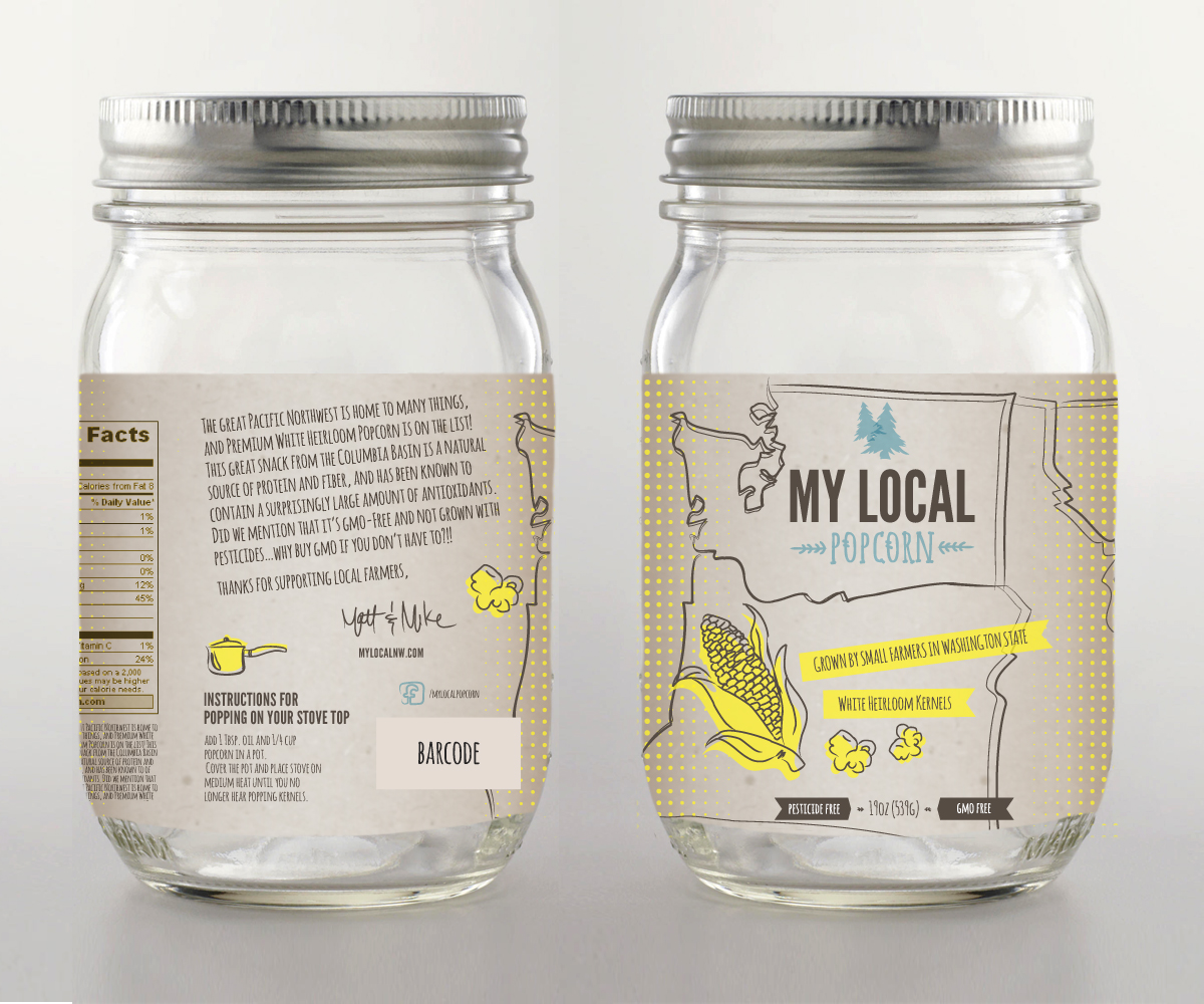
Food Label for Popcorn Kernel Product
¿Quieres ganar un trabajo como este?
Este cliente recibió 56 diseños de viñeta de 11 diseñadores. Eligieron este diseño de etiqueta de masher como el diseño ganador.
Únete gratis Encuentra trabajos de diseño
- Garantía
-
 US$480
-
 56 diseños
-
 11 diseñadores
Resumen de Diseño de Etiqueta
We are launching a new locally produced popcorn kernel in our regional market (Northwest, United States) for sale in local and upscale supermarkets. Our market is a group of people who enjoy spending money on good food, but come from many different backgrounds. They are both hipsters, and a wealthier group of families. They appreciate good style to a label, but to get their attention it should "pop" on the shelf. The label should not give a “commercial” feel, but something “local” and made by an individual, not a corporation. To do this, we would prefer hand-drawn, sketched, or minimally cartoon drawings, but very little clip art or cartoon feel. After reviewing the initial designs, I realize I should have given more direction. Perhaps the label would be great with an outline of the Pacific Northwest in the background (see attached image which includes the three states (WA, OR, ID). If it makes sense to just have WA or OR, then let's try that. You can redraw the outline to make it more simple, and don't need to include the state names on the actual label. In the bottom left, we should try to include the picture of a corn stalk, and in the top right, how about a picture of an evergreen tree (very northwest!). I've provided a few examples of the font and other details. Hopefully this is a better direction. The label we're looking for is both professional, local, and mildly hipster. For the exact location of where the popcorn is from, we should include a star over the area of the Columbia Basin (I'll attached a map with the area highlighted. We can place the star anywhere in that region.
For a few font examples that might work: https://creativemarket.com/TomAnders/10008-Vintage-Logo-Insignia-Bundle/screenshots/#screenshot4
Our price will be higher than our competitors. We don’t have anything in particular in mind, so please be creative. If I had to say anything, we’re just looking for something that is clear and attention grabbing when on the shelf. We can work from there.
We will be using a pint jar (16 oz.) with a wraparound label (circumference is 9.63 inches or 24.46 cm) Please see the attached picture for an example of the jar size and type.
Jar Dimensions: http://www.fillmorecontainer.com/Pint-Canning-Jars-16-oz-Regular-Mouth-Glass-Economy-Mayo-Jar-P14.aspx
size: 16 oz
lid size: G70 CT
height: 5.32 in
outside diameter: 3.07 in
circumference: 9.63 in – 24.46cm
label panel height: 2.453 in – 6.23cm (max 6.35cm)
The label panel height can be smaller, but not higher than this.
The attached example label example for My Local Honey is not to be used as an exact copy of what we are looking for. This is only provided to give you an idea of what our existing font is (My Local Honey) and the max height of the label (6.35 cm). Let’s assume our label will be 6.35cm tall, and as wide as you need, but no more than 24.46cm. The label for this popcorn product will need to be longer than the honey label example because it will include nutrition facts, and possibly more info depending on what you include.
What the label must have:
1. Barcode: Attached find an image of the barcode (the image you include on the label should be similar to the size included in the label example for one of our other products – see the My Local Honey label attachment for an example) – if you prefer to generate your own barcode image, please use this UPC: 74136 0256 217
2. Name of the popcorn company: My Local Popcorn – (The attached label shows how our logo is displayed for another product – please get creative, it doesn’t need to look like this. Maybe include a design or two with this My Local Honey text format, but we’re interested in other formats.
3. Description of the product: Premium White Popcorn
4. Product characteristics: GMO Free, Not grown with pesticides (we don’t need to say it in this order, but the label should somehow let the customer know that we don’t use pesticides to grow the popcorn and that it’s GMO Free)
5. Local – This is important. The customer should know that the popcorn is local and grown in Washington State by small farmers. (maybe the label has a farmer on the front..???) or some corn stalks in a field?
6. Nutrition Facts: see the attached excel file (please format this and include as you have with other food labels (I don’t have a format from other products we have) – This should go on the back of the label.
7. Net Weight 19oz (539g) on the front (bottom) of the label.
8. Our signature should go somewhere on the label “Matt & Mike” (our signature in the font included in the example label).
9. facebook logo with the link /mylocalpopcorn
10. MyLocalNW.com should be somewhere on the label.
Don't be afraid to get really creative, something funny, or totally different. that might be what gets the most attention from the customer.
Other:
Below is a short product description that might be included on the label - it could go on the side, or back…..or pick and choose what you would include and where you would place it. I like the idea of a short sentence or two on the side of the label where it’s easier to see than the back of the label, and the rest of the description on the back of the label with the nutrition facts. Some of have included this on the left side of the label with a lighter shade of a background that the text falls on; I think this looks nice.
Short Description: We never thought much about where our popcorn came from…until we realized we could find it locally right here in Washington State! The great Pacific Northwest is home to many things, and premium white heirloom popcorn is on the list. This great snack is a natural source of protein and fiber, and has been known to contain a surprisingly large amount of antioxidants known for reducing the risk of heart disease, cancer, and other diseases. Did we mention that it’s GMO-Free and not grown with pesticides…why but GMO if you don’t have to?!!
Thank you for choosing My Local Popcorn Matt and Mike

Actualizaciones
Project Deadline Extended
Reason: We have a few new products that we're working on, the first of which is this product (My Local Popcorn). Hopefully things go well and we can work on our next projects together. Regards, Mike
Added Tuesday, December 10, 2013
I have updated the description of what we're looking for, and updated a few example files.. I apologize for not being more specific to start. Thank you for all your time and interest in helping us. Please see the updated description below.
Added Tuesday, December 10, 2013
Tipo de industria / entidad
Nutrition
Mira y siente
Cada control deslizante ilustra las características de la marca del cliente y el estilo que debe comunicar el diseño de tu logotipo.
Elegante
Atrevido
Juguetón
Serio
Tradicional
Moderno
Atractivo
Profesional
Femenino
Masculino
Vistoso
Conservador
Económico
De Alta Gama
Requisitos
Debes tener
- Please see the description i've included above.
Agradable de tener
- Please see the description i've included above.
No debería tener
- try to avoid clip art. i have provided a few examples of corn stalks and trees that i think would look good. if you have something better, use it. we'll go from there.


